Season Preview 2010, Part III
The Icethetics Season Preview is giving you a chance to catch your breath here at mid-week. There have been plenty of new logos to digest over the past two days. Now it's time to take a look at some of them in action in the place where every game begins: center ice.
New Center Ice Logos
A handful of NHL teams will display special anniversary logos inside their center ice circle for the 2010-11 season.
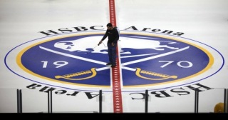 Sabres center iceThe Buffalo Sabres have painted their 40th anniversary logo inside the big circle at HSBC Arena.
The team is trying its hardest to rebrand itself with that original logo. It is on everything these days. As it should be.
Also, the center red line now features a string of white stars running across it. A number of teams are getting more creative with the design of that red line. We'll outline some of them this afternoon.
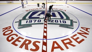 Canucks center iceAlso celebrating 40 years in the NHL, the Vancouver Canucks are using their anniversary mark at center this season.
The logo itself remains mostly intact, but for a few minor alterations. In order to prevent overlap with the red line, the small Canucks primary logo was been removed from its spot between 1970 and 2010. Also, as you can see, the ends of the ribbons are cropped to fit the logo nicely inside the circle.
GM Place was renamed Rogers Arena over the summer and obviously the new paint job represents that change.
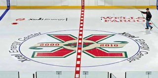 Wild center iceCelebrating a decade since the NHL's return to the state, the Minnesota Wild will have their 10th anniversary logo on the ice inside the Xcel Energy Center.
The Columbus Blue Jackets having also unveiled a logo for their 10th anniversary but are not joining the Wild by placing it at center ice. The Jackets' standard primary logo remains there at Nationwide Arena this year.
Also confirmed as remaining unchanged is the Nashville Predators logo at Bridgestone Arena. It was rumored over the summer the Preds would be altering the color scheme of their primary logo to match their third jersey. It now appears that won't happen until at least next season, 2011-12.
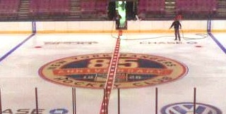 Rangers center iceFinally, the New York Rangers are celebrating a big year — their 85th as a member of the NHL. The logo commemorating the event is already in place at Madison Square Garden.
It's a great logo, but I'm not sure the vintage white was such a good idea on white ice. At least the Sabres knew better than to do that.
Additionally, I understand the San Jose Sharks have their 20th anniversary logo painted at center ice at HP Pavilion but I haven't managed to come across any photos yet.
I tried to be comprehensive with this post, but same as yesterday, I'm counting on you guys to help me out if I missed anything. Tomorrow it's the minor league edition of JerseyWatch 2010 as the Season Preview pushes toward the last big pre-season update to NHL JerseyWatch 2010.
As expected, I overlooked a handful of new center ice designs for 2010-11. But some awesome Icethetics readers have us covered.
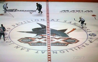 Sharks center iceShaun emailed this in from a San Jose Sharks pre-season game on TSN.
The Sharks are using one of their five 20th anniversary logos at center ice, but it's not the same as the one on their helmet and sleeves. At least they're getting their money's worth.
This logo is actually slightly different from the one previously unveiled.The number 20 is spelled out as TWENTY and the areas behind the years are teal instead of black.
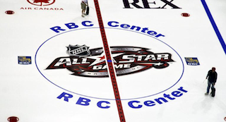 Hurricanes center iceAdditionally, the Carolina Hurricanes, who are hosting the 2011 NHL All-Star Game, will use that all-star logo at center ice in the RBC Center.
This version appears to use a much darker shade of maroon, almost black, in fact. Of course if it had a little more red it might resemble the Hurricanes' logo a little better. I also have to wonder whether it will remain for the length of the season or be replaced after the All-Star Game in late January.
A copule of other teams haven't done much with the center ice logo, but are getting creative with the red line.
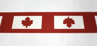 Maple Leafs center red lineAs mentioned earlier this month, the Toronto Maple Leafs have added little Canadian flags along the red line, with the maple leaf in the middle replaced by the team's logo — in red!
An article on the Leafs' website describes it as an expression of the team's patriotism. That's different, but it makes for a neat looking center line anyway.
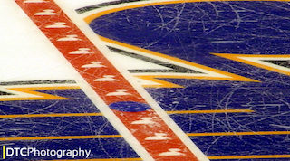 Blues center red lineDavid posted this photo in the comments of the new red line for the St. Louis Blues at Scottrade Center. It features a string of white Blue Notes running the length of the line. It's kind of neat.
For what it's worth, the Tampa Bay Lightning have also done this, with lightning bolts down the red line, for a number of years. It's just a neat way to make your red line your own.
Stay tuned for the minor league JerseyWatch later today.