Hurricanes, Stars Unveil New Looks
To put it mildly, yesterday was a busy day. As expected, two NHL clubs launched redesigned uniforms and even a few new logos. And considering I actually attended one, there's no way I could possibly cover everything fully in a single blog post. And since I'm running on a lack of sleep, I'm just focused on nuts and bolts today.
Over the next several days, I'll be writing more in-depth posts including detailed point-by-point reviews of all the new stuff — something I've never done before but always felt I should. Stay tuned for that!

Carolina goes for simplified jersey designs
The Carolina Hurricanes were first out of the gate on Tuesday with the much-anticipated unveiling of their new home and road uniforms. The event was held at PNC Arena in Raleigh and streamed live to the world from their website.
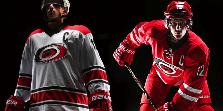 Photos from Carolina Hurricanes
Hurricanes captain Eric Staal was present at the unveiling, where the team released some promotional photos of the new threads, as you see above. Gone are the storm flag stripes and really any silver outside the crest. Now it's all about the classic, simplified styling — even if it's not all that original. But I'll get to the editorial stuff in my review later this week.
Here's the full home set:
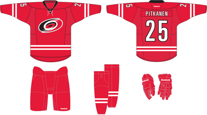 Graphic from Carolina Hurricanes
It is very red, much more than before. The striping — as many have pointed out — is reminscent of what Team Canada wears. But most notably, the design is much cleaner than the previous look Carolina wore for the last 16 years.
Now take a look at the full road set:
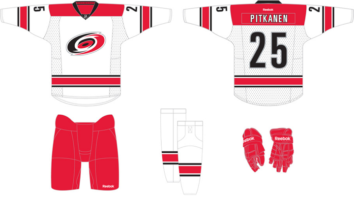 Graphic from Carolina Hurricanes
Again, it's a clean design. But the noteworthy thing here is that the two sweaters don't match. And it's not just the striping, it's the colors and collar design as well. The only black we find outside the crest on the red jersey is on the collar. And speaking of which...
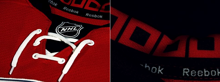 Images from Carolina Hurricanes
The collar on the red home sweater has traditional ties, but the white doesn't. What the two collars share, however, is the unique design on the inside. The storm flags live on — but only when the jersey is hung up. Naturally, Reebok calls this the Hanger Effect. Clever.
Again, I'll dig into it a bit more in my review. For now, let's keep it brief and move on.

Dallas overhauls logo, colors and uniforms
On Tuesday night, the Dallas Stars gathered their season ticket holders at the AT&T Performing Arts Center to discuss some big changes to the franchise. That included a complete rebrand — new logos, new colors and new uniforms. New everything.
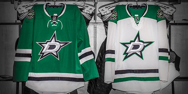 Image from Dallas Stars (via Facebook)
I was honored to get an invitation from the team to attend the event. I'll have a lot more of my photos in my review and a subsequent post detailing my experience watching the unveiling in person. But for now, I'll run down all the important stuff.

Like these new logos, for instance. Along with their new primary mark, the Stars introduced these secondary designs. The circular logo will be worn as shoulder patches on both jerseys while the one shaped like Texas gets featured on the pants. Both of these logos incorporate the new D-star.
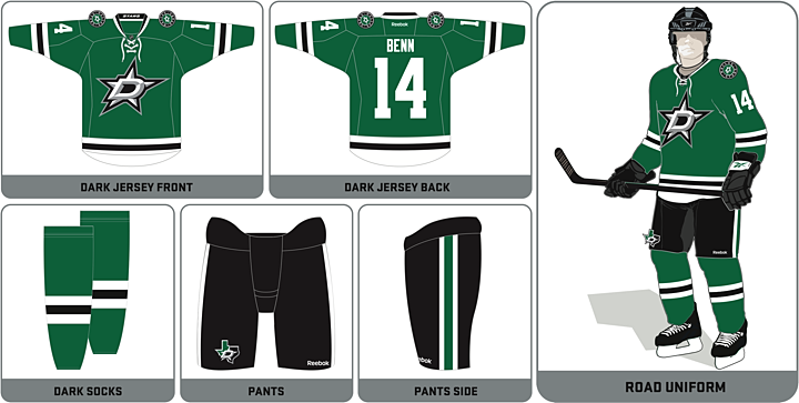
Now to the uniforms. The graphics released by the Stars perhaps erroneously call the green jersey the "road uniform." Some have taken it to mean the NHL is switching back to whites at home next season after 10 years of whites on the road. But I haven't heard anything to that effect. Plus, people at the Stars' event were referring to the green as the home sweater. (And Carolina labeled their reds as home sweaters, for that matter.)
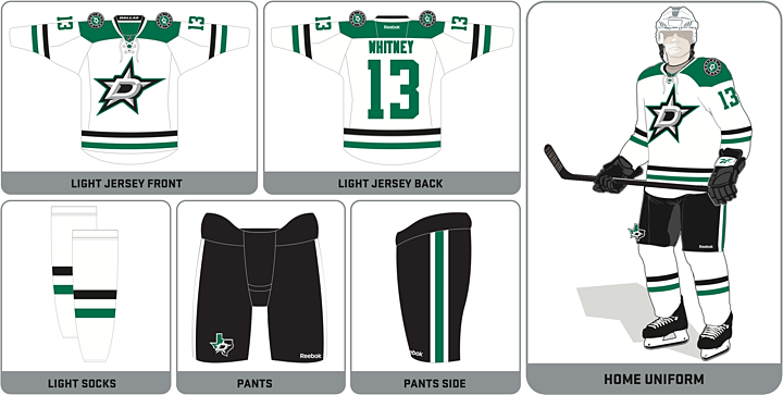
So there you have it. The new looks of the Hurricanes and Stars. I'd love to keep writing on the subject, but I'm running on a lack of sleep after the last couple days so I'm going to take a nap. While I'm snoozing, leave your thoughts on these in the comments. Your feedback will help with my upcoming reviews.