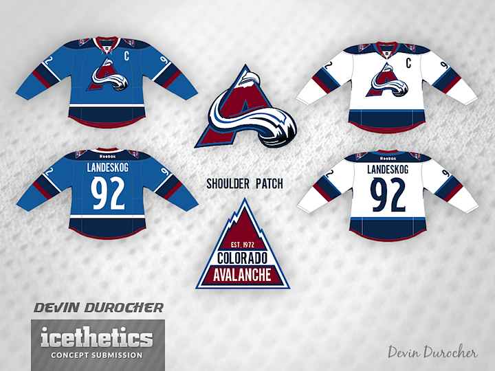
0594: Dual Blue Avs

Devin Durocher made a handful of tweaks to the Avalanche's uniforms — and even the logo. But while I like the two-tone blue color scheme to an extent, the logo without the oval leaves it looking a little off-balanced. What do you think? Good idea for the Avs?