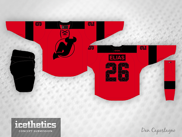
Freaky Oilers Mod
/
Dan Capostagno designed these freaky Oilers jerseys and had quite a lot to say about them. So I'll let him take it from here. Settle in.
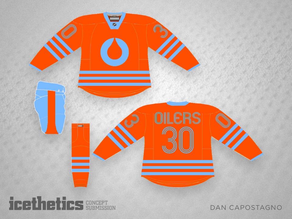
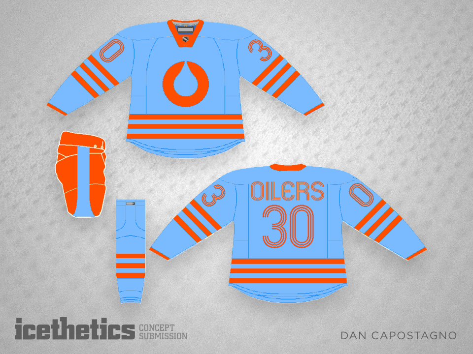
I did this some time ago on my old Chromebook, so it's not super pro, but not bad either. I had 3 versions: one in the traditional blue & orange, which looks nice, one in a more modern navy and fluorescent orange, which is interesting also, but what stands out as my personal favourite is this light blue & copper orange. It's bold, simple, retro, and modern all at the same time... hence "mod." It would look just as much at home in the 60's or 70s as it does in the 2000's, straddling both the Winter/Heritage Classic and the Stadium Series.
I personally prefer designs that are clean and minimalist, and I think that shows with this one. Two colours and one main design motif: the classic Edmonton 3 bars that hearken back to the Gretzky Era also find their way into the numerals and lettering. I kept the TV numbers big, because that seems to be the trend that the Stadium Series is setting. The font is Mexcellent, which is a groovy font that isn't so retro that it could only be from that period. My thinking on these kinds of design themes is to make it in such a way that if someone didn't approach it with previous knowledge of the team's uniform history, they'd believe it was a past design.
As for the colours, I'm not married to the blue shorts with the orange set and orange shorts with the blue set, and I imagine that might be a bone that people might pick. I'm fine with either way. The classic stripe design on the Edmonton shorts essentially determined my choice there, with the stripe being a graphical callback to the droplet in the logo on either jersey. As mentioned in my earlier post, there is a great deal of oil iconography at play also. The logo is somewhat similar to the old logo of the Statoil company that operates in Alberta's oil fields, and the light blue & orange are ICONIC in racing as the livery of Gulf Oil. It's also a colour combo that one doesn't see often, and with so many teams using the same colours, it'd be nice for a team to stand out with a unique choice.
The logo itself is a great design in minimalism; honestly I'm shocked the folks in Edmonton hadn't put this together themselves; it takes the droplet and makes it the star of the logo, forming a big O for Oilers. It's textbook minimalism. If one does some digging, or perhaps "drilling" one might say, they'd discover the holding company for the Edmonton Oilers (the Oilers Entertainment Group) uses a similar logo also. I purposely stayed away from a lace-up collar also, because they really didn't use them in the 60's nor would they in the future, and it's cheating shorthand for "hey, look how retro this is."