Collection 29: Just a Minor Thing
One group that's often overlooked on the Concept page are the minor leagues. Plenty of teams could use a bit of rebranding work. Here's what some of our talented designers have come up with.
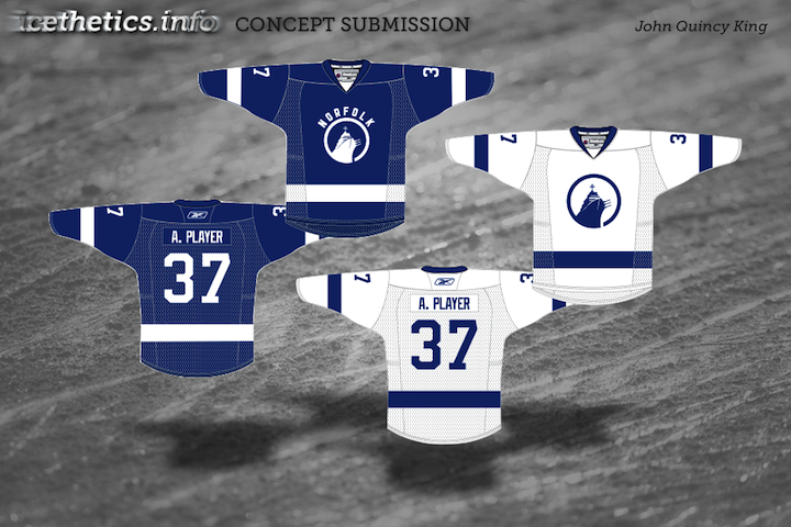
First up is my favorite. John's idea was to rebrand the AHL's Norfolk Admirals based on their NHL affiliate — the Tampa Bay Lightning. The color scheme has been cut down to blue and white and the logo has been simplified. And just like Tampa Bay's new uniforms, the road jersey bears the city's name. It's a brilliant concept and one I've been wanting to share for some time.
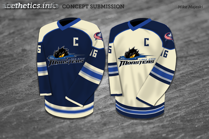
Mike was headed down a similar path, rebranding the Lake Erie Monsters to sync up with their fellow Ohio team, the Columbus Blue Jackets. Only Mike has used the Jackets' new alternate sweater as a base.
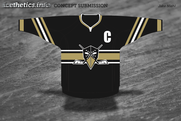
Jake's design is for the ECHL's Wheeling Nailers, an affiliate of the Pittsburgh Penguins — on which his design is obviously inspired. It's actually pretty clever.
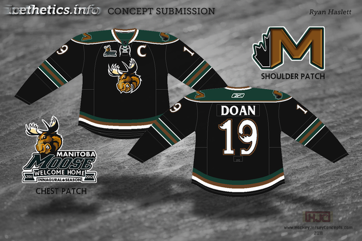
Ryan, here, hasn't rebranded the Manitoba Moose so much as he's applied the existing brand to the Phoenix Coyotes. We now know that the Coyotes aren't an option for Winnipeg anymore, at least not in 2011 — but also that if the Coyotes were to move back to Manitoba, they would likely retake the Winnipeg Jets name. Still, a nice effort anyway.
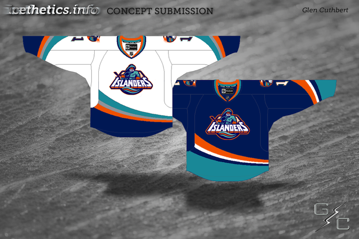
And yes, I know this isn't technically a minor league design. But let's be honest, it was such a minor league design. Glen has Edge-ified the much-maligned jerseys of the New York Islanders from the mid-1990s by adding the fisherman logo to the Ducks' Edge template.
Sorry you had to see that.