The Anaheim Enigma
/Something bizarre is going on.
It's like waking up from a dream and trying to remember it. Yet the harder you grasp for details the scarcer they become. A mystery has been brewing in Anaheim. A third jersey mystery. I can't claim to solve it but I will present all of the facts I am aware of.
 When I sat down to write tonight's post it was with the intention of revisiting something I posted to Twitter on Tuesday evening.
Adam Brady, Director of Publications & New Media for the Anaheim Ducks, wrote an interesting article on his blog talking about the checkered past of third jerseys in the NHL — his club included.
Mysteriously, that post has disappeared. Luckily, nothing in cyberspace ever truly disappears. Google caches everything these days and I've taken full advantage of that in order to keep his post alive here at Icethetics. It's a very good read — even more so now that it's been removed from the Ducks' official web site.
The following was posted on July 27 at 3:58 PM, and re-posted here for posterity with minor edits.
My never-ending search for summer blog material has netted a few items that fall under the hockey jersey umbrella, a topic that remains endlessly fascinating. That's especially true around these parts, as our (once-Mighty) team has been guilty of a few jersey missteps over the years.
The (Mighty) Ducks make a couple of appearances in a well-thought-out piece on the Puck Daddy blogsite that lists the 10 criteria for what makes a bad hockey sweater. Categories include "There are excessive stripes" or "Overt cartoonishness" or "It's an All-Star jersey." Among the teams represented in the "It's like they let a child pick the team's colors from a crayon box" is the Mighty Ducks jersey of 1993-2006, seemingly for its unique mixture of teal and eggplant. Somehow the masked Duck logo escaped falling into the "cartoonishness" category.
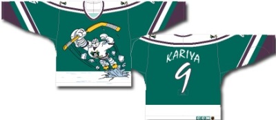
But that uniform looked downright elegant compared to the reprehensible third jersey the Ducks unveiled during the 1995-96 season that depicted a cartoon of Wild Wing bursting through the ice on the front. That image took the attention away from an almost-equally awful back of the jersey, in which the players' last names and numbers were scrawled in an unreadable font. Here's someone actually wearing the thing, and you can tell he's really pleased about it.
I would have killed to be a fly on the wall in the meeting where this thing got approved. For the Anaheim Ducks organization, this jersey is kind of how the people from the Coca-Cola corporation view the introduction of New Coke in the '80s. It's just something we kind of pretend didn't happen. (Then you have wise-ass bloggers like me bringing it up again.)
In the aformentioned piece, the blogger aptly writes: There have been over 50 third or fourth jerseys in the NHL since the mid-90s, and all but probably eight of them have just been objectively terrible. And he's right. That Ducks third jersey may lead the pack, but it's not ahead by much. We can look just up the freeway for one egregious example. At right is one of the low points of The Great One's career.
But nothing can compare to the atrocities adorning this collection of the worst minor league hockey jerseys of all time. It leads off with a look that brings whole new meaning to the term "Y2K scare" in the Wichita Thunder's special New Year's Eve jerseys. And it doesn't get much worse than the 2004-05 season fo the Quad City Mallards of the IHL. While the big boys were sitting out that season for a labor dispute, the Mallards sported two beauties. One was the "sheriff" look with the oversized badge, handcuffs and belt buckle (observe the looks of abject humiliation on the players' faces). The other was the "puffy shirt" pirate tribute ("But I don't wanna be a pirate!") complete with fake red sash and a Mallards logo somehow half-hidden under the left armpit. Rule No. 1 for hockey jerseys: If it looks like a male stripper's uniform, it's probably not a good idea.
Back to our team, I happened to like the third jersey the Ducks adopted coming out of the lockout in 2005-06, though when the organization changed its name, colors and uniforms for the 2006-07 campaign, a third jersey was put on hold for a few years.
There are no plans to have one this coming season, but I've heard rumblings that there are thoughts about adding one for 2010-11.
With that in mind, I take you to another jersey-related discovery from today, the hockey Jersey Builder tool on The Sporting Store website. The tool allows you to create your own jersey by mixing and matching colors, styles, etc., and uploading your own logo. So, Ducks fans, let's see your best creations (it's almost 4:00 as I post this, so your work productivity was probably going downhill from here until the rest of the day anyway).
A Ducks third jersey isn't a Ducks third jersey without using the long-overdue Ducks "D" logo on the front, so use this one I'm providing for the front of the jersey. (Right-click that link, click "Save Target As..." and save it to your computer. Then you'll use the Upload button on the Builder to put it on the jersey, move it, resize it, etc.)
After you're finished, go ahead and email me your creation. The "email" function on the Builder is a little tricky, so your best bet is to screen capture your creation and then paste directly it into an email. PC users, to do this, make sure the image is viewable on your screen, press the Print Screen key located on the top right of your keyboard, then open up an email and "Paste" into the body of the email. (Mac users, I honestly have no idea how you do this. [Command+Shift+3]) Address it to me at [removed] and make sure to write "Third Jersey" in the subject line. Make sure to put your name somewhere in there. I'll post the best ones (as well as the worst ones, which I'll make fun of relentlessly) later this week.
Here's one I put together quickly, which is simple but classy, if you ask me. You get the idea.
Now let's see what you've got.
That scathing review at the beginning is a little surprising coming from someone who works in the department whose job it is to make the team look good. Perhaps that's the reason the entry was removed. Or perhaps not. He did liken the 1995 third jersey to New Coke after all.
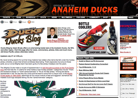
As for the last part, I removed his email address so you guys don't bug him with concepts that, despite what he's written there, will likely never be posted on his blog. Instead, if you're so inclined, email them to me and I may post them here or on Twitter. And below is a screenshot of Brady's blog before the bizarre disappearance — just in case you want proof.

The one piece of news I'd like to take away from this is the fact that a Ducks third jersey is being mulled for 2010. That alone is good news.
Since I've posted the article in its entirety, I think to comment further on it would simply be redundant. You know what I think. Instead, I want to know what you guys think. First, of the content of the article and second, its swift removal from the Ducks' web site. And is there some type of conspiracy at work here to stifle any third jersey news coming out of Anaheim?
Icethetics reader James writes in tonight to remind me: "Last season Brian Hayward (Ducks' television color analyst) during a game said that he had seen the third jersey. Later in the broadcast he went back on that and said there were no plans for one."
The drama builds as the summer heats up. Comment away.

