Around the AHL

Another Sunday brings another massive American Hockey League post. This particular article has been in the pipeline all week.

And I would like to start by thanking all the great readers who have contributed tips and links, as I am not the greatest at keeping track of the minor leagues on my own. But there really is a lot to get to so I'll move it along.


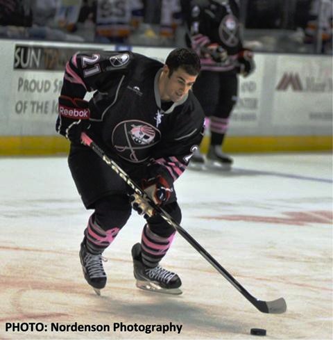
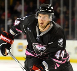
Photo credit: Derek PhilipponThe Portland Pirates sported their cancer-fighting pink jerseys last night.

They did so to the tune of a 2-1 victory over the Bridgeport Sound Tigers. For a good cause and win. Who could complain?

The sweater was unveiled last month. I mentioned it on the blog because I thought the crest was a bit clever, playing on the Pirates' own throwback logo along with that of their NHL affiliates, the Sabres.

For another look at the jersey in action on goalie David Leggio, go the Pirates' website. For details on how to bid on one, also go the Pirates' website.

And my thanks to Phil K. for sending along this photo too.


Whale Pack gets web revampThe Hartford Wolf Pack started implementing their new brand by recently revamping their website.

Later this fall — right in the middle of the hockey season — the team will take on new colors and a new name when they become the Connecticut Whale, prompting the nickname Whale Pack in the interim.

The rebranding efforts have already begun online, but the new look isn't expected to hit the ice until after Thanksgiving, but certainly before Christmas — banking on holiday shoppers and their kids, no doubt.

For the record, www.connecticutwhale.com has been reserved but doesn't yet take you anywhere. On the other hand, www.ctwhale.com works. Thanks to Jeremy M. for the tip on the web revamp.


Moose get new road look
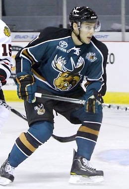
The Manitoba Moose debuted a new road jersey this season.

The old black jerseys have basically been swapped out with brand new green threads. In fact, that's exactly what's happened. The jersey design remains the same with the black and green swapped.

Let's be honest. If your color scheme is that good, why wouldn't you take advantage of it? It's good to see all the black jerseys starting to disappear from hockey. (I said "starting," there's still a long way to go.)

This photo comes from the weekly photo gallery on the AHL's official website. Great way to get a look at a variety AHL sweaters in action during the season.

Ian K. actually emailed me about this more than a month ago but I somehow overlooked it — even during the Season Preview. Jeremy M. reminded me in an email this week.


Rampage don Spurs jerseysIt finally happened. A hockey team actually wore a basketball jersey in the Age of Reebok.

All right, technically the San Antonio Rampage were still wearing hockey sweaters last night, but they were wearing a basketball logo.

It was "Spurs Night at the Rampage" for the team's 2-0 win over the Houston Aeros. Rampage players were on hand prior to the NBA's San Antonio Spurs game earlier in the week, wearing their own jerseys, by the way. (And someone has to tell me who's the guy with that crazy 'stache.)

For another look at the jersey, Ryan H. emailed in the splash page promoting Spurs Night from the Rampage's official website.


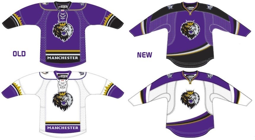
Monarchs' new uniforms unveiledThe Manchester Monarchs are rocking new home and road jerseys this season.

I've had difficulty finding any game action photos, so we'll just have to live with the terribly-lit pictures posted on the Monarchs' website when the sweaters were unveiled earlier this month.

For a side-by-side comparison of the previous set of uniforms and the new ones, I've nabbed these renderings from the AHL's online store. Thanks to Jeremy M. again for the tip.

They're affiliated with the Los Angeles Kings so I have just one question. Why in the world would they try to look like the Anaheim Ducks?! At least the old uniforms had that crown stripe on the sleeves.

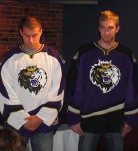
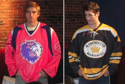
Monarchs unveil specialty sweatersBy the way, that same article I linked to earlier also revealed the Monarchs' 10th anniversary logo along with a pair of specialty jerseys that will see action this season (left).

The pink one is obviously for Pink in the Rink Night. Along with the sweaters, the ice at the Verizon Wireless Arena will be painted pink. That all goes down on Saturday, Jan. 22, 2011.

As for the black and gold jersey, I'll let the team explain in a blockquote:

On Saturday, December 4, the Monarchs will be celebrating the rich hockey history in New Hampshire with their final New Hampshire Legends of Hockey specialty jersey. The team will don throwback jerseys from the 1970s original Manchester Monarchs team when they host the Springfield Falcons at the Verizon Wireless Arena that night.

To be honest, I never knew there was another Manchester Monarchs team from the 1970s. Anyone have any information they can share?


Now we'll wrap up this epic post where it began — pink hockey sweaters.

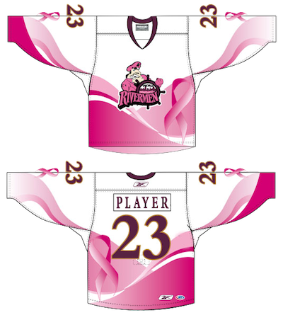
Rivermen unveil pink jerseyThe Peoria Rivermen unveiled their Pink in the Rink Night specialty jersey this week.

In a rather appropriate twist, the Rivermen will sport their pink-infused threads the night before Halloween, next Saturday, when they host the Oklahoma City Barons.

I'm all for breast cancer awareness and I'm not bothered by one-off pink jerseys, but there are better ways of doing this. For instance, Portland got it right.

Still, it's good that they're doing this. The jerseys will be auctioned off after the game and the proceeds will benefit Susan G. Komen for the Cure.

Thanks to Drew S. for the email tip on this jersey.

By the way, the Wilkes-Barre/Scranton Penguins have four new jerseys this year, like the Monarchs, so rather than making this post even longer the Baby Pens will get their own post later this week.

The Whale is Coming

The AHL's Hartford Wolf Pack will be renamed the Connecticut Whale on Monday at 5 PM, according to the Hartford Courant.

A long-in-the-works deal for Howard Baldwin to take control of the American Hockey League franchise is apparently done. It was rumored he would rename the team the Connecticut Whalers. Perhaps he's saving that name for his ultimate goal of reviving the Hartford Whalers.

Connecticut Whalers T-shirtThe Courant says the deal and the rebranding efforts will be officially announced late Monday afternoon at the XL Center and that the new logo will not be unveiled. However, it could look something like what's on a t-shirt being sold through Baldwin's website. Wrote up a whole blog post last month.

Despite the announcement coming right away, it'll take some time before the change over happens. According to the newspaper:

The team will open the 2010-11 season as the Wolf Pack; the name change is expected to take place at some point before midseason. The name, a new logo and uniforms are expected to be in place by Feb. 19, when the Whale face the Providence Bruins.

That previously scheduled game is expected to be moved outside to Rentschler Field and played before an exhibition between a team of Hollywood celebrities — centered around the movie "Mystery, Alaska" — and former NHL All-Stars in celebration of the 25th anniversary of the NHL All-Star Game played in Hartford.

The article says to expect the changes to the logos and uniforms to happen between Thanksgiving and Christmas. Definitely keeping an eye on that.

Thanks to Jason for the tip!

A Tail of a Whale

With word coming down this week that merchandise emblazoned with that classic Hartford Whalers logo is among the hottest selling in the NHL, it's only fitting that we talk about its inexorable return to professional hockey.

It's been 13 years now since the Whalers left Connecticut for Raleigh, N.C. Despite that, T-shirts, hats and jerseys with that iconic blue-and-green mark continue to sell like that of a team that just won the Stanley Cup.

Howard BaldwinHoward Baldwin is a man bent on bringing back his team. And he may get his wish sooner than we think.

In June, Icethetics reported on Baldwin's plans for Whalers Hockey Fest 2011. A day of outdoor hockey featuring Connecticut's best college teams. But he's not nearly done.

Howlings, a blog dedicated to the AHL's Hartford Wolf Pack, has been following some interesting developments. Blogger Mitch Beck says Baldwin will be taking over the Wolf Pack and renaming it the Connecticut Whalers.

As many have read in local newspapers, or here on Howlings, the last hurdle has been cleared for Howard Baldwin and his Whalers Sports & Entertainment to take over operation of the Hartford Wolf Pack.

Well, it is only a matter of time now, as early as next week, that it should become official. When that happens, the Hartford Wolf Pack will be no more and the new team will be the Connecticut Whalers.

This will be a huge moment for the city of Hartford and for the players as well. With Baldwin running things there should be a renewed interest in the team and making it an event once again. Expect the team to once again start drawing big crowds and become the place to be.

Connecticut Whalers T-shirtThat was posted about a month ago. While we wait for something official, Beck at Howlings continues to stress the inevitability of the change as recently as a week ago.

[The] Greenville Road Warriors will be the new ECHL affiliate for the Rangers and the Connecticut Whalers… Technically they’re still the Hartford Wolf Pack, but that’s only a matter of time.

And even now you can buy a Connecticut Whalers T-shirt from Baldwin's website, WhalersProShop.com — complete with a brand new logo and everything. The potential new logo for a rebranded Wolf Pack franchise?

It's not a great logo, but how much can really stand up to that original HW design? Some people go years before even noticing the H in the negative space. It's a logo so great, it gets featured in a book titled Design Principles and Problems, published in 1995 and referenced by Paul Lukas on Uni Watch last December.

Whalers logo evolutionWhen the WHA folded in 1979, the New England Whalers were forced by the Boston Bruins to change their name before they could enter the NHL. That meant the need for a new logo. The following is an excerpt from Design Principles and Problems:

When Peter Good was commissioned to create a new logo for the Hartford Whalers hockey team, he was given a specific message to convey. Good's challenge was to give the H of Hartford and the W of Whalers equal billing in a design that suggests whaling and the feeling of a partnership between a dynamic team and a dynamic city.

The trial sketches and the final solution reveal Good pushing this basic idea through a variety of solutions until a design evolved that conveyed the desired message well. The first solution shown (a) was accepted by the client but unsatisfactory to Good because the H repressed by the enclosed, unfilled area was stronger than the W.

In the second sketch (b), Good softened the impact of the H by opening it to look more like harpoons than in the first solution. In the third sketch (c) he extended the attempt to soften the H, pushing the harpoons to the side. This possibility he rejected as ugly. In the fourth sketch (d) Good tried omitting the harpoons. The result balanced the W and H but was not particularly exciting.

The fifth sketch (e) reveals the sudden inspiration of using a whale's tail. Sketch after sketch followed, with Good trying to develop a more flowing interlock between the tail and the W. When he hit on the final solution, he wrote, "Eureka! Good 'W' and good 'H' living happily together."

Finally, Good notes a special effect created in the "empty" H space: Light seems to flow into the H legs from the outside, becoming trapped in glimmering optical pools of brightness at their base. This heightens the contrast between the straight-based H and the curved both of the W, giving the design an exciting look.

Stories like this always help me find inspiration when designing.

Anyway, though Baldwin might get his wish with the Wolf Pack, the chances of the NHL returning to Hartford in the near future are slim. Let's not forget the nature of expansion in the NHL over the past decade. This has been the league's most stable period since the 1960s.

Brian Favat of SB Nation Boston also makes a good point:

Thirteen years later, the primary factors that caused the Whalers to leave town — a viable market and lack of modern playing facilities — are still present. When the Whalers were in town, Hartford was the smallest market in the NHL. As Hartford straddles both the New York and Boston markets, their marketability was severely limited by geography.

In addition, Hartford still doesn't have a new hockey arena. The city's XL Center is 35 years old and there are no plans to build a new arena. The AHL's Hartford Wolf Pack ranks only 18th in the AHL in attendance, drawing a little over 4,000 fans a night.

Hartford's limited appeal as a viable NHL market isn't the city's only hurdle to overcome. Today, the city faces increased competition from cities like Kansas City, Winnipeg, Quebec and Hamilton, all vying for their own NHL franchise. Despite these obstacles, however, Baldwin remains positive about his chances.

Icethetics will continue to track any Howard Baldwin-related Whalers news, including any possible name change for the Wolf Pack.

Checking In With the AHL

The Charlotte Checkers are making preparations to check into a new league next fall as they jump from ECHL to AHL. That means the unveiling of a new logo — in a way.

Here's the scoop in a nutshell. The Carolina Hurricanes want their top farm club, the AHL's Albany River Rats, to be geographically closer. So decisions were made to get the team relocated from upstate New York to Charlotte, North Carolina — a quick, 45-minute flight from Raleigh (or about three hours if you're driving).

Basically, the owner of the ECHL's Charlotte Checkers bought the Albany club and will move it to North Carolina, transferring the name of his ECHL franchise. So the Albany River Rats become the Charlotte Checkers this fall and will keep the Checkers' current logo, with some color alterations. It will now match the Hurricanes in black and red, as seen in this banner from the Checkers' AHL website.

Not a big surprise. Is the color change an improvement? More of a lateral move, in my opinion. An article on the Checkers' website discussing the move to the AHL had this to say:

The Checkers have also announced that they will change their logo and uniform colors to match those of the Hurricanes. The team went through an entire rebranding before the 2007-08 season and will simply change colors and incorporate the Hurricanes trademark. The details of these changes will be revealed at a later date.

When they say they will "incorporate the Hurricanes trademark," I assume that just means Carolina's logo will be used on the shoulder — a common affiliate practice. The logo in the banner above is likely the final artwork for the Checkers' updated logo. If anything changes, I'll let you know.


I'm keeping an eye on some other AHL jersey news.

Wolf Pack jersey design by Mike IvallThe Hartford Wolf Pack seem to have skipped a scheduled specialty jersey event last weekend.

I only bring it up because the jersey was the result of a fan contest won by a frequent Icethetics concept art contributor named Mike Ivall.

According to the Pack's website, the March of Dimes promotion and jersey auction was scheduled for (and took place) Feb. 26 and 27. Only the jerseys auctioned were not the one's Mike designed.

Photo albums posted on the team's Facebook page from the games on Feb. 26 and Feb. 27 clearly show the players wearing their standard white sweaters. I'm assuming it's those that were auctioned off following the weekend's games.

I have emails in both to Mike and the Wolf Pack about the situation. If I get any answers, I'll be sure to share them. In the meantime, if anyone else knows what's up, we'd love to hear about it.


Last bit of AHL news for the night. John writes in to let us know that during the Olympic break, a couple of American clubs wore specially-designed jerseys modeled after those worn by the United States in 1980 as a tribute to the "Miracle on Ice" team.

Admirals "miracle" jerseyInstead of USA, the Milwaukee Admirals' red, white and blue tribute duds read ADS.

But to everyone in the stands, it must've felt like they were at the Olympics too. (Right?)

The Admirals wore these special sweaters on Feb. 19 and 21 and then auctioned them off afterward to benefit the Power Play Foundation.

In case you were wondering, they were good luck as the Ads won both games, beating the Houston Aeros 2-0 on Friday and the Rockford IceHogs 4-1 on Sunday.

It's a neat tribute and it makes me wonder if it's been done before — or if they were just waiting for a nice, round-number anniversary. But then I feel like all these one-off specialty jerseys are just now becoming more commonplace in the minors. Am I mistaken about that?

Phantoms "miracle" jerseyThe Adirondack Phantoms, who recently relocated from Philadelphia, also wore similar jerseys. Theirs read ADK in lieu of USA.

Unlike the Ads, for which I was able to find loads of information thanks to their incredible and easy to use website, I can't seem to track down any details on when (if) these were worn.

I'm assuming it would've been between Feb. 16 and 28 but then again this is not a game action photo so I can't be sure. Any Phantoms fans out there that care to fill us in?

Anyway, that wraps things up for tonight. Get excited for the new logo tournaments! Voting kicks off on Monday!