Designing the ’90s NHL, Part 5: A History of Blue
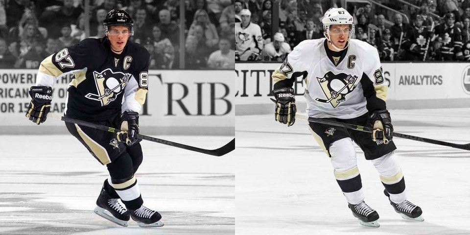
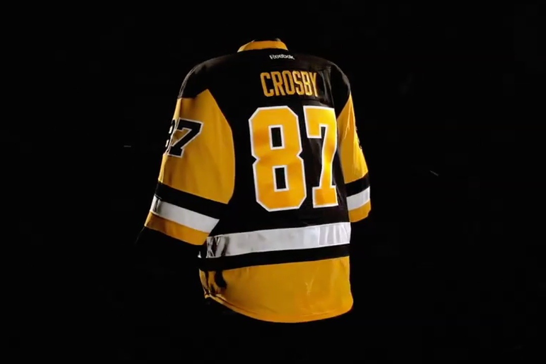
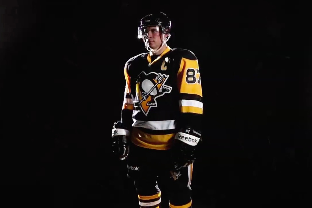
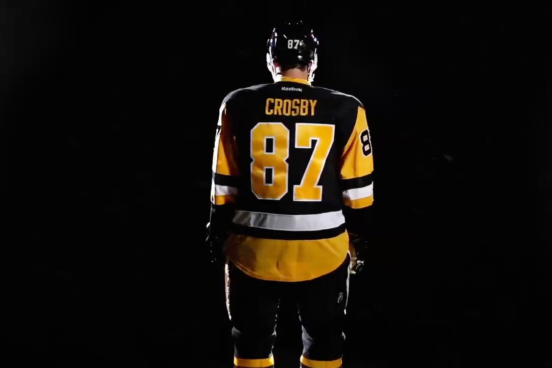
/Tonight the Pittsburgh Penguins will take the ice wearing a uniform fans haven't seen in more than 20 years. They've been waiting a long time for this.
It's the debut of the Pens' new alternate jersey. Their third third — you might say — since 2008 when they adopted their first Winter Classic uniform for extended use.
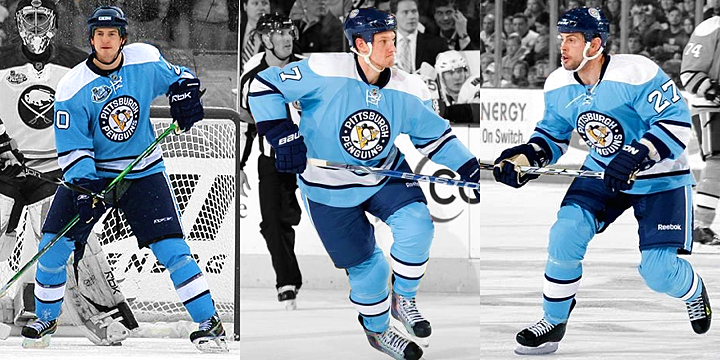
The Penguins were born in blue way back in 1967. But after 1980, that color disappeared from their sweaters until that big outdoor game 28 years later.
Photos from Pittsburgh Penguins
But few people realize that blue's reappearance in Pittsburgh could've come much sooner — on two separate occasions!
Remember the '90s? I did that whole series of articles over the summer about NHL logos and uniforms that happened and almost happened in that most gaudy of decades.
Well, the Internet has unearthed another of the "almost happened" variety and you truly have to see it to believe it.
Jim Kubus operates a website called PittsburghHockey.net. Like Icethetics, it's a one-man labor of love. And he's amassed quite a riveting history of Steel City hockey.
One fascinating section of the site is the Penguins' jersey history. It features in-depth discussions not only on the many variations of sweaters the team has worn over the last five decades — but even those that were never worn.
Which brings us to this.
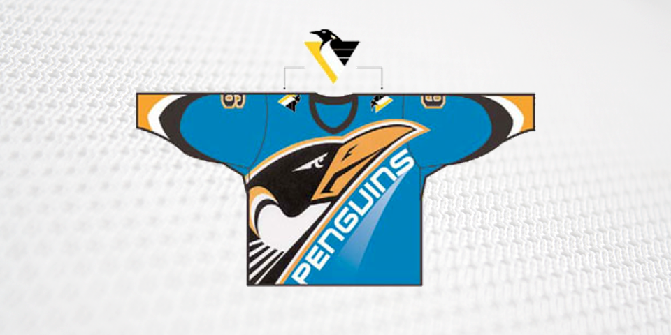
Image by Vance Wright Adams via PittsburghHockey.net
In 1994, the NHL was in the early stages of formulating its original Third Jersey Program — an initiative that brought about the likes of the Burger King and Wild Wing jerseys.
The jerseys you see above and below were "finalists to become the new third jersey," according to the site. They were designed by Vance Wright Adams — the firm that gave the world the "Robo Penguin" or "pigeon" logo in 1992.
"The designs were nearly submitted to the NHL for approval," the site says, "but the league’s labor dispute ultimately canceled the project."
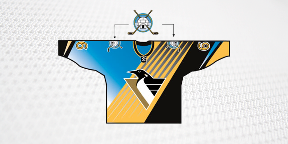
Image by Vance Wright Adams via PittsburghHockey.net
So if the 1994-95 lockout did us one favor, this was it. It seems neither of these jerseys ever made it past the concept stage. What a relief.
As you watch tonight's game and conjure visions of Mario Lemieux and Jaromir Jagr hoisting their back-to-back Stanley Cups in 1991 and 1992, don't forget about the bullet they would dodge just a decade later.
I mean, could you imagine an actual igloo shoulder patch? I shudder to think.
Now that was the first time the Pens flirted with bringing back the old Columbia blue. Remember, I said it almost happened twice.
Keep perusing the info-packed PittsburghHockey.net and you'll details about another third jersey that didn't happen — this time in 2003.
The Penguins scrapped their plan to unveil a new third jersey in the 2003-04 season.
It would have been a virtual replica of the Columbia Blue jersey with the circular crest and tie-down collar the team wore, mostly in home games, from 1968-72.
The hemline would have had striping similar to the 1967 home jerseys.
The Penguins had reached the late planning stages with the jersey, [which] was slated to be unveiled in June 2003 as part of the NHL’s Vintage Program.
The jersey described might've looked something like this.
Ultimately, it was simple economics that kept this jersey from seeing the light of day. Due to merchandise sales deals within the arena, the Penguins wouldn't have been able to capitalize monetarily on a third jersey at that time.
And the team's president at the time was concerned about the number of new jerseys the team had launched around that time as well as the "pressures on mothers to go out and buy yet another jersey."
They certainly don't worry about that anymore.
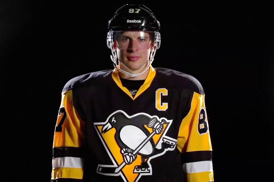
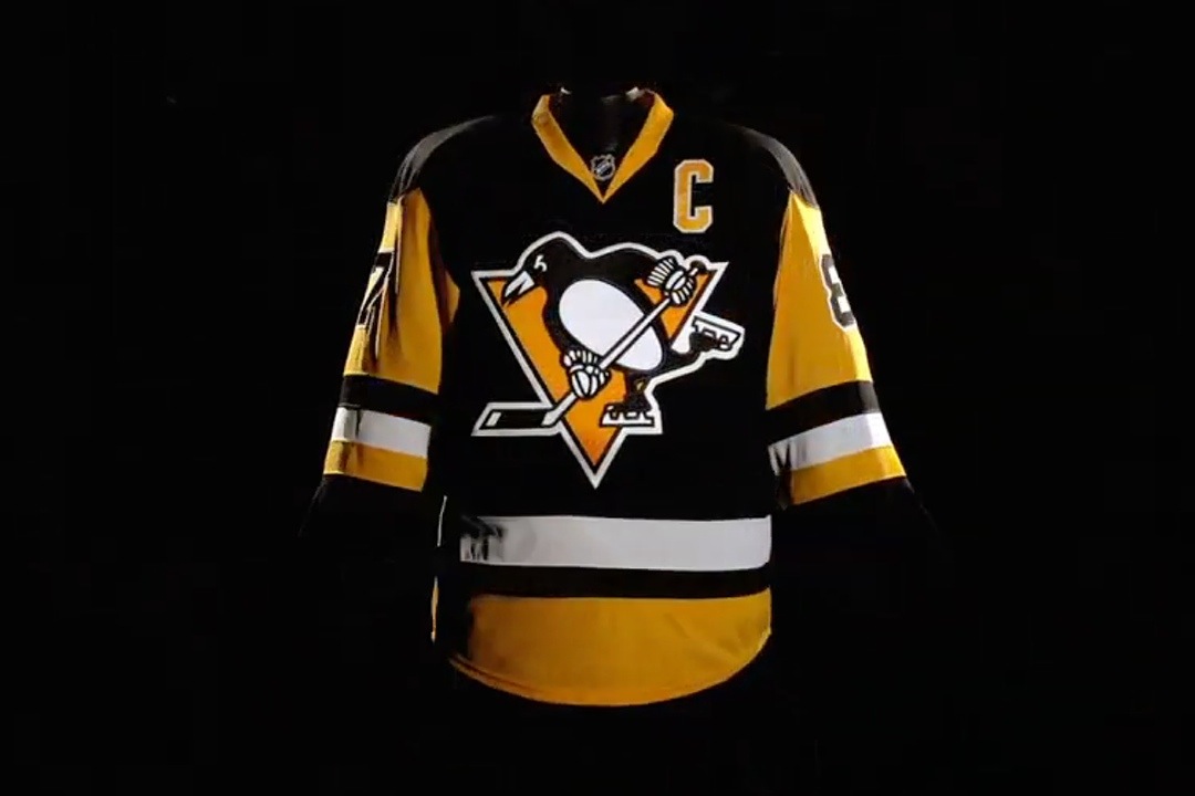
I mentioned this latest jersey is the Pens' third alternate in recent years, but don't forget they introduced yet another uniform just last season for their 2014 Stadium Series game in Chicago.
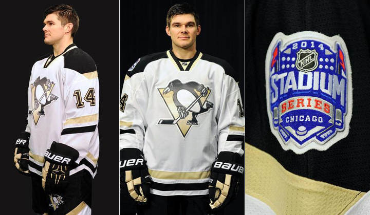
Photos from Pittsburgh Penguins
For what it's worth, I don't get the sense the Penguins are slowing down either. If they are indeed responding to fan demands with the latest throwback, it wouldn't surprise me to see them adopt it full time and add a white version — and potentially a yellow one down the road.
Throwbacks are all the rage these days and that trend is as strong as ever.
Unlike giant cartoony, sublimated 1990s jersey graphics.
What do you see coming down the road for Pittsburgh? And what's your take the unused alternate designs from 1994? Did we miss out or luck out?