
Everything that happened on draft day in the NHL
/
We got 3 new sweaters, 5 new patches and a handful of new collar laces. It was a big draft day!
Read MoreWe got 3 new sweaters, 5 new patches and a handful of new collar laces. It was a big draft day!
Read MoreThe new retro look will replace the white one that's been worn by the team since 2011.
Read MoreTonight, we're taking a look at a couple of purported Reebok Edge prototype jerseys thanks to one ebay seller with a rare stockpile. And they are fascinating!
A current auction listing from manonthemoon12345 features what's described as a "rare authentic" Washington Capitals prototype jersey. The date on the tag appears to read Nov. 16, 2005 and notes it is a second version.
Most intriguing about this jersey is the crest which bears more than a passing resemblance to the Caps' Weagle logo — which currently graces the shoulders of their primary uniforms. In this version, the U.S. Capitol dome silhouette in the negative space is much more pronounced.
The design of the jersey itself, on the other hand, is much closer to the final product that was finally implemented during the 2007-08 season.
Back in July, another listing from the same seller offered an alleged "rare authentic" Vancouver Canucks sweater. The tag was dated September 2006, a full year before the blue and green jerseys were introduced.
This one is just painful. So many bullets dodged. First, remember that Reebok template I railed against earlier this week? The one Pittsburgh, Ottawa and Tampa Bay all used in 2007. Looks like Reebok was trying to push it on Vancouver as well.
Second, it looks like the Canucks considered sticking with the 1997 color scheme. I call it a dodged bullet, but in truth it was a unique look. No other team before or since has used it. But green and blue are definitely more fitting.
The best thing this prototype had going for it was the lack of the word "VANCOUVER" arched across the upper chest. Everything else about it... yikes.
What do you think of these jerseys? Have you seen any other interesting NHL prototypes?


Here's something cool. A couple of Icethetics readers pointed me to the Dribbble account of graphic designer Andrew Sterlachini.
It turns out Andrew not only created the crest on the Washington Capitals' 2015 NHL Winter Classic jersey, but he designed at least one other logo that didn't make the cut.
You can see above the W intertwined with a shape that looks like a D on one side and a C on the other. As clever logos go, this is by far one of my new favorites. It's just a shame the Caps didn't see fit to use it in some way. (At least not yet.)
If you're on Dribbble, give Andrew a follow.
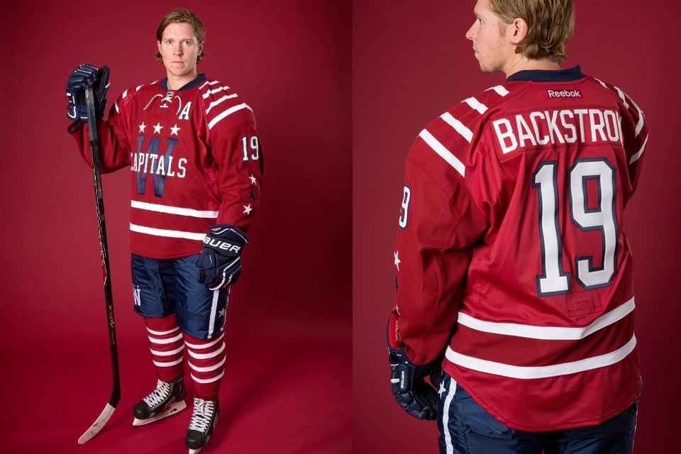
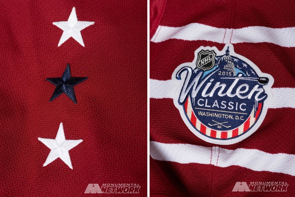
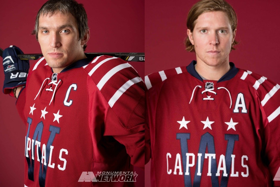
The Washington Capitals surprised us by opting against their original red jersey for the 2015 NHL Winter Classic. In fact, the sweater they unveiled this morning at Nationals Park is unlike anything the franchise has ever worn.
As you can see in the photos above, the Caps went with a look that's much older than the team itself. But according to the press release, they're celebrating all of D.C.'s hockey history.
The primary color for the Capitals’ Winter Classic uniform is vintage deep red to symbolize hockey’s deep roots in Washington.
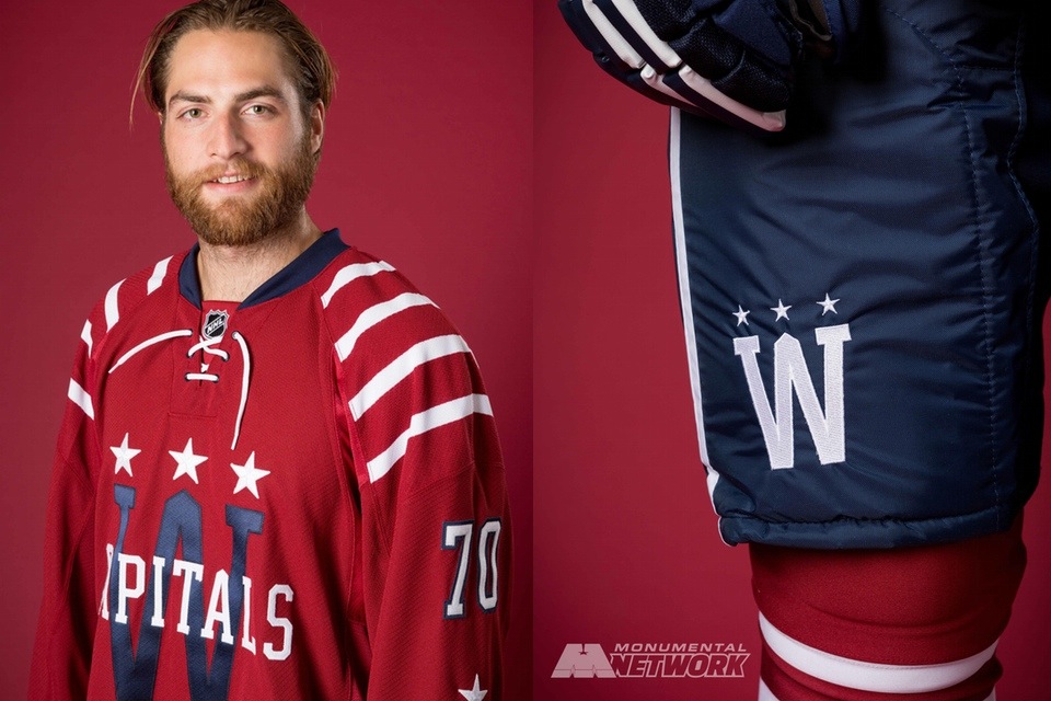
The stripes on the shoulders, waist and legs bring in elements of Washington professional hockey jerseys from the 1930’s, predating the Capitals’ formation in the 1970s.
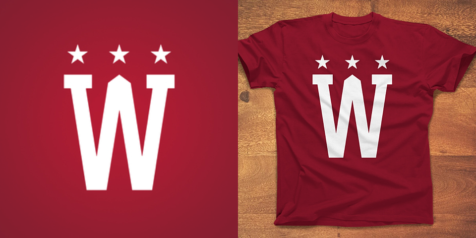
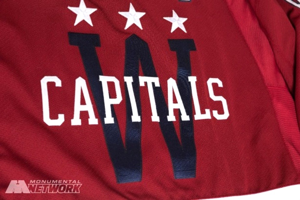
A large “W” on the front of the jersey is offset in blue to contrast the white Capitals wordmark and features a silhouette of the Washington Monument, offering a unique look never seen before in franchise history.
I love seeing teams introduce new jerseys, so I am a big fan of this design. As much as I would've liked the red throwback, I still would've found it a bit lazy.
More than that, this is a great design. It incorporates historical elements and looks like no other NHL sweater. What's not to love?
One element I like is the many nods to the Washington Monument. The middle of the W and and all the As have it — even the alternate captain's patch.
So much about this jersey is incredible. I swear it's like something I've seen on the Concepts page before. Now that I mention it, we should really revisit a couple designs by Nick Sample and Brian Brideau. Those guys were obviously on to something.
By the way, Dump 'n Chase has an interesting read on the uniform's yearlong design process.
Also revealed today for the first time was the 2015 NHL Winter Classic logo itself. It's a solid design and even has a bit of a holiday feel which will fit in perfectly leading up to the big game.
Conspicuously absent from this morning's unveilings was the uniform the Chicago Blackhawks will wear on New Year's Day.
Signage around the ballpark clearly showed the Hawks' current primary logo rather than any kind of retro version like the one they used at Wrigley Field in 2009. Is that just a placeholder until they can stage a reveal of their own? Or will their jerseys simply feature that logo?
We'll have to wait a little longer to find out. The Blackhawks have not yet set an unveiling.
Until then, what do you think of the Capitals' new Winter Classic jersey?
