
Dallas On Dallas
/Once they've established themselves as the NHL's green team, the Dallas Stars might be ready to reintroduce a black third jersey. And I think Dallas Kirkpatrick has kinda nailed it.
Once they've established themselves as the NHL's green team, the Dallas Stars might be ready to reintroduce a black third jersey. And I think Dallas Kirkpatrick has kinda nailed it.
In the last couple weeks, I've been writing a series of blog posts on jersey and logo trends from the 1990s. This Islanders concept from Dallas Kirkpatrick brilliantly nails everything that was wrong with hockey uniforms from that era — teal, black, and a ridiculous cartoon character. The ideal ingredients for a Freak Out Friday.

Here's a concept hot off the presses from Dallas Kirkpatrick. He literally emailed it to me this morning. Normally I'm working from a backlog, but I'm traveling this week and I managed to leave behind the hard drive where I backed up all our upcoming concept art.
So I'm having to mine my recent emails for posts over the next several days. Things should be back to normal by the weekend.
Keeping the streak alive!
Last summer, the Carolina Hurricanes downgraded their uniforms with one of the league's most generic looks. Dallas Kirkpatrick aims to give them an identity again with this set. I like how he's thinking, but the new crest kind of looks like a football to me. What are your thoughts?

Am I the only one that misses the Washington Capitals' blue and bronze era from the mid-90s? It was such a great, unique color scheme and was never really used to its fullest potential. Apparently I'm not alone.
John Elbertson successfully adapted the Weagle to the old palette in this set of home and road sweaters. But he wasn't alone.
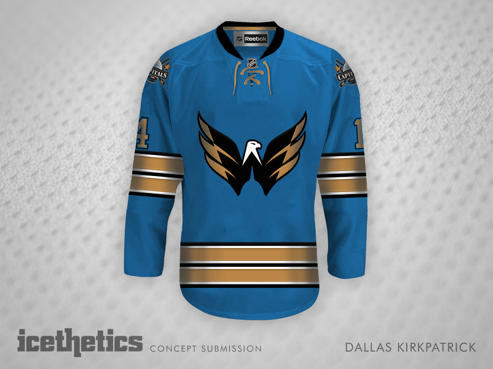
Dallas Kirkpatrick also saw something in those colors, though he came up with a slightly different way of using them. Think these guys are crazy? Or should the Caps bring it back?