Madore's Atlantic
/


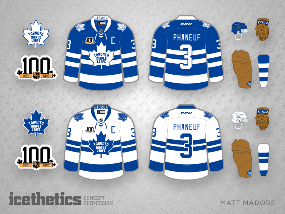
Mondays have been handed over to Matt Madore for a few weeks. He's tackling a redesign project for all 30 NHL uniforms ahead of the league's 100th anniversary. This week brings us the Atlantic Division. Only one more left!
Mondays have been handed over to Matt Madore for a few weeks. He's tackling a redesign project for all 30 NHL uniforms ahead of the league's 100th anniversary. This week brings us the Atlantic Division. Only one more left!
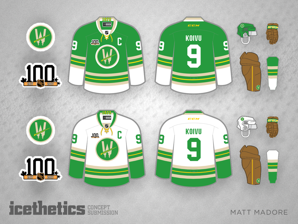
Matt Madore is taking over Mondays for a few weeks to present his NHL centennial series — one division at a time. This week he's tackling the Central Division. (Click to enlarge each design or cycle through using your arrow keys.)
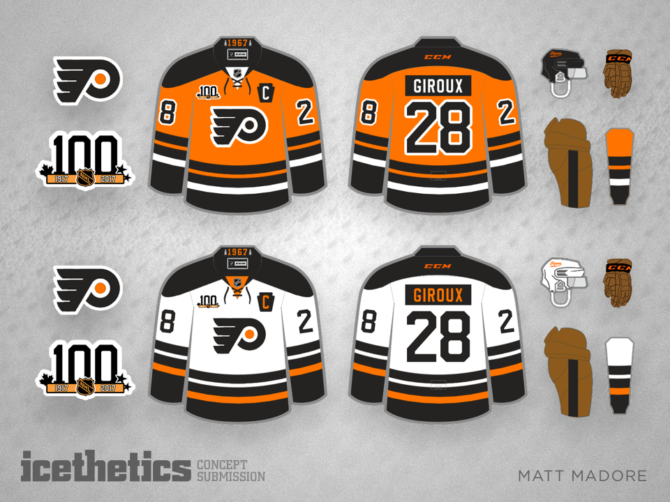
The next four Mondays belong to Matt Madore. The concept maestro has undertaken the challenge of redesigning the NHL for its centennial in 2017-18 — one division at a time. Today we start with the Metropolitan. (Click to enlarge each design or cycle through using your arrow keys.)
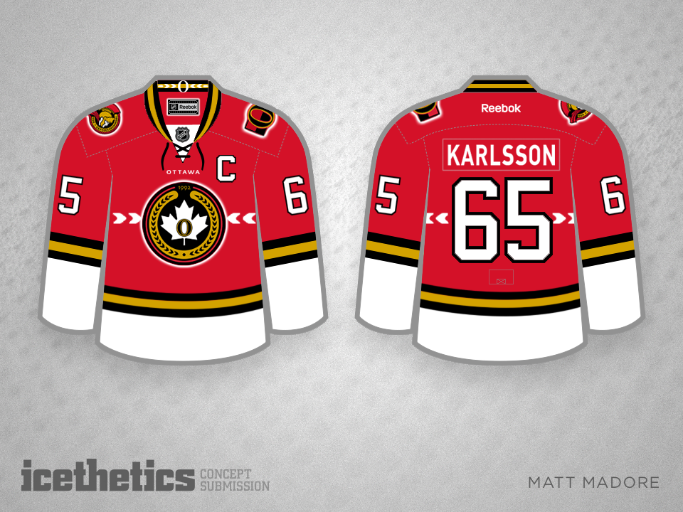
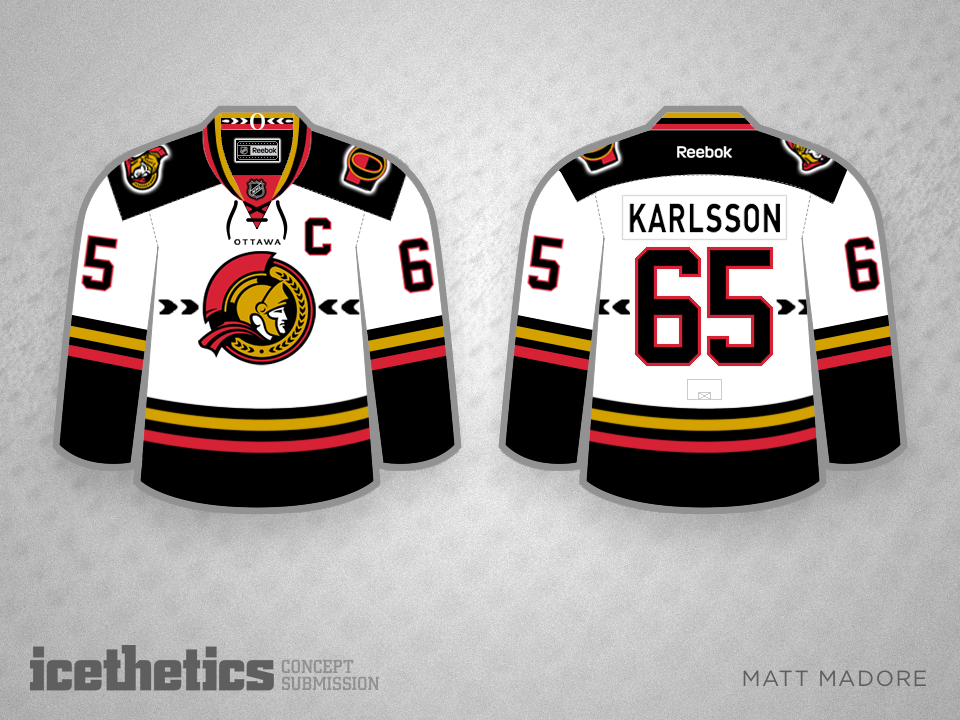
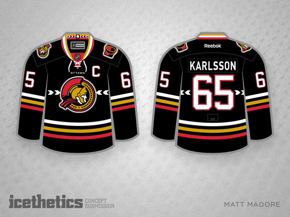
Check out this cool Senators set from Matt Madore. The colors are used well as are the rest of the club's logos and symbolism.
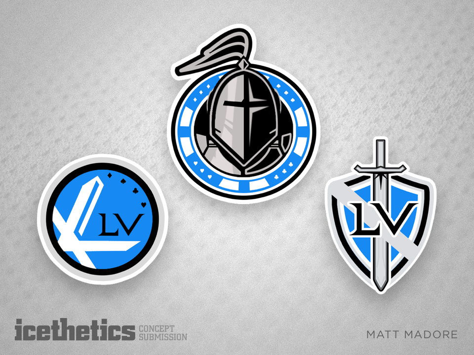
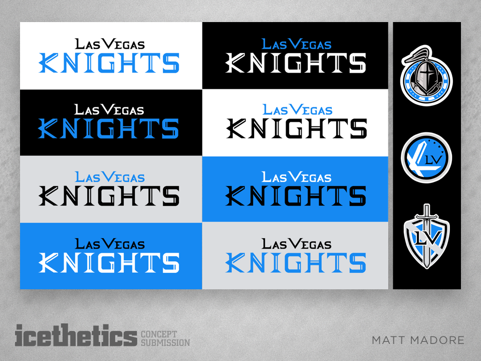
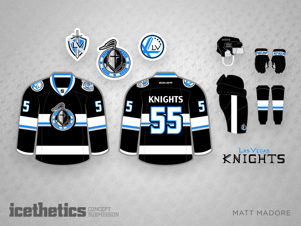
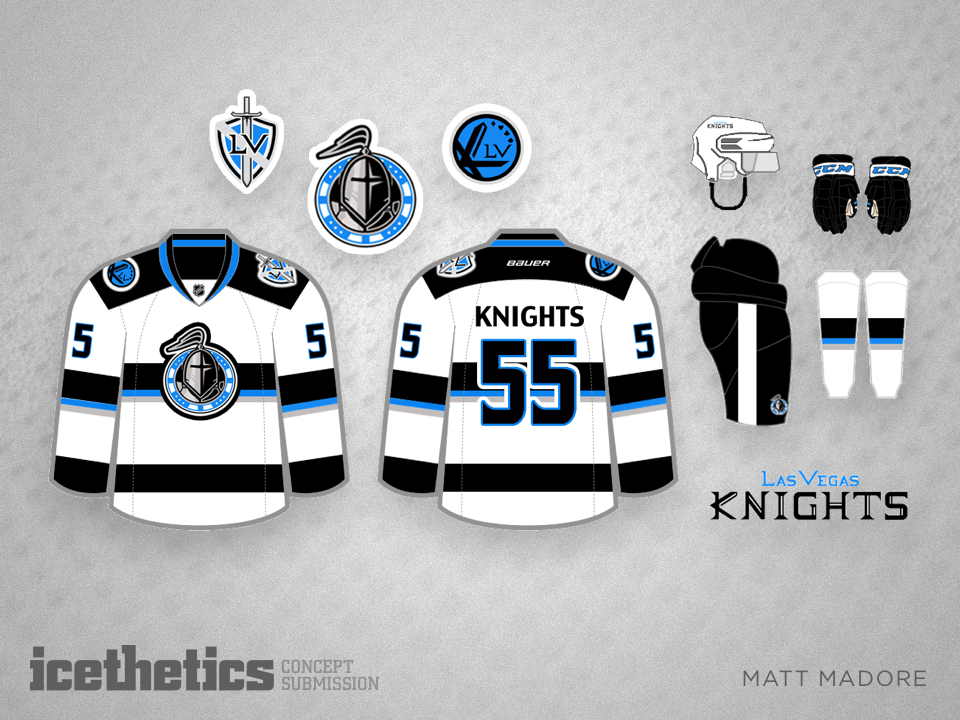
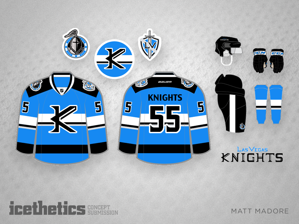
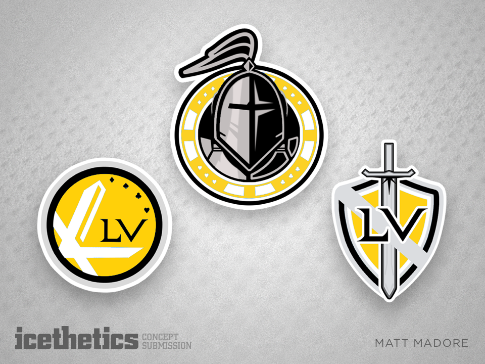
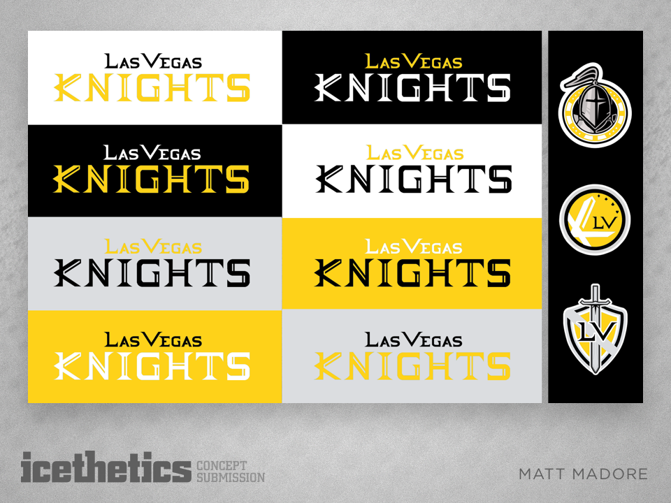
Today, Matt Madore brings us a full identity package for a future Las Vegas team called the Knights. Matt began his design with black, silver and electric blue as his color palette. But recently the potential owner of a Vegas NHL team revealed his club's colors would be black, grey and gold. So Matt made an adjustment.
What do you think of these logos and jerseys? And which color palette do you prefer?