0114: The Stars of New York
/
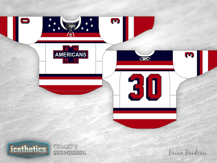
Stars Week continues with a double feature. What if the New York Americans were still around? What might they look like today? These guys have a few ideas. Brian Bridea put together the first one. Very clean and simple. I could see it in use today. Of course something would have to be done to get the name on the back.
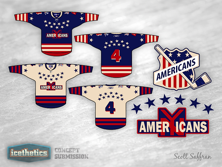
Meanwhile, Scott Saffran's design feels much less modern and more of a throwback. Maybe it's all that "vintage white" we love so much. It's still a neat look. Which of the two do you prefer?