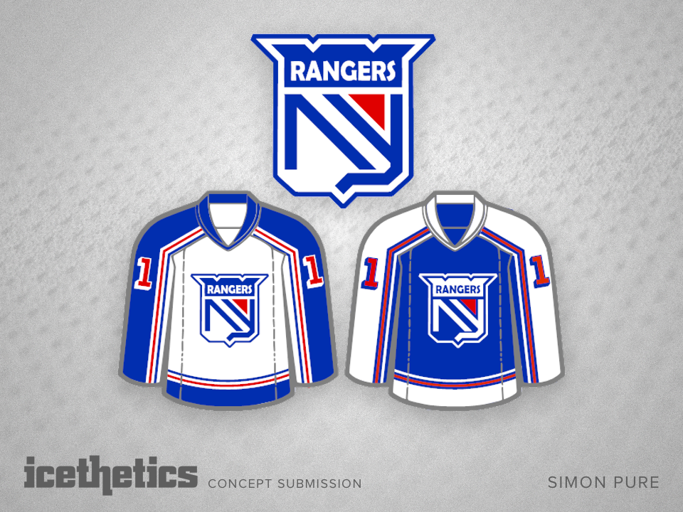
Madore's Metropolitan

i
288 VOTES

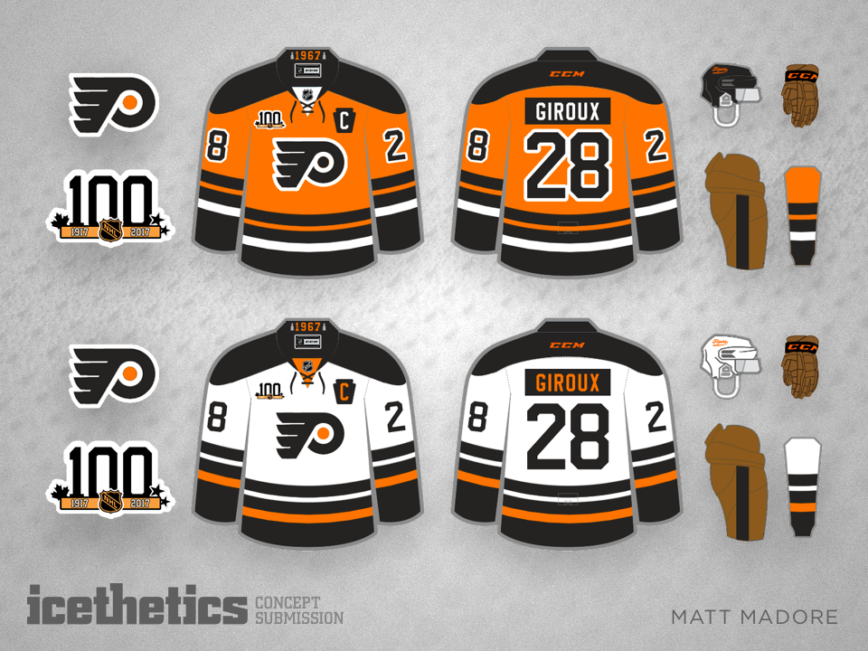
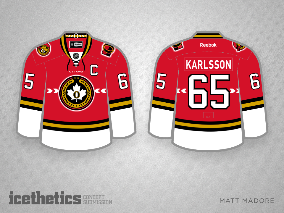
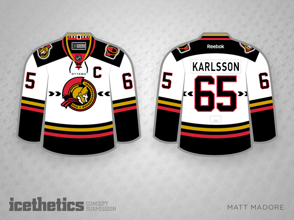
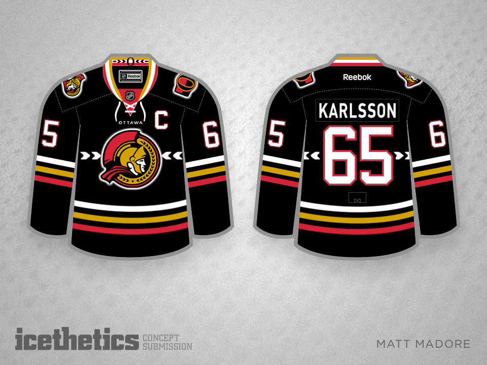
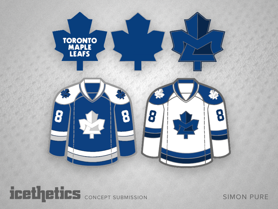
The next four Mondays belong to Matt Madore. The concept maestro has undertaken the challenge of redesigning the NHL for its centennial in 2017-18 — one division at a time. Today we start with the Metropolitan. (Click to enlarge each design or cycle through using your arrow keys.)

Sens Sense

i
323 VOTES

Check out this cool Senators set from Matt Madore. The colors are used well as are the rest of the club's logos and symbolism. 

Quaker Tradition

i
199 VOTES

This isn't the first time we've seen a Flyers jersey inspired by the old Philadelphia Quakers, but this modernized take proves it might be worth a try, perhaps for an outdoor game.

Millionaires Modernized

i
308 VOTES

The Vancouver Canucks have looked good in their Millionaires throwback jerseys in recent seasons. What do you think of introducing a version as a new third jersey with modern Canucks colors? Hunter Nordhauser shows us how it could work.

Hiding in Plain Sight

i
511 VOTES

I recently wrote up a blog on hidden images in NHL logos. Simon Pure has taken the notion a step further by hiding images in existing logos. Check out what he's done for a couple of Original Six teams in the Maple Leafs and Rangers.