
NHL, Adidas officially unveil new uniforms!
/Two years of hype have led up to this.
It was Sept. 15, 2015 when the NHL first announced its partnership with Adidas. Tonight, they joined together in Las Vegas to reveal half of the new team uniforms that will be worn starting in 2017-18.
All 31 home uniforms were officially unveiled at a special media event and simultaneously online for fans. In addition, most teams even took to social media to reveal their white jerseys. The others may do it later in the week with some planning a reveal at their draft parties on Friday.
Obviously there's an incredible amount to dig into with so many new uniforms revealed all at once. I want to do them all justice but it's not going to happen in one night. In the coming weeks I'll have individual reviews for each team. But for now, let's just start by taking a look at all of them.
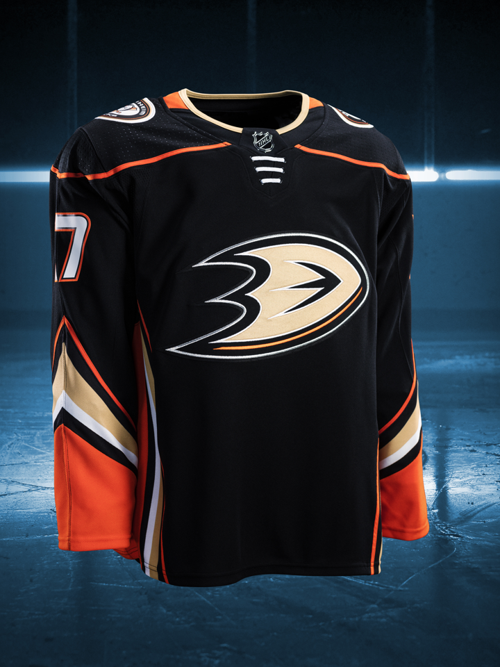
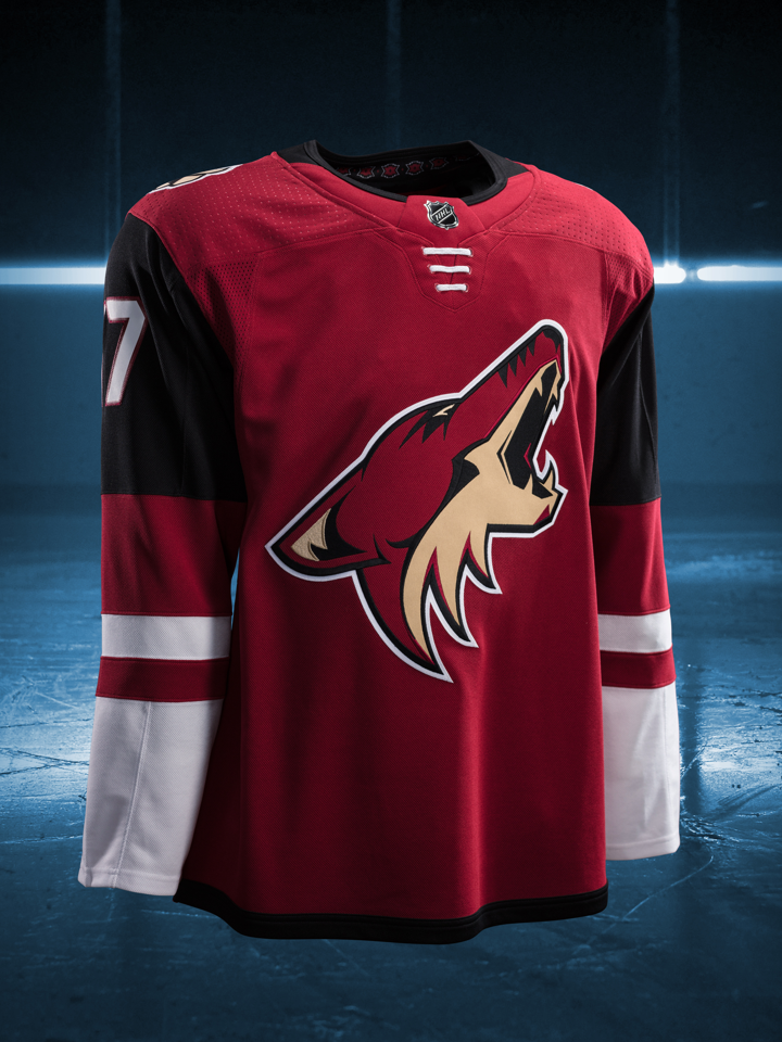

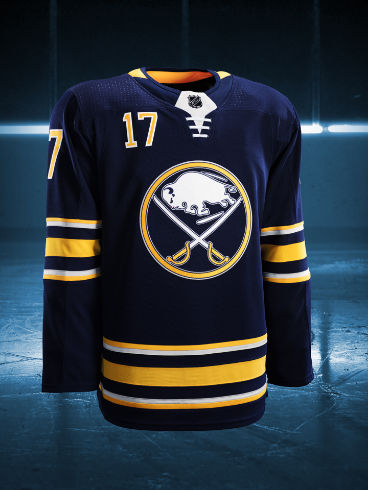

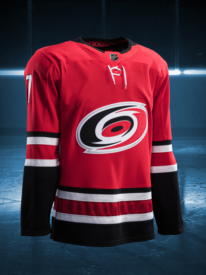


Generally speaking, things don't look that much different. Most teams have simply carried over their previous uniform to the new Adidas Adizero template. But a handful have redesigned their look — and, of course, one is completely new. Let's hit the highlights.
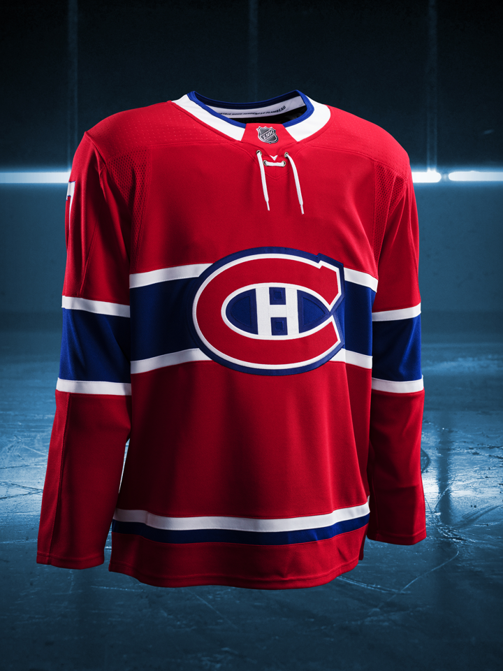
- Buffalo & Calgary — The Sabres and Flames have both ditched the piping that used to wrap around their sweaters in an odd way. So that's a plus. Unfortunately, the Sabres have kept the jersey number on the front of their uniform — the only team to do so.
- Carolina — The Hurricanes bring back the storm flag striping in a more subtle way. And black becomes a bigger part of their color palette once again. Overall, a significant upgrade.
- Colorado — While the Canes may have seen an upgrade, the Avalanche have seen a full on rebirth with this uniform. It's an absolutely gorgeous return to classic form and if I was judging a competition, I'd say the Avs absolutely won the night! It's a brilliant new look.
- Edmonton — The leak that preceded the unveiling by a couple of days proved to be mostly accurate. It was clearly an early version with that heavy white collar. The team smartly veered away from that design for the final product. Good call.
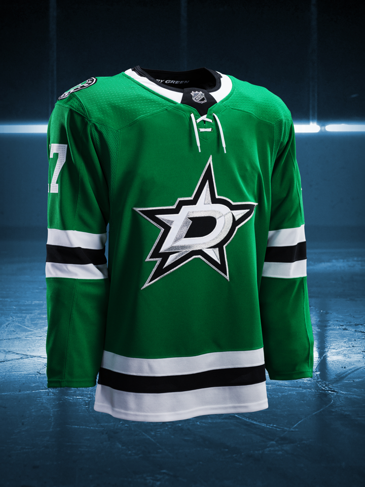
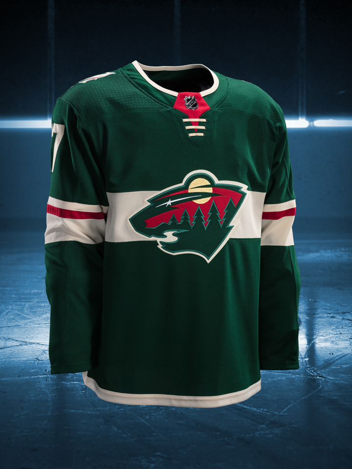
- Minnesota — Modern teams adding a horizontal chest stripe for a throwback feel isn't exactly authentic but, you know what, it works for the Wild. I love that they're going back to green and I love this jersey. I'm almost tempted to buy one for myself. That's how good it is.
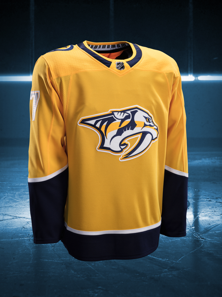
- Nashville — The new Adizero template meant the fangs and the piping had to go. Sadly, it seems to have taken the personality away from the jersey. Now it's a little too yellow, actually.
- New Jersey — Holy hell, what happened here? The Devils have always had a classic look. For 25 years they didn't touch their jerseys — mostly because Lou wouldn't allow it. But when Lou left, so did good sense. The sleeve stripes are too big and why did they have to lose the waist stripe?
- San Jose — It's tough to tell from the image here, but the new shoulder patch is pretty sharp. Would I have preferred a return to the encircled fin? Sure. But this works too.
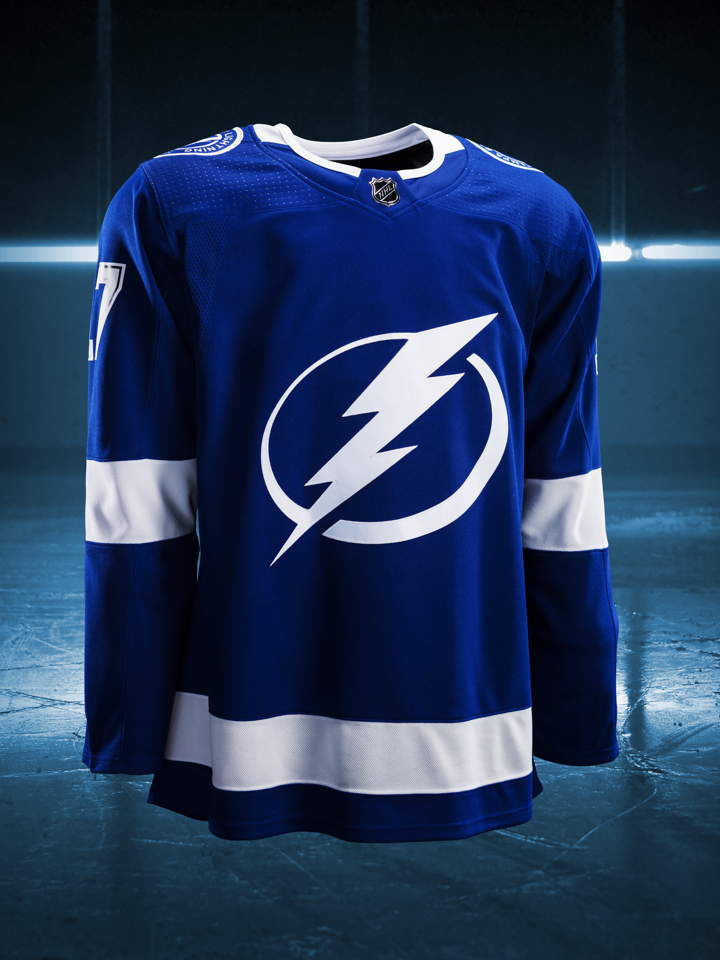
- Tampa Bay — As far as I can tell, the Lightning were the only team to discard the collar ties from their previous uniform. It's a good call since the ties on the Adizero jerseys are more useless than ever. They don't even pretend to tie the jersey together at the top.
- Vegas — The Golden Knights will wear grey with black and gold stripes and some red trim to give those dull colors some much-needed pop. But take a closer look. The embellishments in the striping fit nicely with the embellishments in the crest.
A few teams also added hanger effect designs inside their collars but I'll get into that along with all the other details with the individual team reviews.
As I mentioned, tonight also brought the reveal of 18 of the 31 road jerseys. Here they are.


Again, there's a lot of carryover here. I'm thinking that teams with more significant changes will hold out until later in the week so as to draw more attention to their redesigns. But here are a few highlights.
- Buffalo & Calgary — Again, the Sabres and Flames have dropped the piping and are so much better off for it. None of these white jerseys are numbered so don't get any ideas about the Sabres' chest number just yet.
- Minnesota — The Wild didn't share any photos of their white jersey today, but it was featured in an infographic about all the jerseys they've worn since their inception in 2000.
- N.Y. Islanders — On first glance it doesn't look like the Isles did much. But that blue outline around the crest makes a big difference in my book. In fact, until 2010, that classic crest was never seen on a white jersey without it. Glad to see it return.
- Vegas — The Golden Knights have a pretty basic color reversal for their road jersey. It works. It will give a very new team a very traditional look when it first takes the ice this fall.
And that's about all I can make happen tonight. I need to get some sleep and get back at it tomorrow. In the meantime, fill up the comments with your observations and opinions. What do you think of all this?