
Norfolk Admirals unveil new logo
/Norfolk Admirals logo, 2017—
The ECHL's Norfolk Admirals revealed a new yet familiar logo on Thursday, June 1.
Paying tribute to the Hampton Roads Admirals, who played in the ECHL from 1989 to 2000, the nautical design is inspired more by sailing ships than war ships. The club is also returning to the classic blue and gold color palette — which happens to fit rather nicely with their new NHL affiliate, the Nashville Predators.
The Admirals' old logo was a carryover from when the Bakersfield Condors franchise transferred to Norfolk in 2015 and adopted the existing AHL team's identity.
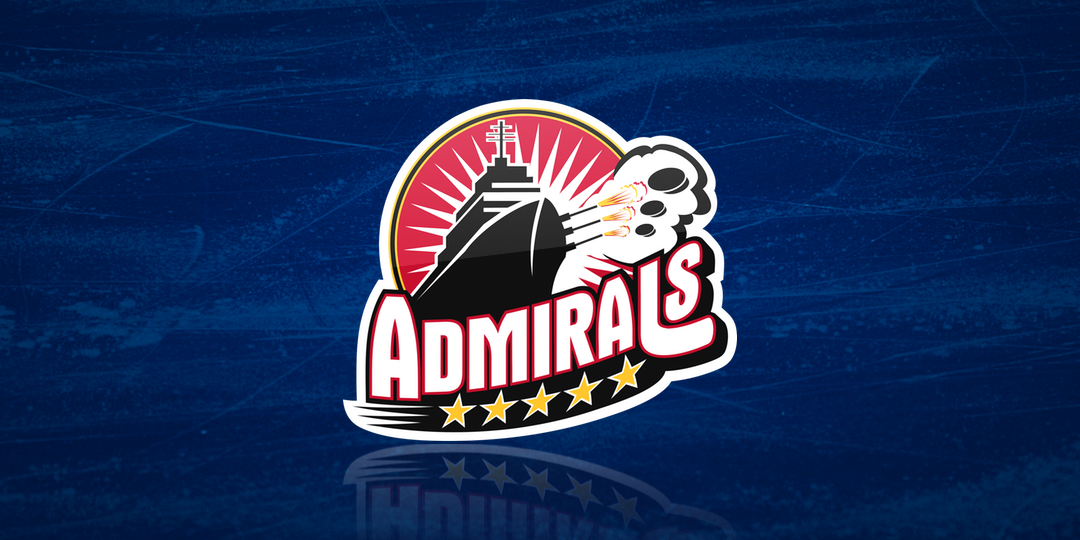
Norfolk Admirals logo, 2004—2017 (AHL/ECHL)
During the 2016-17 season, the Admirals wore Hampton Roads 1989-inspired throwbacks with the classic crest that is part of the new primary mark.
Norfolk Admirals third jersey crest, 2016-17
The Admirals have been using yellow as the background color behind their logo on their website and in other graphics — which makes me think they could be considering yellow jerseys to match Nashville. Sweaters were not unveiled with the new logo but are expected in July.