
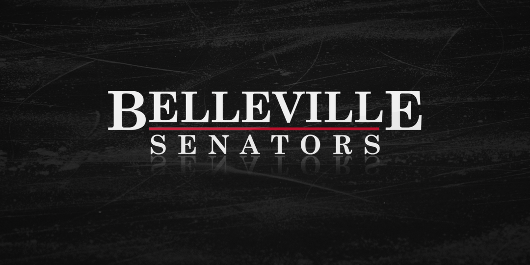
Belleville Senators unveil new logo
/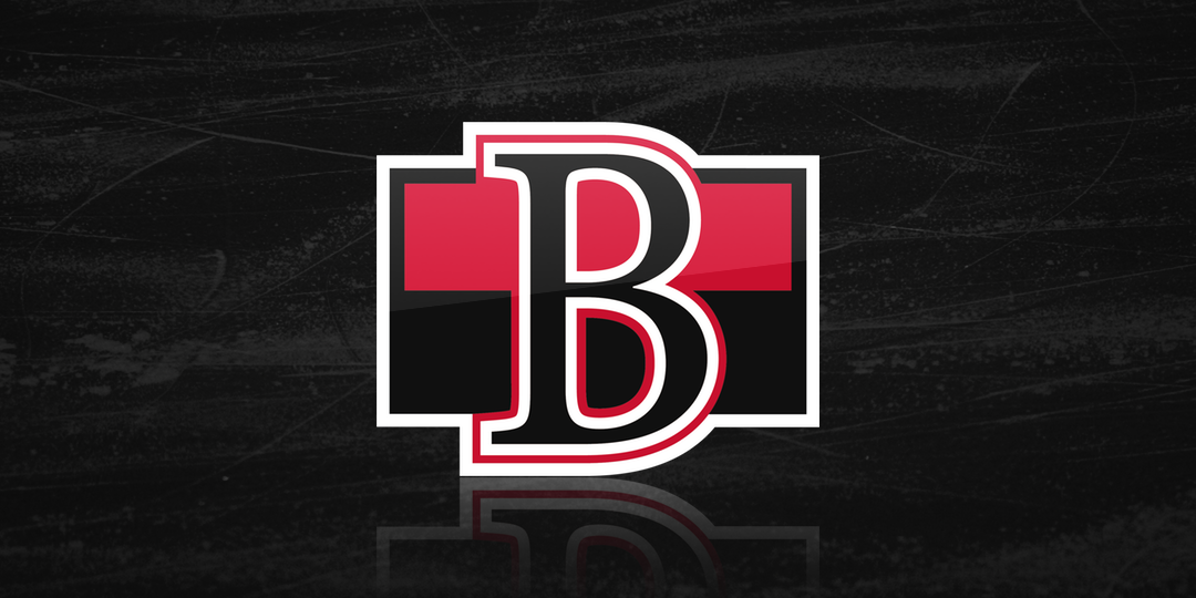
The AHL's Belleville Senators finally revealed their logo today and, to be honest, it's precisely what most Ottawa fans were hoping for. A simple "B" over black and red stripes — an adaptation of the Ottawa Senators' heritage logo. Jerseys were not yet revealed.
Simply put in the team's press release, "the design is intended to be classic and versatile."
Ottawa announced last year that it's AHL affiliate would be leaving Binghamton after 15 years to play a little closer to home in Belleville, Ontario — while keeping the parent club's moniker.
In fact, it's taking over a market that was left bare after a domino effect that started with the Winnipeg Jets moving their AHL affiliate into their home arena in 2015, bringing back the Manitoba Moose. Settle in for a sec.
When they did that, the Montreal Canadiens, shifted their AHL team, the Hamilton Bulldogs, to St. John's where they took over the IceCaps nickname. With Hamilton open, the Ontario Hockey League's Belleville Bulls relocated and took that name — which left Belleville open.
Crazy, right?
Anyway, here's a sampling of logos the Binghamton Senators used in recent years.


Binghamton hockey fans need not worry though. After the B-Sens announced their departure, the New Jersey Devils' affiliate in Albany announced they would fill the gap. (Albany fans, I'm sorry but the news is not good right now.)
The Binghamton Devils, as they've be named, have not yet revealed their logo, but I'd expect it soon. In fact, if you want a sneak peek, this concept by Scott Markiewicz from February is probably a safe bet.
As nice as his work is, however, it would be a bit disappointing to see two new B-shaped logos based directly on those of their NHL parent clubs. That said, brand synergy is big between NHL teams and the AHL clubs they own. What can you do?