
0291: Canucks Re-Bourne
/
Today we have the next installment in Andrew Bourne's NHL makeover series. Here he tackles the Vancouver Canucks but he's done my least favorite thing — he dropped the green.
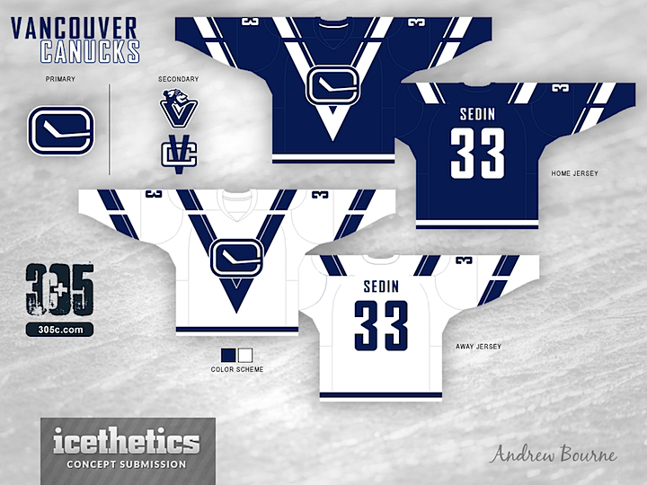
This was hard because I really love the jersey set and color scheme put in place by the current owners but also really love the old V uniforms that Vancouver used in 80's. So, instead of just mailing it in, I pushed myself to push The Canucks design to the edge of Seizure-Town.
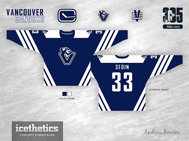
Right away, I condensed the color scheme to two colors. A lot of V's and a lot of colors with make you want to puke. The large striping appears to be cut or broken up to really show that V in the body of the uniform. With that break, you can really see the V and the C work together. The alternate jersey already has a V on the chest so, I made some angled striping along the sleeves and body of the jersey. Why 3 stripes, you ask? Three trips to the Stanley Cup Finals. Would the stripes actually look good on the ice? I'm not sure, but it looks interesting enough on paper - er... computer screen.