Icethetics Season Preview, Part 3
/We're midway through the Icethetics Season Preview and after yesterday's three-section post, I'm going to make Part 3 short and sweet. It's a recap of the new logos that will be seen around the NHL this season.
Part 3: New NHL Logos
At least six NHL clubs will have new logos in their arsenal beginning with this 2009-10 season, presented here in alphabetical order.
 Boston Bruins (special)
The Boston Bruins will face the Philadelphia Flyers in the Winter Classic on New Year's Day 2010. The NHL's annual outdoor game typically sees its participants dig into their history for special vintage uniforms. And the Bs had a long history to dig into.
For this year's big game, the Bruins pulled elements from five of the different looks they've had over the last 85 years. This logo comes from the sweaters worn 60 years ago to commemorate the franchise's 25th anniversary.
The logo will be used on the jersey as well as other Winter Classic-related merchandise. No plans have been announced to make the jersey the new third beginning in 2010-11, but it's not out of the question. The Penguins and Blackhawks have both given their Winter Classic threads an upgrade.
 Buffalo Sabres (vintage)
While nothing has been made official just yet, everything is beginning to point to the notion that the Buffalo Sabres will retreat from the slug and give that classic 1970s primary mark another go. (I'll have details on this from Larry Quinn soon.)
Retro is in right now in the NHL and it seems like a vast majority of the teams are looking backward to move their uniforms forward. Sabres fans have been begging for a return to the team's original look. Their wish may soon come true.
The logo will continue to appear this season at center ice in the HSBC Arena and on tons of merchandise along with the team's official web site and other electronic and social media.
 Calgary Flames (vintage)
After scrapping plans to release a brand new black third jersey complete with a fancy new logo, the Calgary Flames jumped on the throwback bandwagon. In fact, forget the black jersey — black is nowhere to be found on the new vintage threads the team is trotting out for their 30th anniversary season.
The club will wear a red jersey that's nearly identical to what was originally worn when the Flames moved from Atlanta to Calgary in 1980. Front and center will be that classic, white-hot flaming C.
No word yet on whether this vintage jersey and logo will be sticking around beyond the five games its scheduled for this season or if that previously designed black third will ever see the light of day.
 Florida Panthers (alternate)
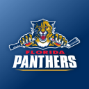
After 15 years in the NHL, the leaping cat logo most associated with the Florida Panthers is disappearing. While nothing has been announced officially, this legless feline has been popping up all over the place — everywhere but the jerseys, that is.
The Panthers are also one of a handful of teams expected to release a third jersey this season. They, along with the Colorado Avalanche, have yet to do so. It's not clear yet what to expect for the alternate sweater, but it wouldn't surprise me if this new logo somehow figures in.
For now, you can find it all over the team's electronic media outlets as well as publications and merchandise. And I haven't seen it yet, but it'll will probably be painted at center ice as well.
 Minnesota Wild (third jersey)
So far this summer, two teams have unveiled third jerseys and both have involved new logos. The Minnesota Wild's new green duds feature a script rather than a typical logo. But that M will be making its way onto all sorts of Wild gear this year.
The logo is an encapsulation of the history of classic Minnesota hockey. From the simple M to the shooting star which dots the I that, no doubt, calls back to the Minnesota North Stars.
It's not my favorite thing for the front of a jersey, but it has a lot of meaning and the Wild still have the best primary mark in the entire league if you ask me.
 Nashville Predators (third jersey)
The launch of their third sweater brought two new logos into existence for the Nashville Predators. However neither is entirely new. The one you see here is a simplified and recolored version of the Preds' primary mark.
A mix of black, grey and shades of blue join a brand new color in the team's identity — the red in the eye. I certainly prefer the simpler version of what is surely the most detailed primary logo in the NHL.
 The other logo, found on the shoulders of the new jersey, is an adaptation of the current secondary mark which depicts the skull of a saber-toothed tiger. It's now encircled within the same checkerboard pattern found on the uniform itself.
I might've been more impressed with a completely new logo, but then we do know Nashville's track record in this category (see the old mustard jersey). Still, they're at least moving in the right direction by simplifying a complicated set of logos.
I'm not anticipating any other new logos around the NHL. The Colorado Avalanche have yet to unveil their third jersey, but it's expected to feature text across the front with the primary logo on the shoulders — nothing new.
And that wraps up Part 3. We're back tomorrow with Part 4. Can you guess the topic?
