
Iowa Wild Unveil Logo and Sweater
/
Relocated AHL franchise holds press conference
That happened fast. Today, the Iowa Wild (still known as the Houston Aeros until the Calder Cup Playoffs end) unveiled their new logo and home jersey for the 2013-14 season. And it looks familiar.
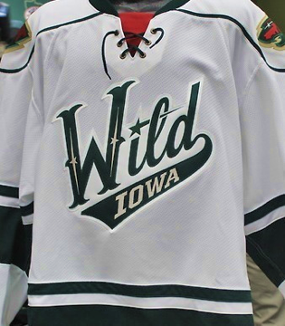 Iowa Wild jersey via TwitterThe new logo is not surprising. It's based on the script font found on both the Minnesota Wild and Houston Aeros third jerseys. It was shown off today on their new website.
It's really not that great of a uniform or logo design so I'm a little stumped as to why this organization keeps coming up with new versions of it. What worries me is that the NHL Wild are working on a new road (white) jersey for next season. Is this a preview of what's to come for them?
I'm also a little annoyed at the name change. I don't mind Iowa Wild the way some folks do. What I mind is them using "Wild" in the first place as now every time we mention the name we'll have to specify NHL or AHL.
At least with the other instances of the NHL/AHL name duplication, there are easy ways of distinguishing them — B-Sens, P-Bruins, Baby Pens (though I know a lot of folks hate that). But with this team? The I-Wild?
It's also disappointing that one of the great minor hockey identites of the last two decades is going away. We'll miss the Houston Aeros and I'm not sure anyone would miss the "Iowa Wild" even if they'd been around 20 years.
All right, enough complaints from me. I'm just disappointed by the lack of creativity of this team's new branding. I'll get over it, but first I'll take out my frustrations by whining here on the blog.
What do you guys think of the new look of the Iowa Wild? Am I being too hard on them?