
2013-14: Season of Change, Part 1
/Last weekend brought the debut of last new uniforms of the 2013-14 NHL season. Now, as we near the Stanley Cup Playoffs, let's take a look back at all the new logos and jerseys introduced this year.
There was a lot so I won't try to tackle everything in one article. I'm splitting it up into the Cover Stories for this week and next. Part 1 focuses on the changes the everyday stuff while Part 2 will recap the special events like the Winter and Heritage Classics and the Stadium Series.
As usual, we'll do this alphabetically for the sake of simplicity.
Anaheim Ducks
20th anniversary throwback
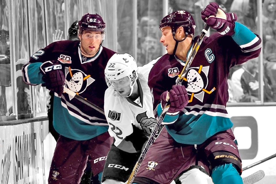
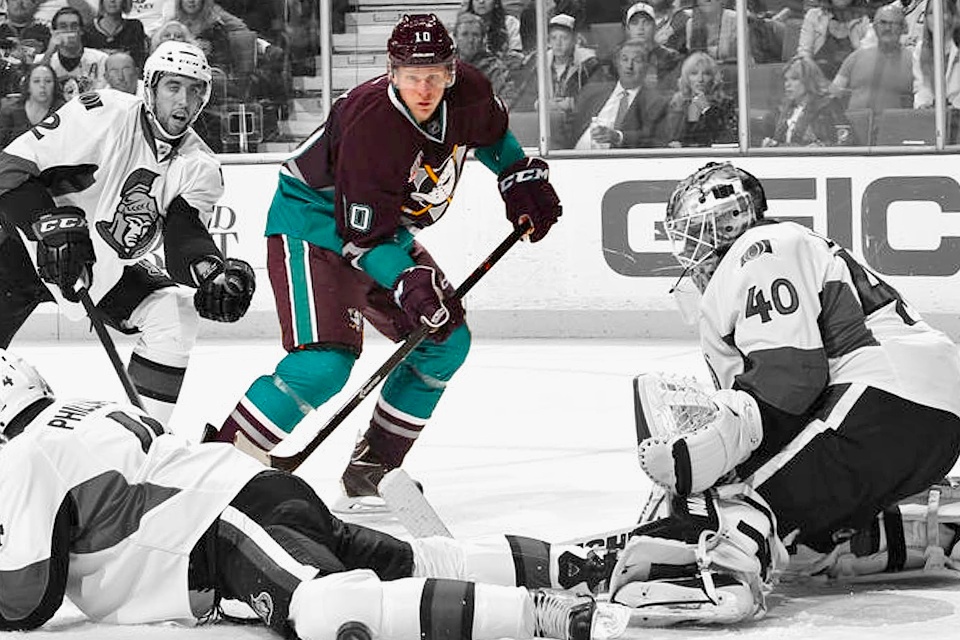
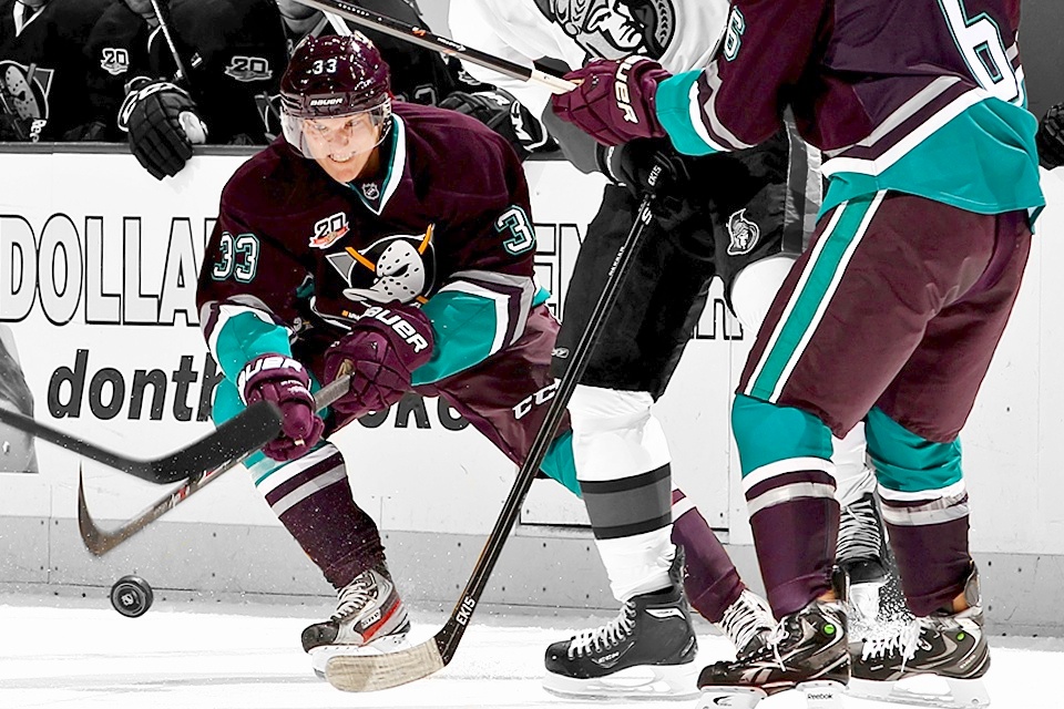
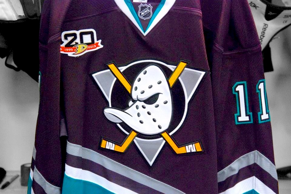
The Ducks' debut in 1993 was marked by ridicule from those who thought an NHL team shouldn't be branded based on a Disney film. Two decades later, many long for a return to that look. Just shows what a little time can do.
Early in the season, Anaheim went Mighty again for one night. The players wore the same eggplant-colored sweaters as the guys who skated 20 years before them. It was extremely well received.
Even the Ducks' television team got in on the throwback fun with retro graphics during their coverage of the game. Be sure to flip through the slideshow above. Then rate it and cast your vote in the poll on the right.


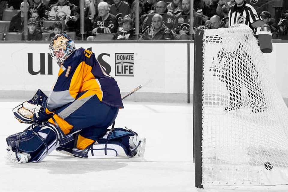
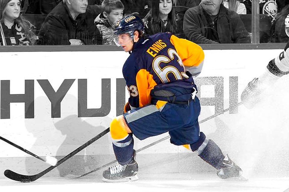
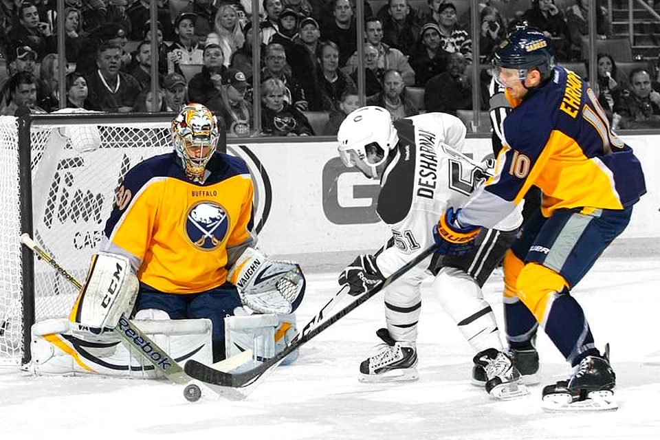
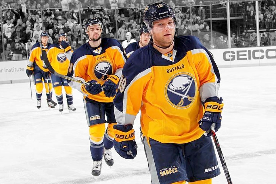
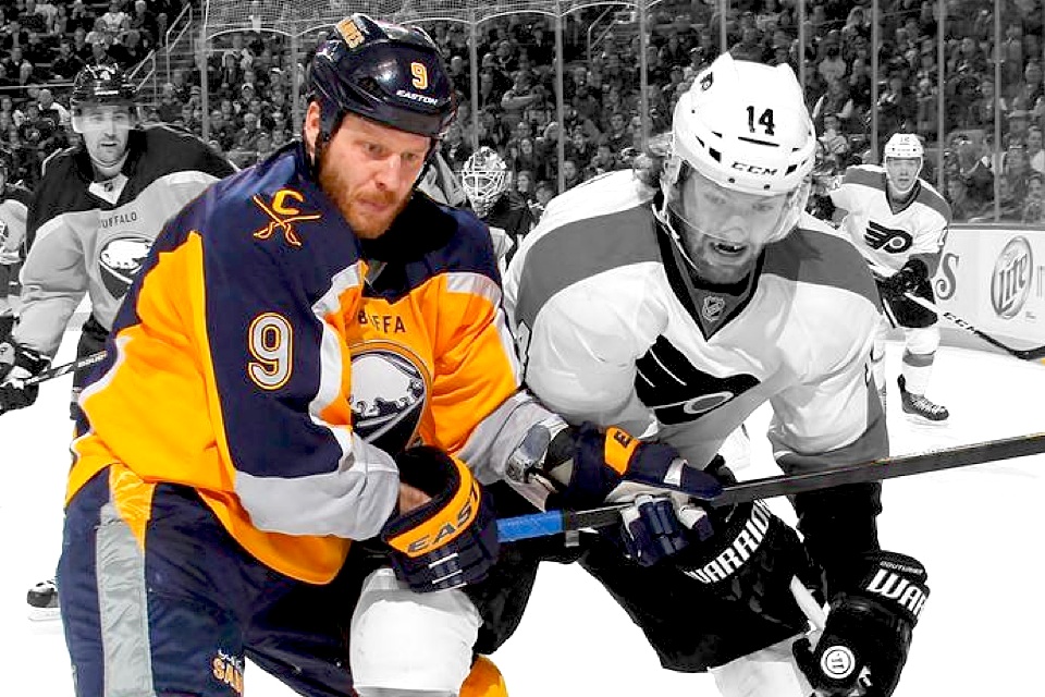

Buffalo Sabres
New alternate jersey
There's no way this one slipped under anyone's radar. The Sabres' third jersey unveiling went about as well as their season has. Pitiful and scorned. So I don't want to pile on here, but we can't ignore it either.
It's an odd saga. Buffalo had just retired a rather popular third jersey which it launched for its 40th anniversary in 2010. We were eagerly awaiting a late summer unveiling when Steve Ott seemed to level a Twitter ultimatum against his own organization.
A short time later came another tweet — making good on the first one.
Most assumed it was a social media stunt staged by the Sabres marketing team, but I'm not sure we ever got a solid answer on that. Maybe it was. Maybe it wasn't.
Either way, the jersey was out. And it was two colors. Gold on the front, blue on the back — the first of its kind in the history of the NHL. The immediate reaction from Twitter was, well, not good. People hated it.
I've always been a fan of outside-the-box third jerseys. That's what third jerseys are for, if you ask me. But that opinion was shouted down pretty universally — as I'm sure the poll on the right will bear out. Oh well.
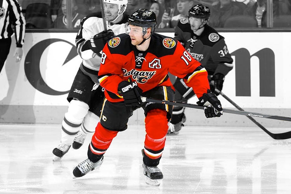

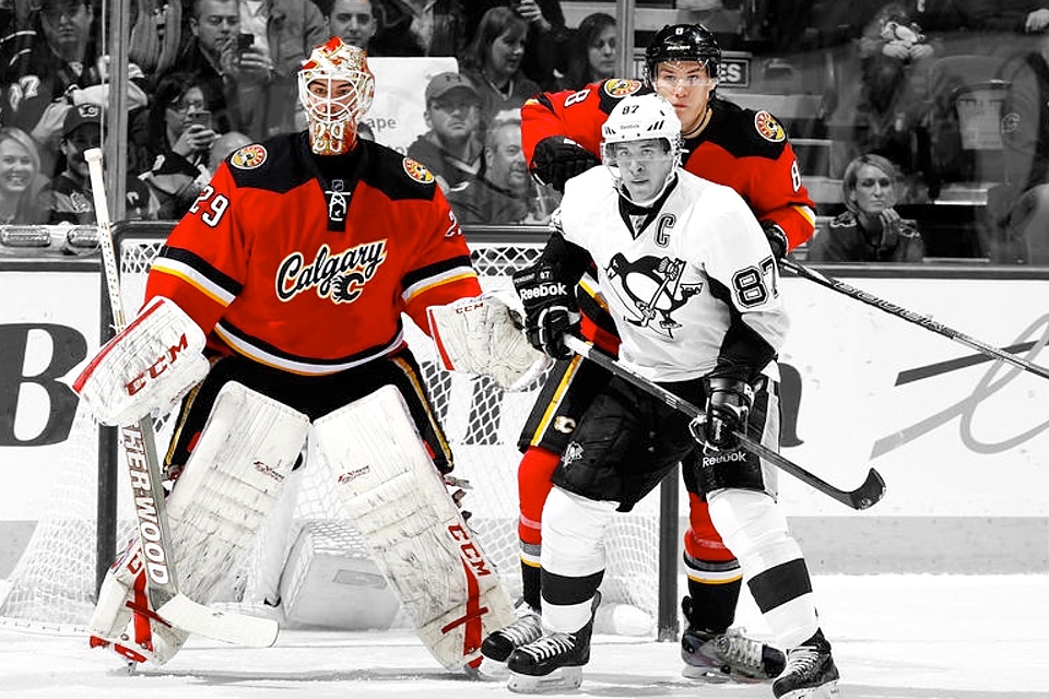


Calgary Flames
New alternate jersey
Since 2010, the Flames have been using their vintage 1980s jersey as an alternate about a dozen times per season. So there was concern among fans when we learned a new third jersey was on the way this summer.
It came on Oct. 27 and was actually a little reminiscent of the third the Sabres had just retired — the city's name in a script over the usual crest. It was touted as a more traditional jersey design. Who's tradition?
A mixed reaction met the newly unveiled sweater but it was the custom numbers on the back that got the most buzz — particularly the 5 on Mark Giordano's back. But all in all, it was a solid move forward for the brand.
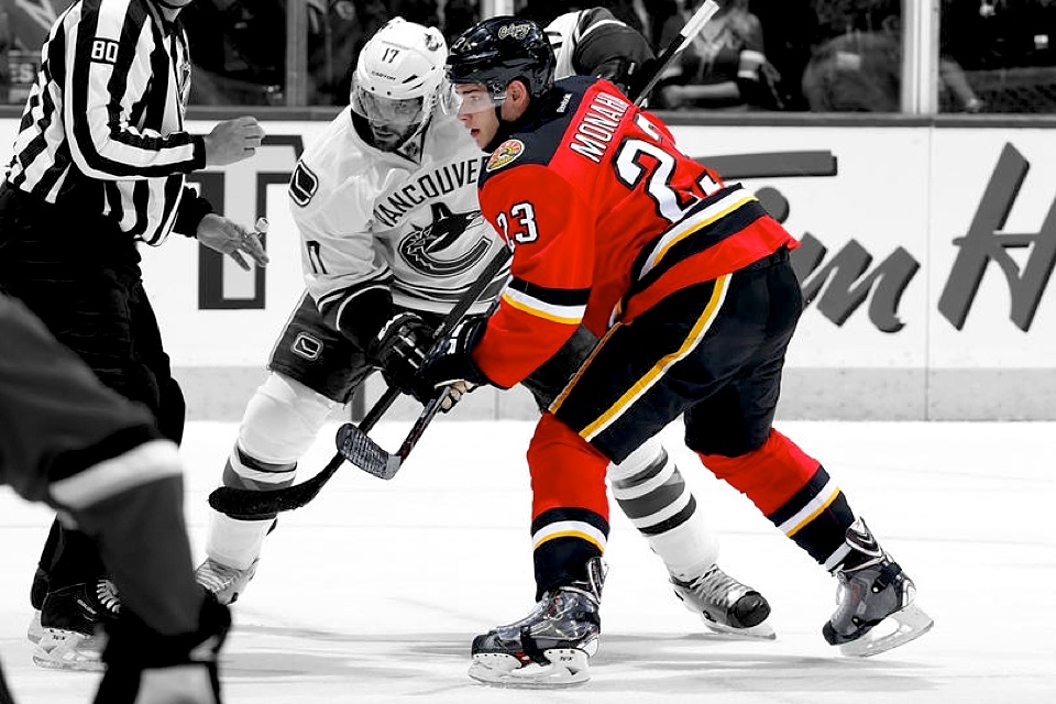
Best of all, Calgary didn't ditch its '80s threads. In fact, they were worn again last week for the Flames' Retro Night. The club is joining a growing list of team's employing throwbacks as a fourth jersey — Anaheim, Los Angeles and Vancouver being among the others to occasionally go retro. The Coyotes are expected to do it next season.
It's satisfying a desire among fans to see the past in the present a little more often — but not too often that we all get tired of it.
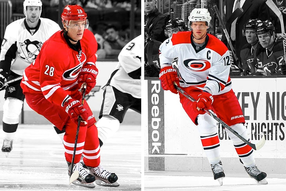
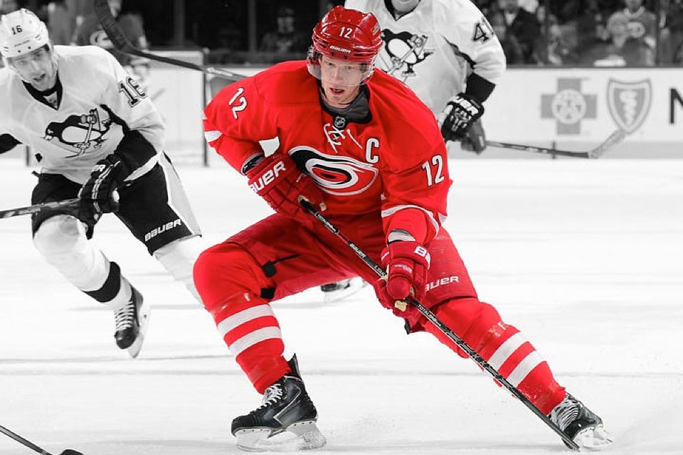
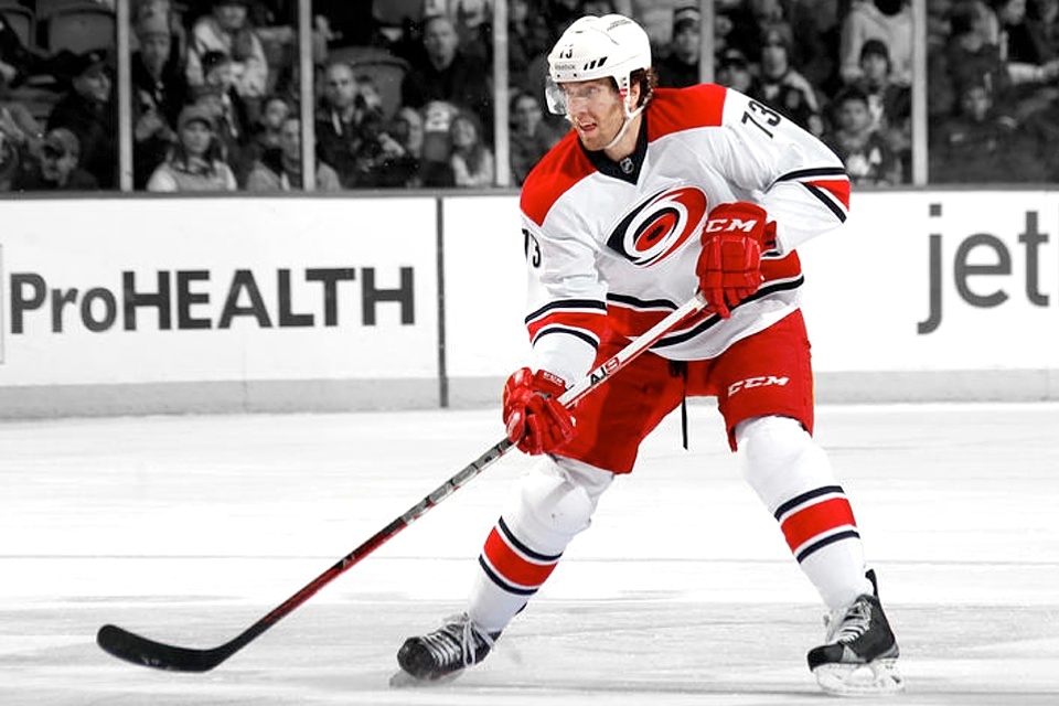
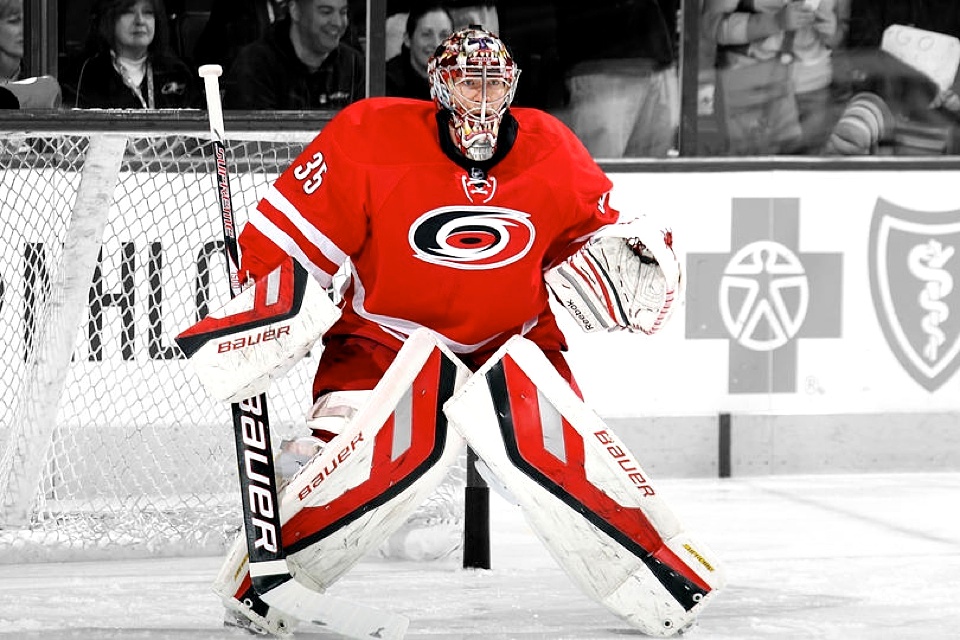

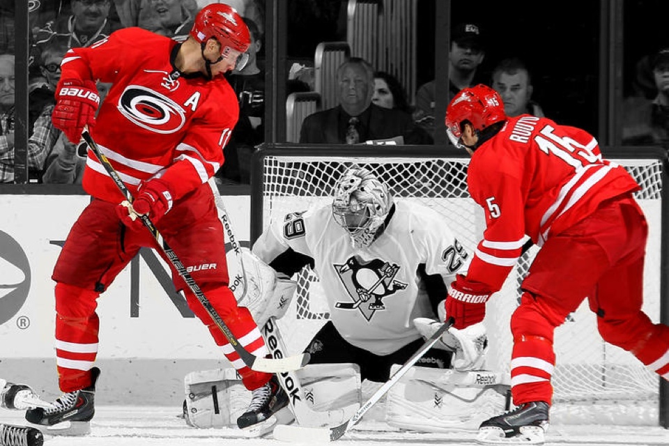
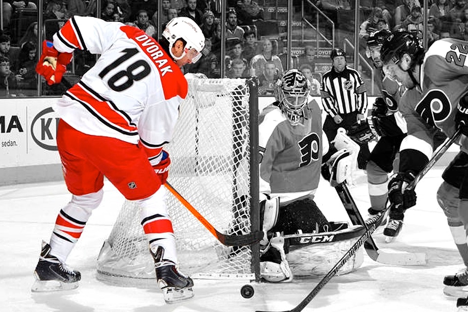
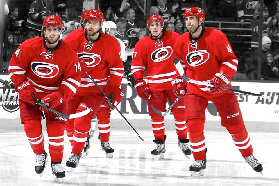
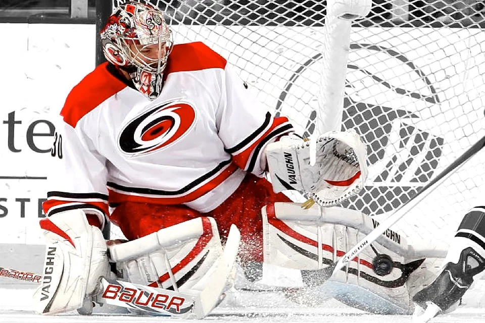
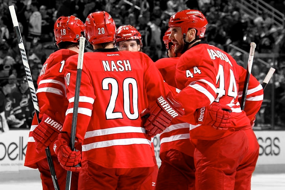
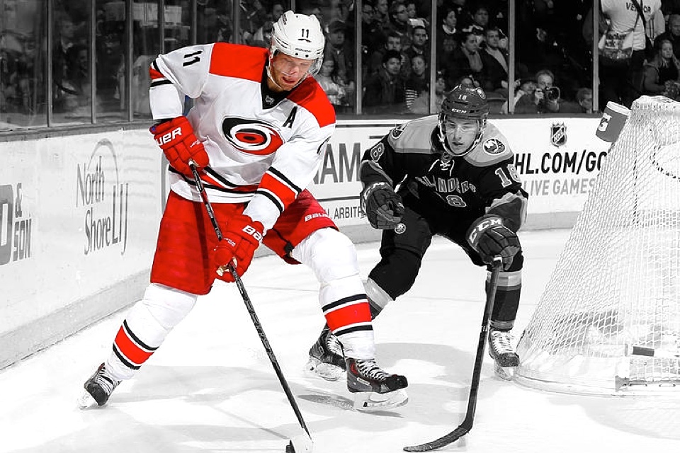

Carolina Hurricanes
New home/road uniforms
For some reason, the Hurricanes decided this was the year to swap their distinctive uniforms for something a bit more generic. They revealed new home and road sweater designs in June.
The new look isn't particularly bad, it just doesn't represent the North Carolina NHL franchise as we've come to know it. Gone are the lines of storm flags that once wrapped around the waist and sleeves. Gone are the silver accents. Gone is the character.
Traditionalists will say that's what a classic hockey sweater should look like. And I would not disagree with that. However, I would say the Hurricanes probably don't need a classic sweater. They need something that speaks to their own unique identity.
The poll on the right should gauge how many of you agree with that sentiment.
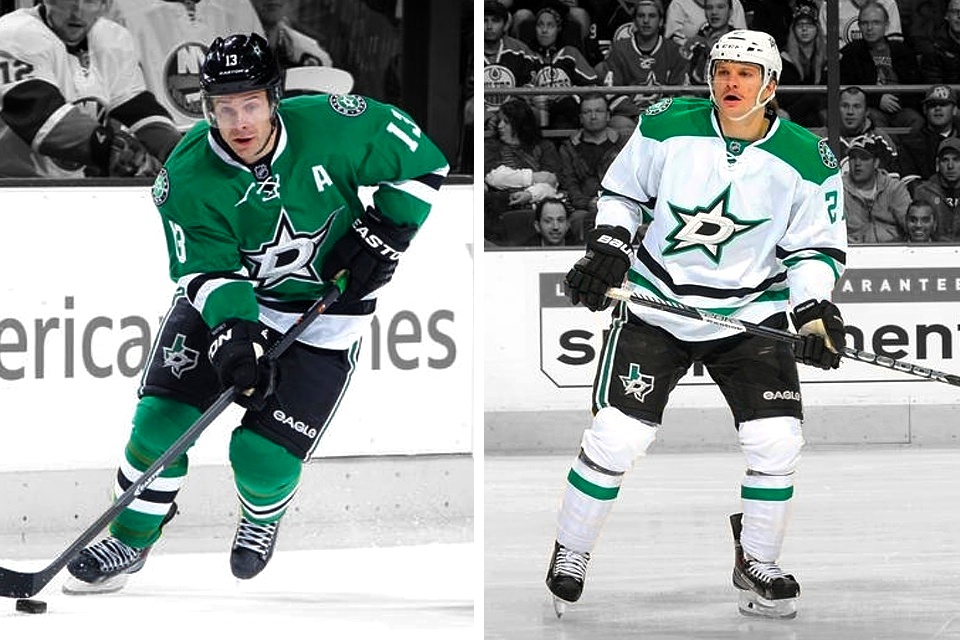

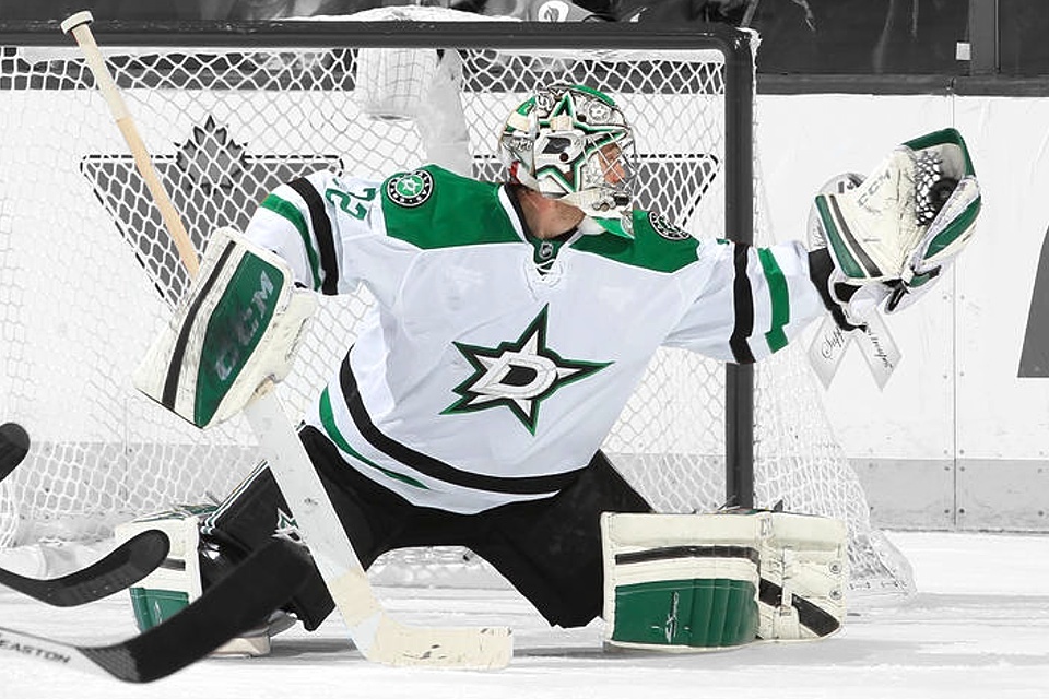
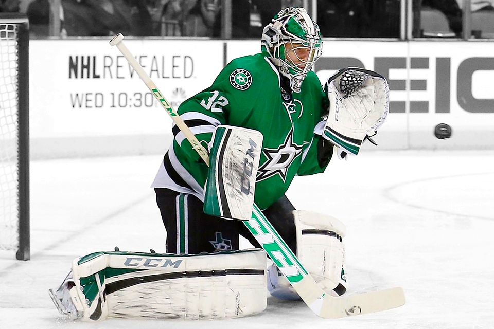
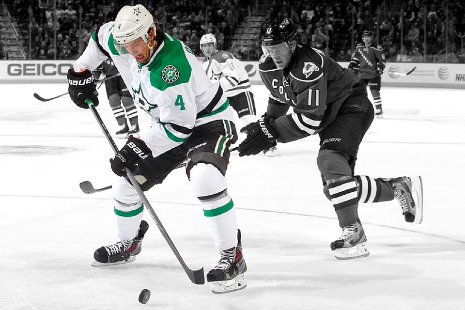

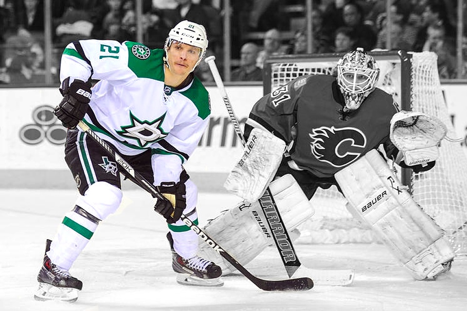

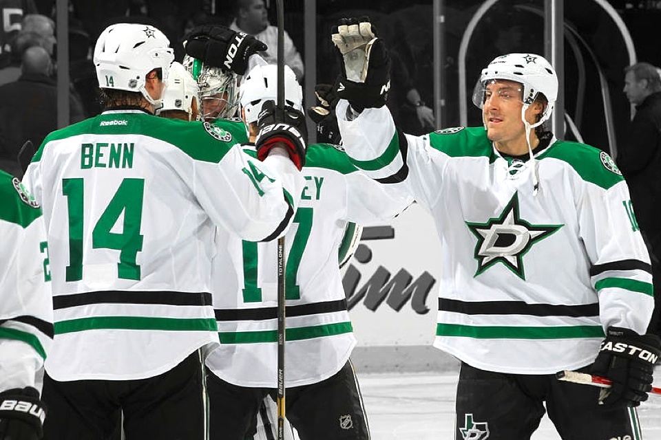
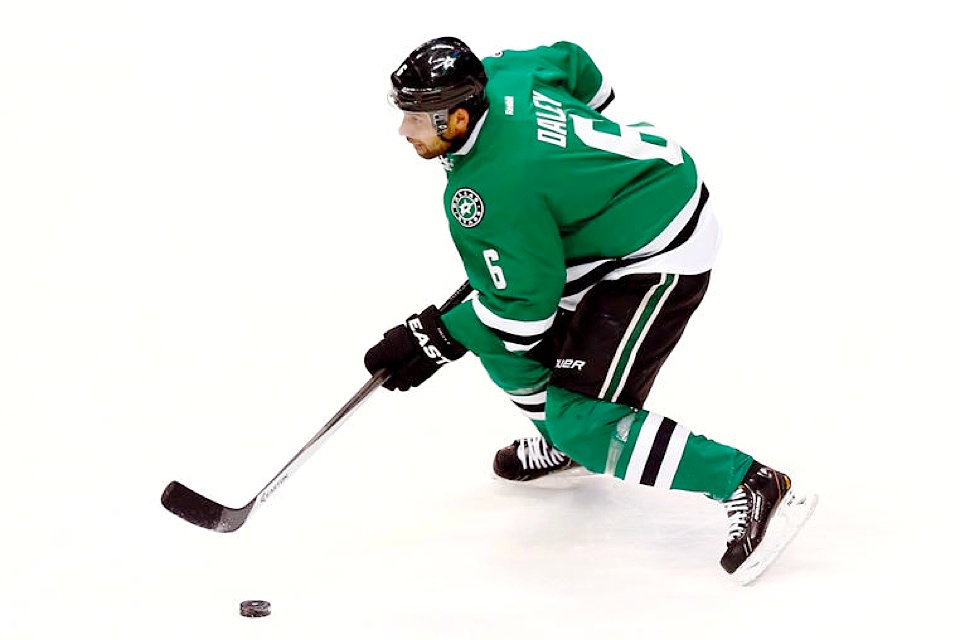
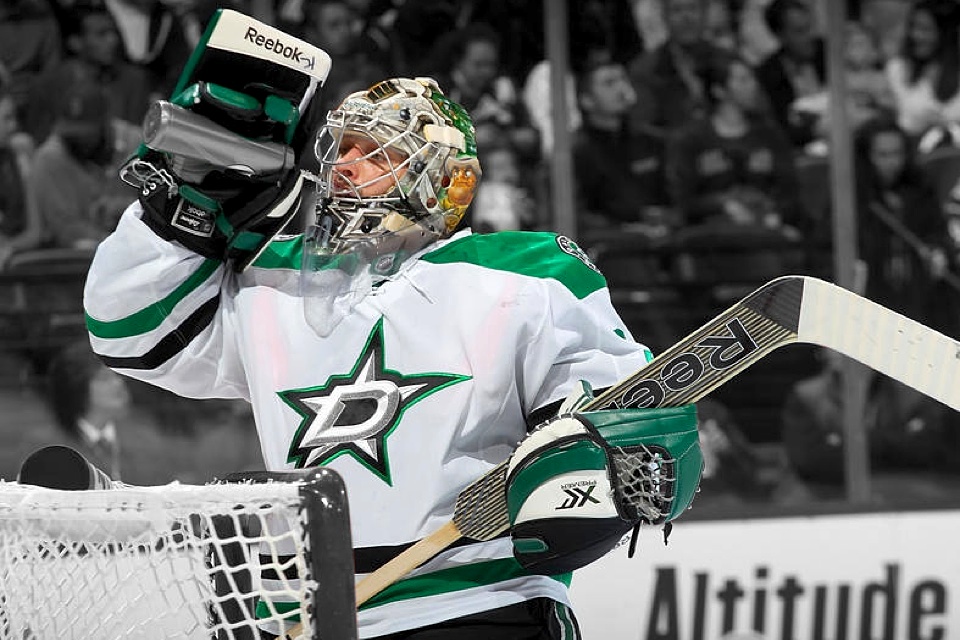
Dallas Stars
New logos and uniforms
Over the summer, the Stars underwent a major brand transformation — one that was well documented on Icethetics as I traveled to Dallas to cover the unveiling myself.
It was a small milestone for this site. It was a big milestone for the Stars, who have now called Texas home for 20 years. A change was long overdue and this was a significant one.
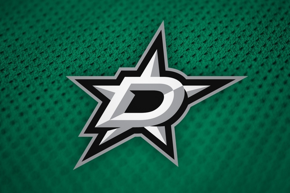
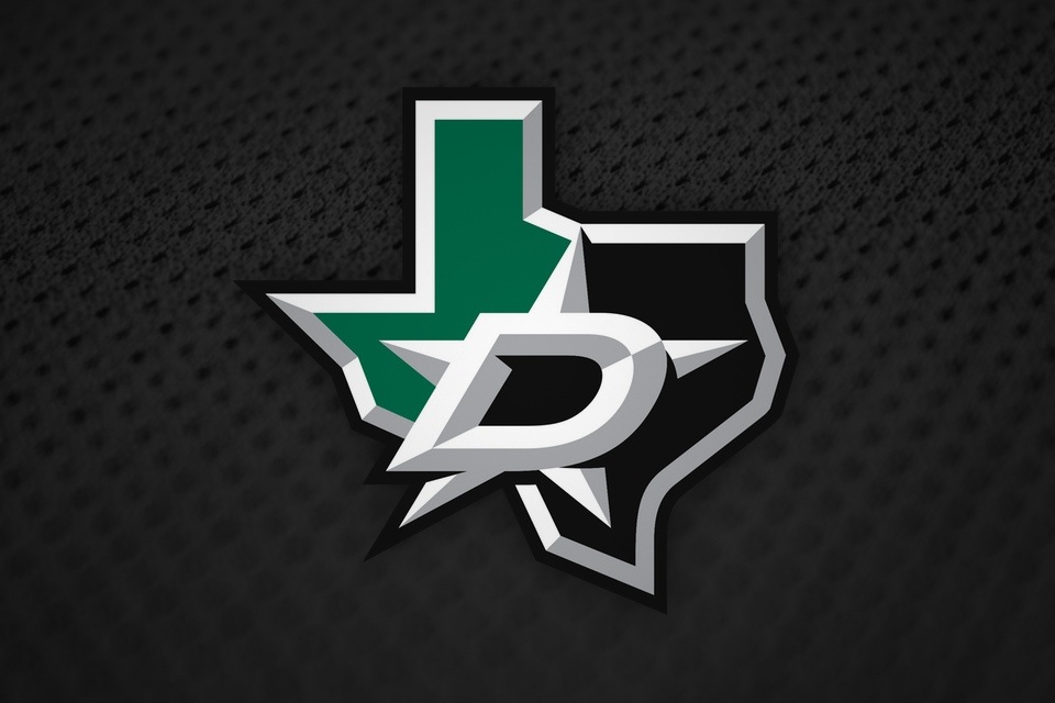

Dallas built its new look around a new color — Victory Green, as they call it. The team introduced a handful of new logos as well as new home and road uniforms. After years of wearing black and an indistinguishable dark green, the brighter colors were a welcome upgrade.

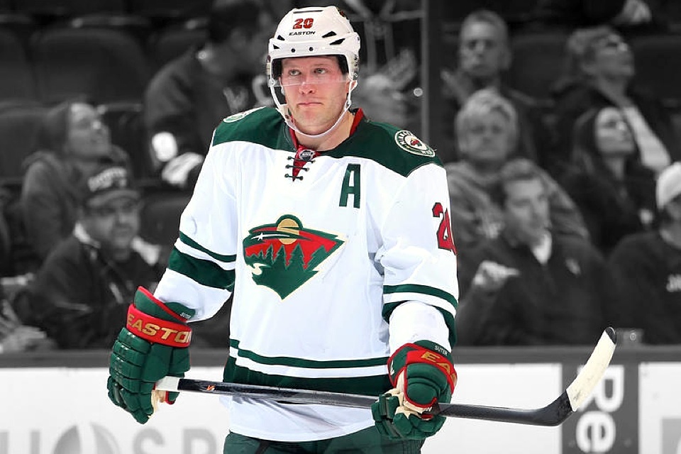
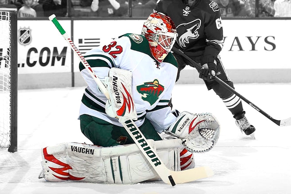
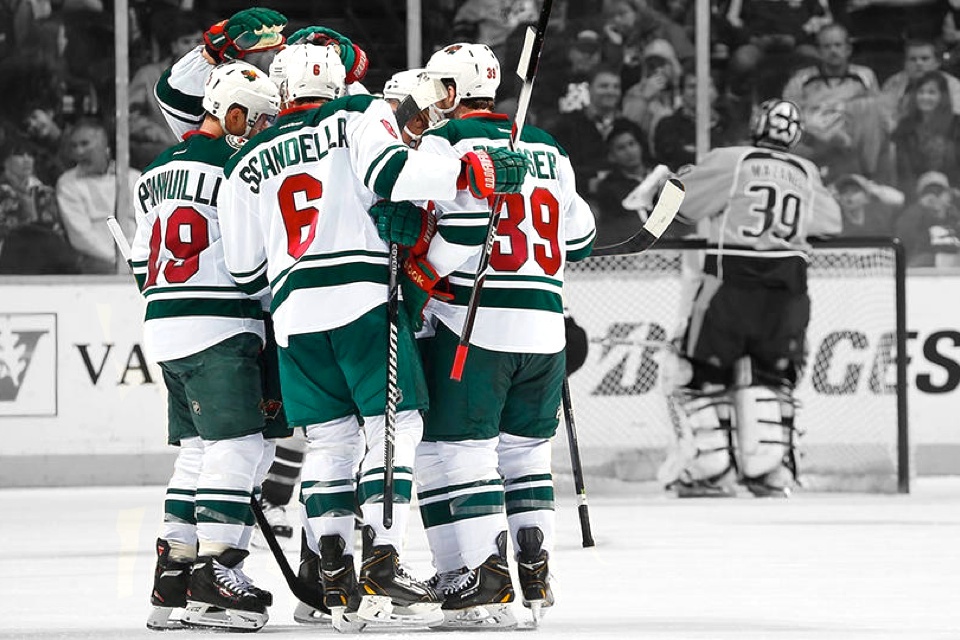
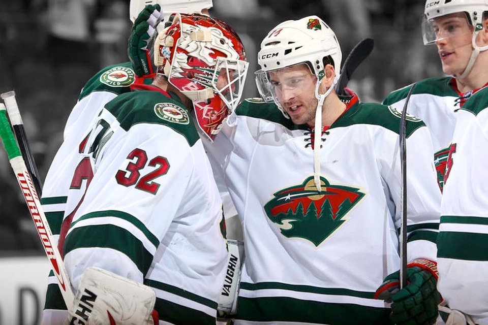
Minnesota Wild
New road uniform
Since their inception 14 years ago, the Wild's identity has been slowly evolving by becoming more old-fashioned. And that's a very good thing. Minnesota's hockey heritage deserves to be represented in its NHL franchise.
When it was conceived in the late '90s, the Wild's identity was very indicative of the design trends of the times. They tried to make it too "cool." But their home is a state with a rich hockey history.
With Minnesota's new road jersey, all three uniforms now have a more traditional feel that's appropriate for this club. And while some will still argue that the logo is a little too modern, I think it fits perfectly. I hope it's still around for the 2100-01 season when the Wild celebrate their centennial. (I hope I am too!)
I was surprised that the Wild went with an all new design for the new white sweater instead of simply creating a white version of their home jersey. I know a lot of fans prefer teams to have matching and home and road uniforms. Again, I have to stray from the pack here.
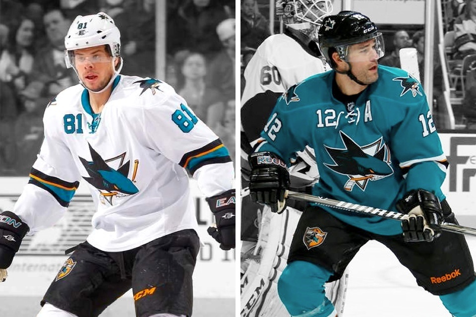
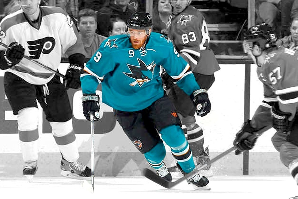
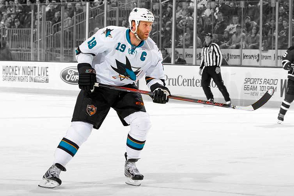
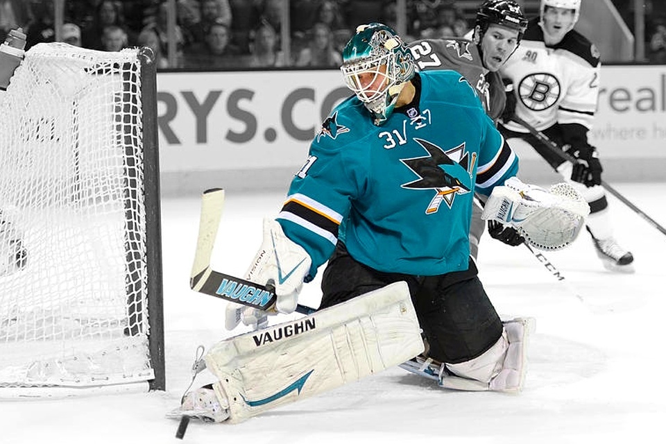
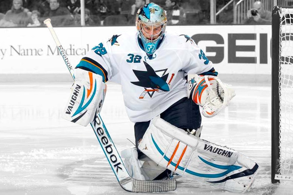

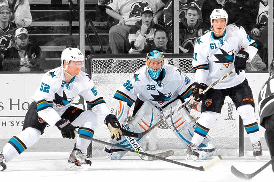
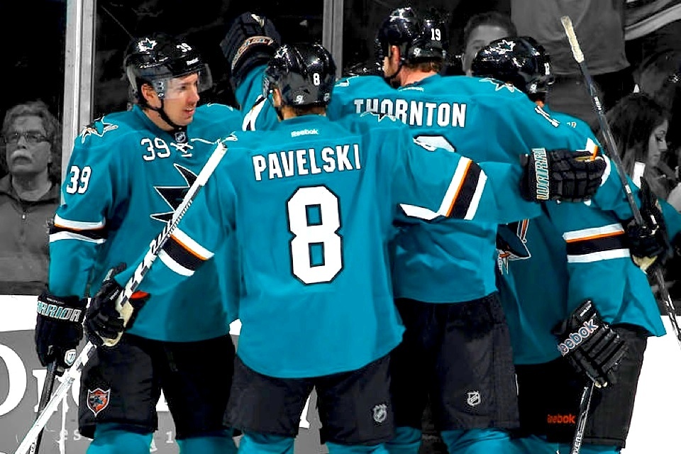
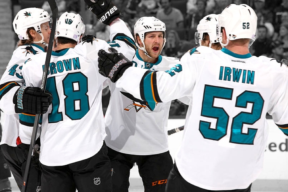
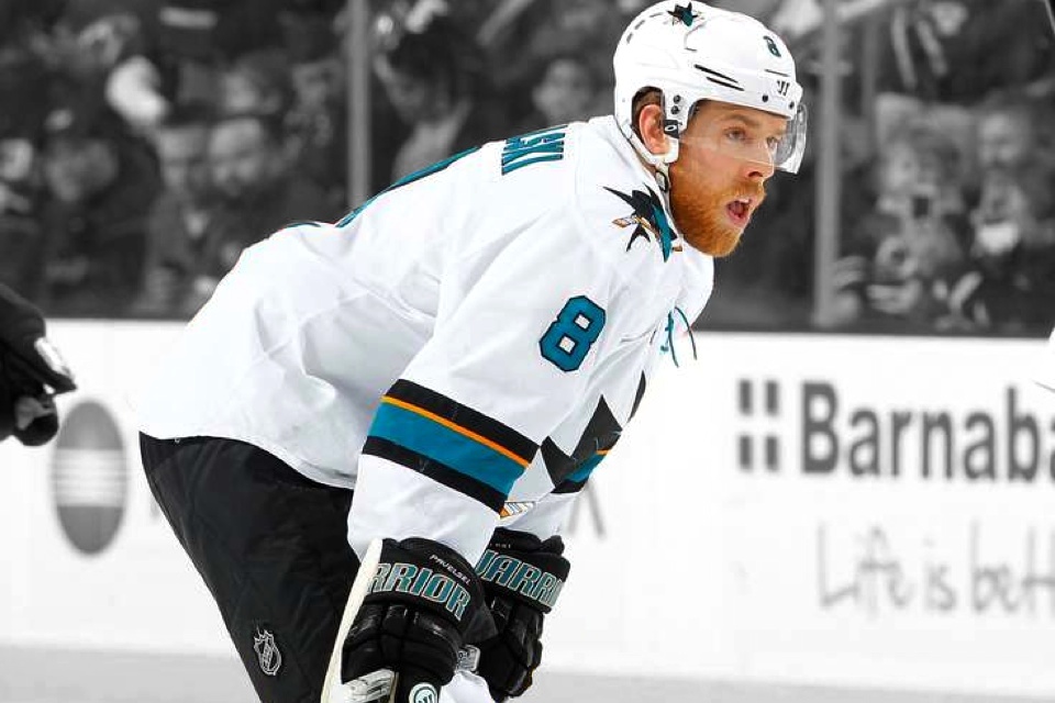
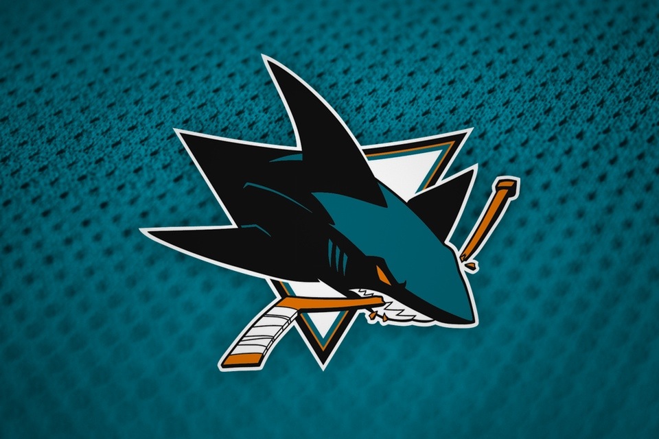
San Jose Sharks
New home and road uniforms
Like the Hurricanes, the Sharks chose to simplify. While the Canes wanted a more traditional look — which I can respect — San Jose claimed its removal of stripes and shoulder yokes with this update was a product of the player complaints.
In recent years, the Sharks have worn their black third jerseys during the playoffs. The players said their range of motion was improved with the lighter weight — a product of the lack of waist stripes and shoulder yoke. So this change was meant to make the regular sweaters more like the alternate.
It also led to more than a little ribbing from fans. Really? The jerseys were too heavy?
If player comfort was the bar, these new sweaters were a success. If good jersey design was the bar, they missed it. By a lot. A lot of what made for a strong design in the previous jerseys were lost with this update.
That wraps up Part 1 of this 2-part Cover Story. Check back next week for a recap of the jerseys used in the six outdoor NHL games that took place in 2014.