
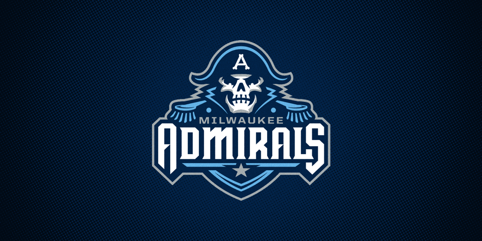
Milwaukee Admirals reveal new logos, uniforms
/

The Milwaukee Admirals will be the only AHL team named the Admirals next season, with Norfolk shifting to the ECHL. And now the franchise will have a brilliant new visual identity to boot!
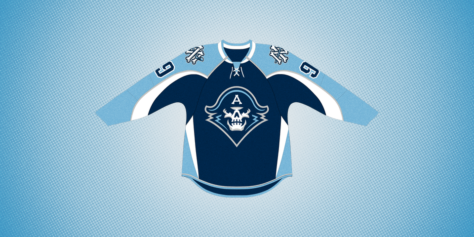
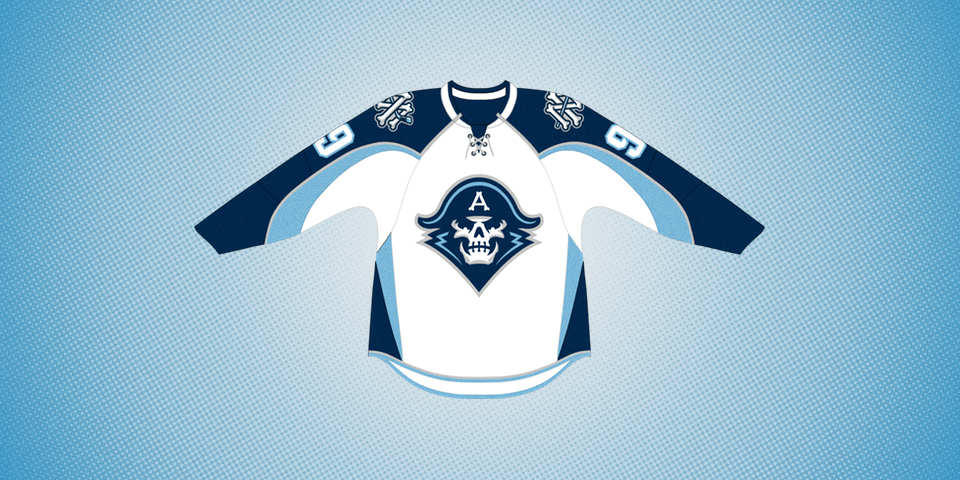
The Ads unveiled their new logos and uniforms on Wednesday evening at a special event for fans.
With the new look, the Admirals have retained their iconic light blue accents while returning to their original navy blue primary color. And the brilliant logo, while introducing a unique personality, brings together elements of the team's past designs as well.
Can you pick them out?
Behind Milwaukee's new look is Studio Simon, a firm with a long roster of solid sports identities including a few Super Bowls and the ECHL's Toledo Walleye.
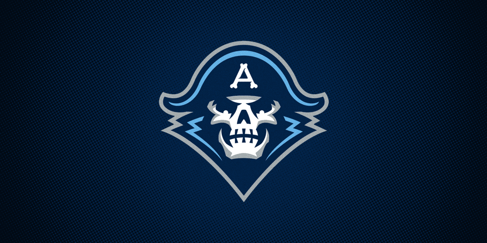
It's hard not to think this is a major upgrade from the club's previous look. That said, the Admirals will hang onto an updated version of their third jersey.
Photo from Admirals via Facebook
So the old skeleton pirate — also known as Deadmiral (which is awesome!) — will continue to be part of the overall identity for now, only with navy blue replacing the black in the design.
By the way, for the font geeks among us, I'm having some difficulty placing the typeface used in the "Admirals" portion of the wordmark. Bonus points to whoever can name it!
So what do you think of the new Admirals?