
Vegas Golden Knights are born!
/
The wait is finally over.
The NHL's new expansion franchise will hit the ice next fall as the Vegas Golden Knights!
And let me say — since I can speak first-hand on this — if tonight's event was any indication, the Golden Knights will have no trouble filling the seats at T-Mobile Arena. Hockey fans here are excited for their new team!
The atmosphere was incredible! I was thrilled to be able to make the trip — though it all came together last minute. But more on that later. I'll walk you through how it all went down and then share my initial thoughts on the design.
Toshiba Plaza outside the arena was packed with people and a wide variety of hockey jerseys. Cirque du Soleil performers from KÀ served as the opening act of the evening.
Then after what seemed like a long wait, emcee and local news anchor Chris Matthius took the stage to introduce the three key players in this whole NHL-in-Vegas venture.
First, commissioner Gary Bettman stepped out to cheers that turned to boos, bizarrely. I think at first fans were excited because he's the guy that allowed the NHL to come to their city. Then they realized if they're going to be true NHL fans, they have no choice but to boo him.
Then, weirdly, he kept encouraging the booing. Like he was a monster feeding off their disdain. I mean I liked his sense of humor about it, but it was weird.
Next, general manager George McPhee spoke about his plans to put together the new team "here in Washington." Yeah, oops. All those years running the Caps, I guess. But everybody knew what he meant.
Finally, majority owner Bill Foley spoke about why the knight is such an important symbol to represent his hockey club. From the press release:
"We want our team to be known for dedication, honor, strength, courage and a commitment to never give up - both on the ice and off," said Foley. "We want our team to be committed to teamwork, service to this great city and integrity in all things — and we wanted a name and logo that represented all of this and was unique to Las Vegas and our community. Vegas Golden Knights is that name."
Foley explained, "We selected 'Knights' because knights are the defenders of the realm and protect those who cannot defend themselves. They are the elite warrior class."
All noble values and worth building a brand around.
At that point, Matthews introduced a short video to get everyone hyped up about the reveal. Sadly, they flubbed it. A few seconds in, the video gave way to a "placeholder" graphic and the sound went away.
While the tech team tried feverishly to get it back up and running, Bettman and Foley filled time talking to the crowd a bit.
After a while, they scrapped the video and jumped straight to a countdown that culminated with the big reveal and all manner of pyrotechnics and confetti.
The original video never played but if you'd like to watch it, it's online and worth a look.
If you watched those videos, it's obvious Foley had a clear vision for this team's brand — whether you like the end result or not. And personally, I do — for the most part.
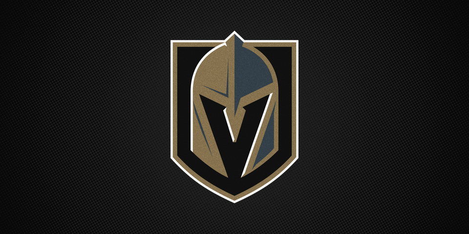
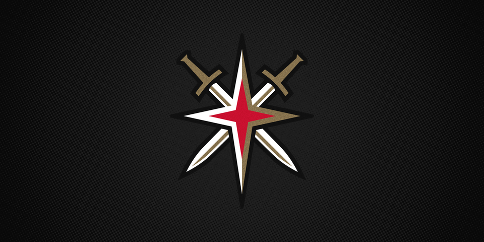
The helmet with the "V" in the negative space is reminiscent of the brilliance seen in the old Hartford Whalers logo. The colors are unique too. While not featured in the primary logo, red accents will be part of the uniform. You can see it in the shoulder patch which was inspired by the star on the famous sign welcoming visitors to the Strip.
But while we're on the uniforms, I wanted to point out that steel grey is being described as the team's "base color." My instinct was that we should be expecting black jerseys, but perhaps they'll be this dark grey instead. That would be cool.
Also, call me crazy but I'd be willing to bet the numbers we saw in the countdown are what we'll see on the jerseys — complete with red trim and everything. But that said, I'm not sure I'm a fan of the design.
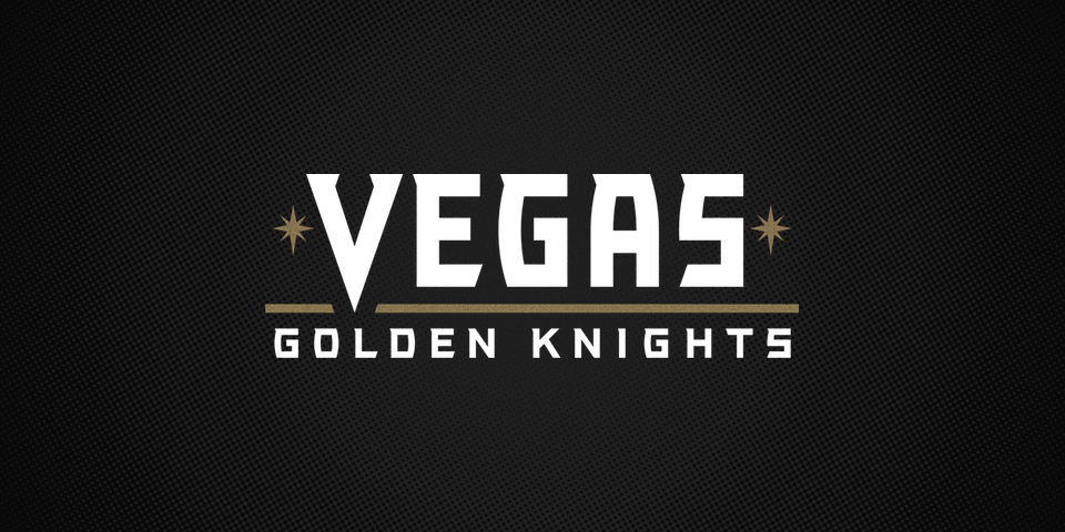
Which brings me to the Golden Knights wordmark. There's just something a bit old-fashioned about it. And not in a good way. I was really expecting something a bit more modern so that may be coloring my judgment a bit.
So those are my first impressions. They may change. Or not. But I did like the new logo enough to buy myself a polo if that says anything.
Based on some quick scrolling through Twitter, it seems reaction outside of Las Vegas has been pretty mixed. I'd love to read more of your feedback in the comments. What do you think of the new name and logos? Are you excited about the Vegas Golden Knights?