
Worcester ECHL team unveils name, logo
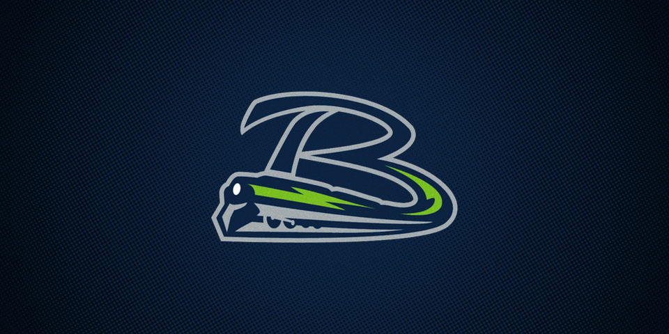
/A new ECHL expansion franchise, approved in February, officially announced its name and revealed its logo today. The Worcester Railers HC will climb aboard in the 2017-18 season. (Yes, the HC, standing for "hockey club," is officially part of the team's name.)
Hockey fans in Worcester, Mass. have been without pro hockey this season after the AHL's Worcester Sharks relocated to San Jose where they now play as the Barracuda.
As for the Railers moniker, the press release tells us:
The name is reflective of the region’s strong association with the railroad industry and heritage. From every Worcester neighborhood you can see, hear and feel the railroads. The historic and iconic Union Station is a landmark in the region and throughout the United States.
The new logo has been received well by fans so far, but I'm a bit worried. The design is all over the place, of course, and it would be tough to embroider on a hat. But that's not my biggest concern. It's the train.
Over the last past decade or so, hockey teams with trains in their logos haven't exactly been all that successful. Think about it.
In September 2010, the ECHL announced an expansion team, named the Chicago Express, that would take the ice the following year. The Express played the 2011-12 season and abruptly shut down without much explanation — though attendance was clearly an issue. (If only there was some mode of transportation to get people to and from games.)
And it's not hard to see the similarities between this logo and the Railers'. For one thing, they basically use the same colors of navy blue and silver.
But you might be thinking that's just a coincidence. The branding was solid. Maybe the business model wasn't. What does any of it really have to do with the logo?
So let's ride back to 2005.
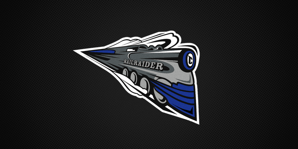
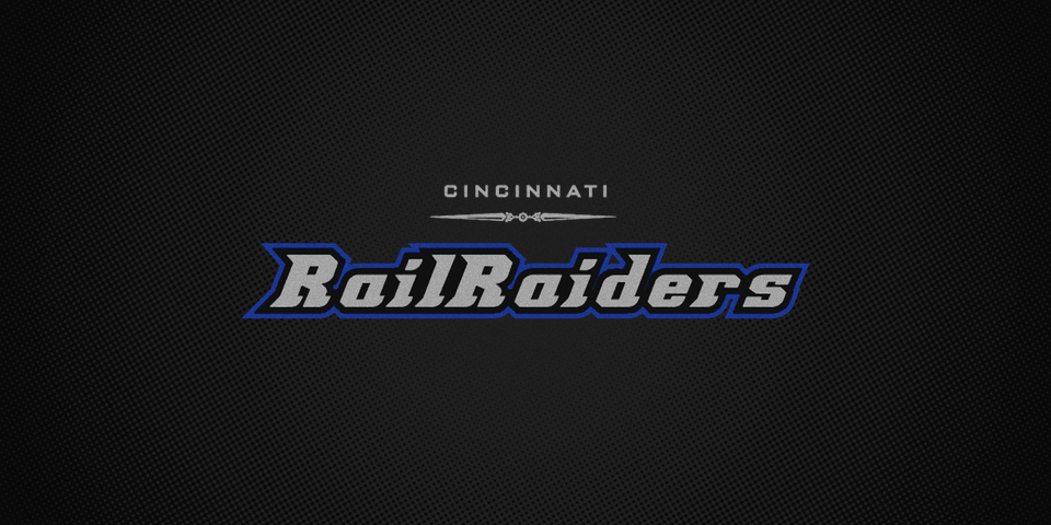
The AHL's Cincinnati Mighty Ducks suspended operations after their NHL affiliate in Anaheim signed a deal with Portland. No longer able to keep their name, the franchise announced it would rebrand itself the Cincinnati RailRaiders and return to action in 2006-07.
More people may have wondered what a "RailRaider" was if that team had ever taken the ice. It never happened. The plans were derailed when the ECHL's Cincinnati Cyclones resumed operations after a two-year shutdown.
The RailRaiders logo was consigned to the waste bin before it was ever stitched onto a sweater.
Are you following my train of thought here?
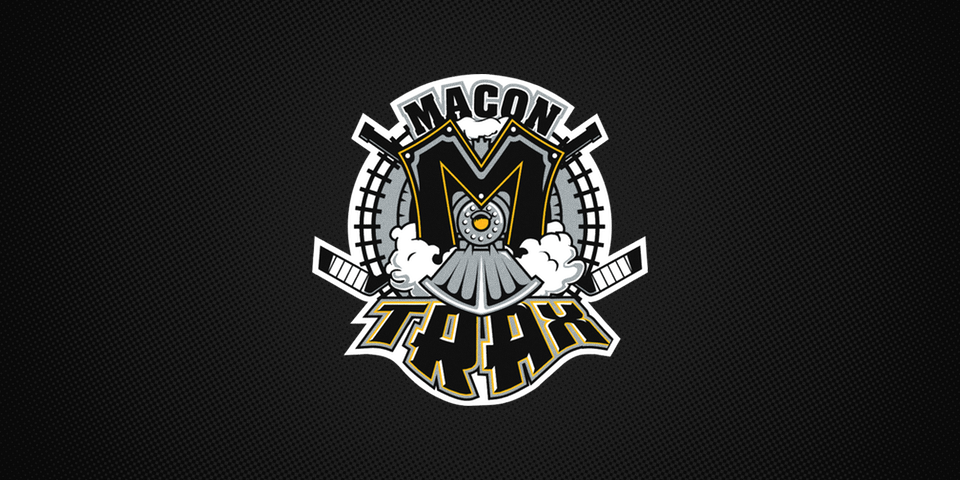
A year earlier, the fledgling Southern Professional Hockey League made its debut in 2004-05 with eight founding members — one of which was the Macon Trax. In any new league, you're bound to have trouble with at least a team or two. The Trax were one of three that shut down after that first season. Bad luck or train curse?
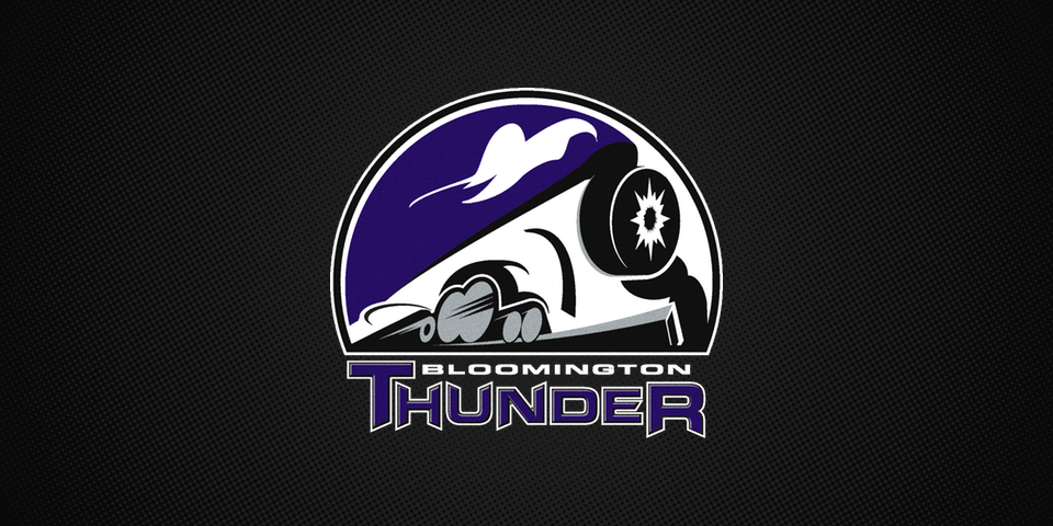
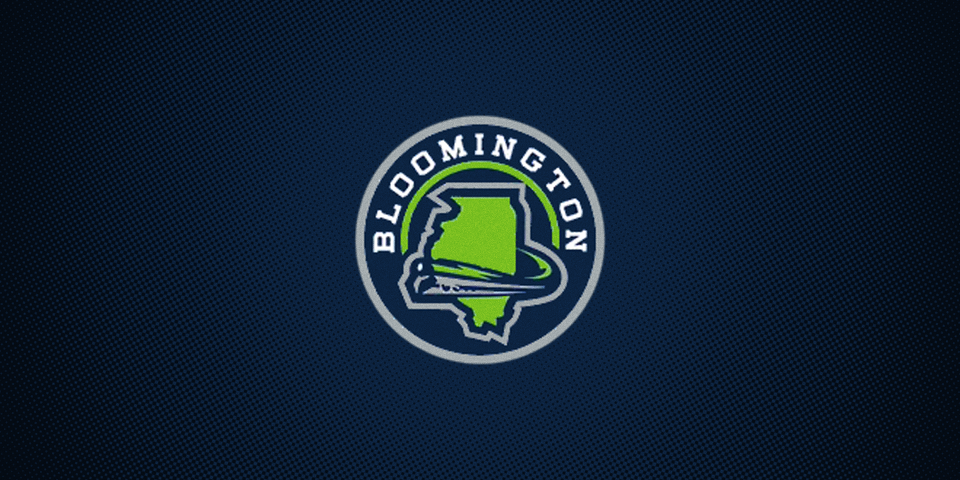
The SPHL was apparently undeterred by the Trax failure. In 2013-14, they accepted a new team, the Central Hockey League's Bloomington Blaze, under new branding. The new Bloomington Thunder went with a train as their symbol. After one season, it was the end of the line.
But that's where our story takes a turn.
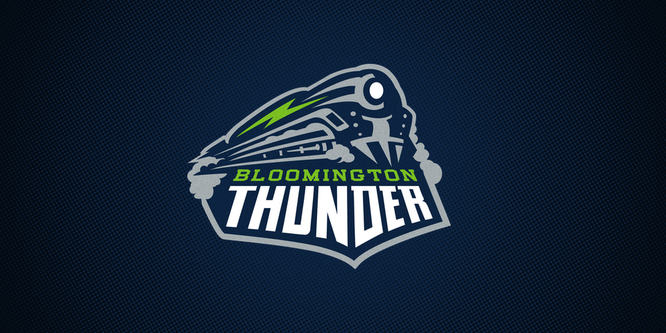
The Bloomington Thunder shifted leagues again in 2014, this time to the USHL, a Junior A league. They kept the name and the train motif, but redesigned the logos. And when that team skated out for its second season last fall, it seemed the curse may be losing steam.
I'm not ready to call it yet. Maybe the curse only applies in the pro leagues? We'll have to keep a close eye on the Railers. But if I'm a Worcester hockey fan, I might try to encourage management to consider a name change before 2017.
Also, it's going to be weird when they play Wheeling — Railers vs. Nailers? We just solved the Admirals vs. Admirals problem in the AHL. Let's not create another one.
Anyway, the Curse of the Train. It's real.