
Cleveland witnesses evolution of Monsters
/
It's been a big year for Cleveland. The Cavaliers won their first NBA championship. The Monsters won their first AHL championship. And, by all accounts, the city hosted the most unconventional political convention in American history.
But only one of those things are of interest to us.
When the Lake Erie Monsters swept the Hershey Bears for the 2016 Calder Cup, they were playing their final games under that moniker.
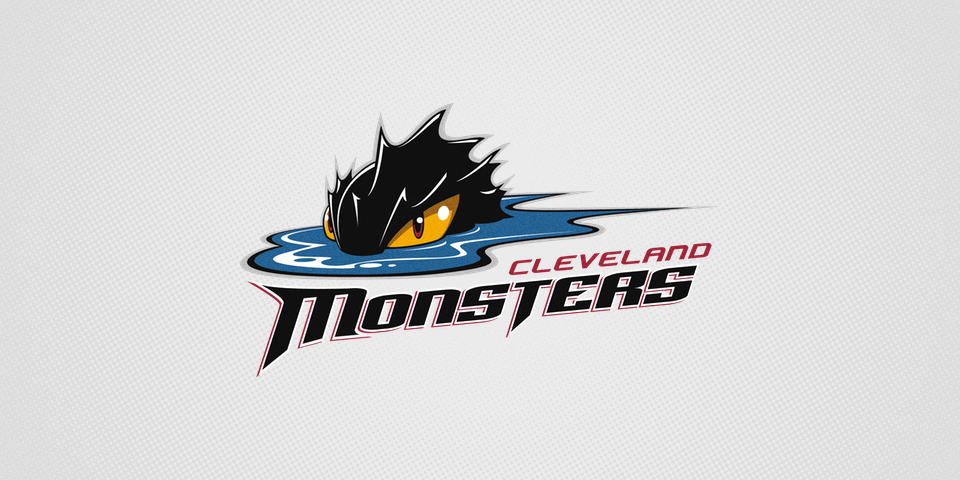
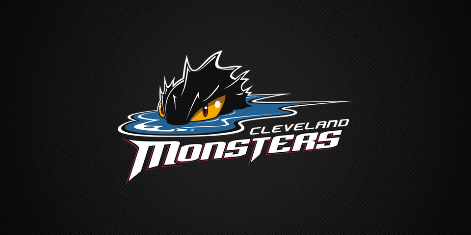
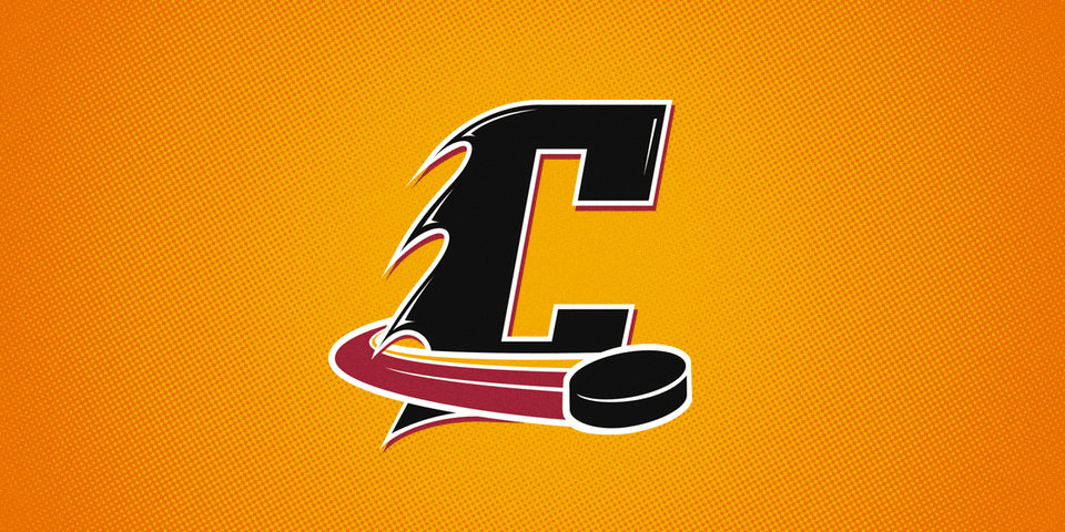
This week, the AHL's defending champion was renamed the Cleveland Monsters. The franchise announced the rebrand alongside new logos and uniforms on Tuesday.
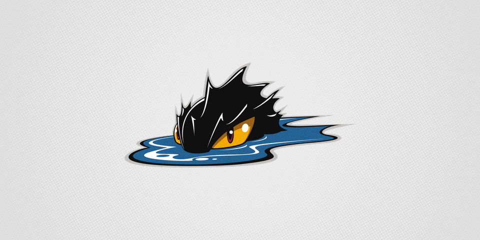
The logos aren't a huge departure. Lake Erie was replaced by Cleveland — which was actually added to the bottom of the logo in 2012. This move cleans up the design and further cements the Monsters as Cleveland's team. No more wondering where the club from Lake Erie actually plays.
It was a different story with the uniforms, though. For the first time in team history, the gold from the monster's eye takes on a prominent role.
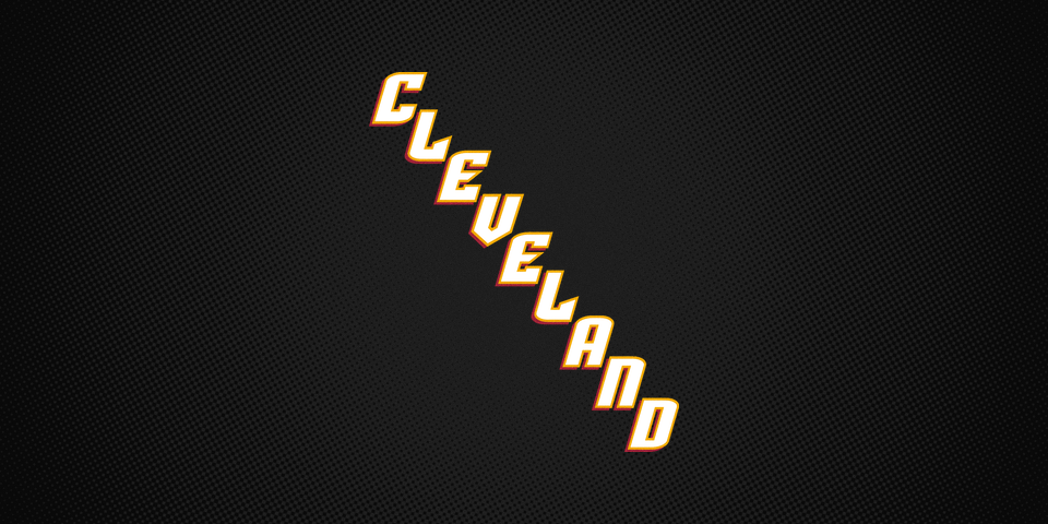
The white home sweater introduces a simplified version of the original primary mark. The black road jersey goes with the classic diagonal text treatment. And now there's a bright gold third jersey entering the mix later in the season.
Provided by Cleveland Monsters
Following the announcement, I spoke with Pam Frasco, the Monsters' VP of Marketing and Communications, to get the story behind the redesign.
"It's not a full rebrand," Frasco told me, "just a refresh."
And it couldn't have come at a better time.
Teams don't change their logos or uniforms on a whim. And certainly not their name either. The fact that this is coming immediately following their championship is just a coincidence. This change had been in the works for a while.
"We had to submit these designs last November," Frasco said. "We had no idea that either team would win. We wanted to add 'Cleveland' to tie the name of the team to where we play."
Frasco has been with the organization since before Cavs owner Dan Gilbert bought the AHL franchise in 2006. She was there when Cenergy Communications was hired to help create the new team's identity. And she was there when it was revealed on Jan. 25, 2007.
"There was mixed mixed reaction when launching," she admitted. By choosing "Lake Erie" for the team's name, the goal was to be more inclusive of the region. But over the years, confusion only increased both within the market and especially outside of it.
"[This change] has been a long time coming," Frasco said. "It's just the perfect storm for us."
The redesign process began in October with help from the team's graphic artists — who also work for the NBA's Cleveland Cavaliers and AFL's Cleveland Gladiators — led by Nick Prost.
"We talk about what we're looking for, then they go to work," Frasco said. "It was a two-month process getting down to the main concepts. We knew we wanted one jersey to say Cleveland in some fashion."
For inspiration, the group looked to local hockey teams of the past including multiple iterations of the Barons as well as the IHL's Lumberjacks, who used "Cleveland" diagonally across the front of one of their sweaters. By using that design on their dark jersey, it'll be clear in buildings they visit where they come from.
But there's a twist! Normally, AHL teams wear white jerseys at home, but that will change next season. Frasco told me the league will reverse their home and road colors mid-season, wearing white on the road for the second half of the year. This is new for the AHL but has been common in the ECHL for years.
On the white jersey, Frasco said they "wanted the monster head to be larger so you could see it from the stands." But the way the logo was designed made that difficult. There water stretches out to a very long point on the right side. So the designers made a simple tweak to reign in that point, allowing them to increase the size of the crest.
It's also the first time the text has been separated from the monster on the jersey. It demonstrates a great evolution of the brand that the logo can live on its own without the wordmark elements.
Then there's the third jersey, which won't hit the ice until December. "We're waiting to debut the gold," Frasco said, "because we weren't sure what it would look like."
Knowing how well the gold jerseys work in Nashville, there's little doubt in my mind they will be a hit in Cleveland. But gold has never been a big part of the Monsters' identity. It's been in the eye of the monster since the beginning but never used on the jerseys.
"When the logo was created, we always knew we'd be a cousin of the Cavs," Frasco said, referring to the wine and gold accents in the logo. She pointed out the common misconception among fans that the maroon color was burgundy borrowed from their original NHL affiliate, the Colorado Avalanche. But, in fact, it's always been Cavs wine.
With this brand refresh, the Monsters move even closer to their corporate cousin from the NBA.
As we wrapped up our conversation, Frasco pointed out that as mixed as the initial reaction may have been in 2007, fans always get attached. So change is always a challenge. But in this case, she reiterated, "it's just refreshing and evolving a bit."
That said, she fully understands that "fans can't really embrace and love the new look until they see it on the ice."
Is it October yet?