16 Best Concepts of 2016
/Another day. Another concept. That's how it works around here. For five straight years, there's been new fan-created artwork posted daily to the Concepts page. Now that we're 16 days into the new year, let's take a look back at the 16 highest-rated concepts of 2016.
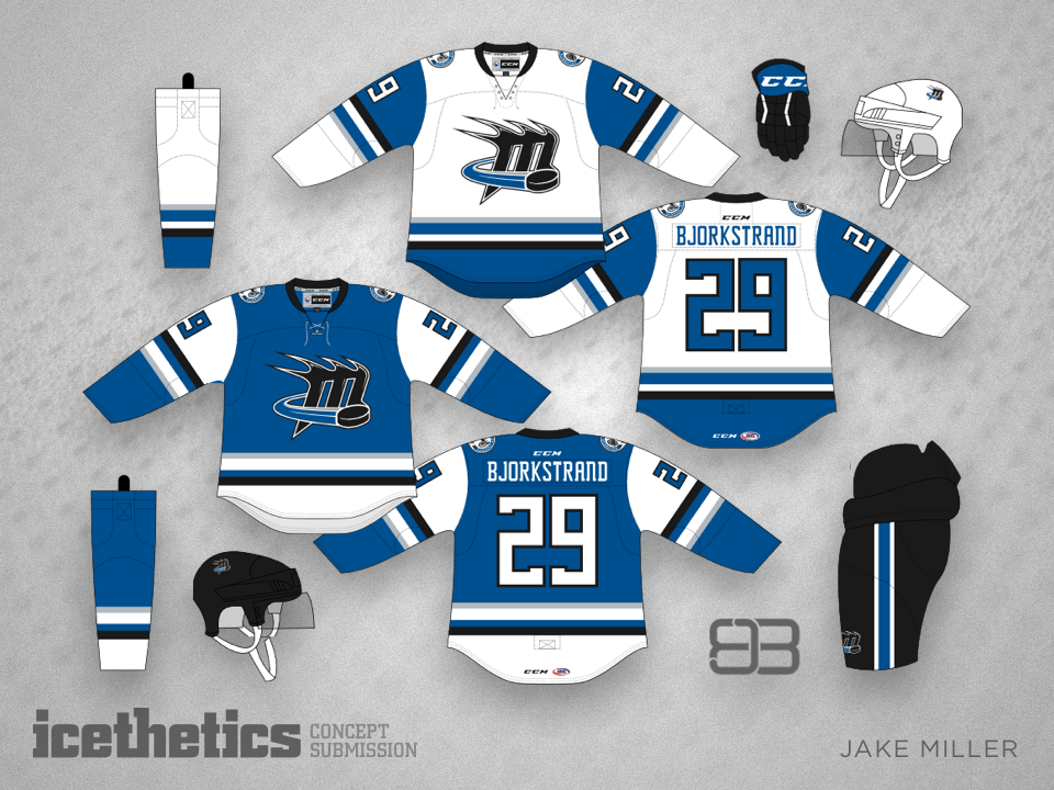
#16 · Jake Miller: Ohio Connection
Our countdown starts in January with Jake Miller's redesign of the soon-to-be AHL champion Lake Erie Monsters. He wanted to connect them more to their owner and NHL affiliate, the Columbus Blue Jackets. He also proposed changing the team's name to the Cleveland Monsters — which actually happened in August, though the team doubled-down on its Cavaliers color palette.
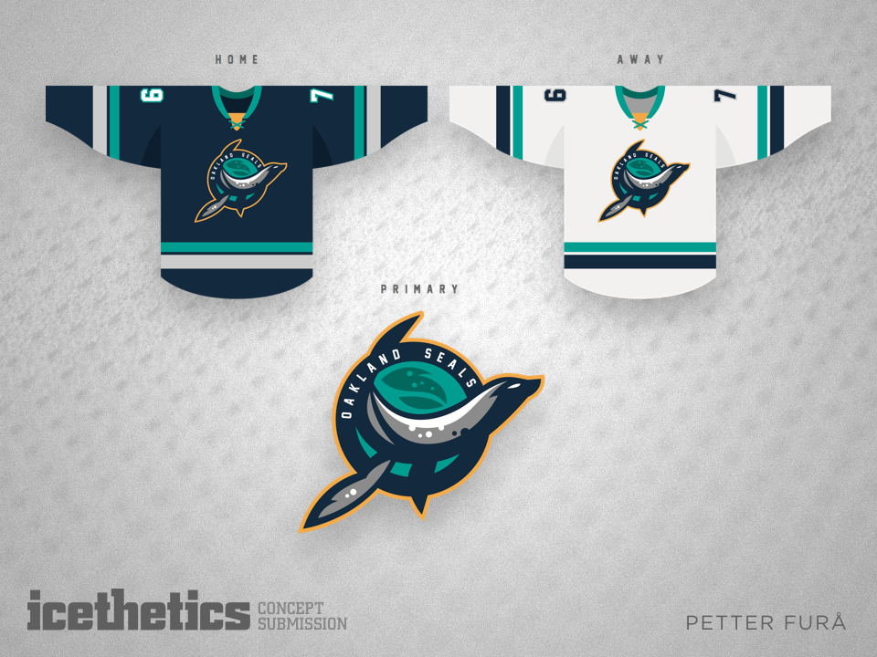
#15 · Petter Furå: The Seals Resurrected
Petter Furå's simple design style is a personal favorite of mine. Clean, minimalist, and completely unique, his resurrection and redesign of the Oakland Seals identity was positively stunning. And clearly I wasn't the only one who thought so. Most of you did as well!
"Easily one of the best, if not the single best, concepts I've seen on Icethetics. Amazing work!" —Jim Nicholson
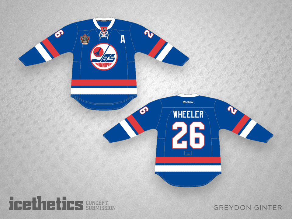
#14 · Greydon Ginter: Winnipeg Heritage
Following the announcement that Winnipeg would host the next NHL Heritage Classic, Greydon Ginter's idea was simple — adapting a classic design to a modern jersey. The Jets ended up going with the white version of their classic sweater, but the high rating of this concept proves the club would've been successful either way.
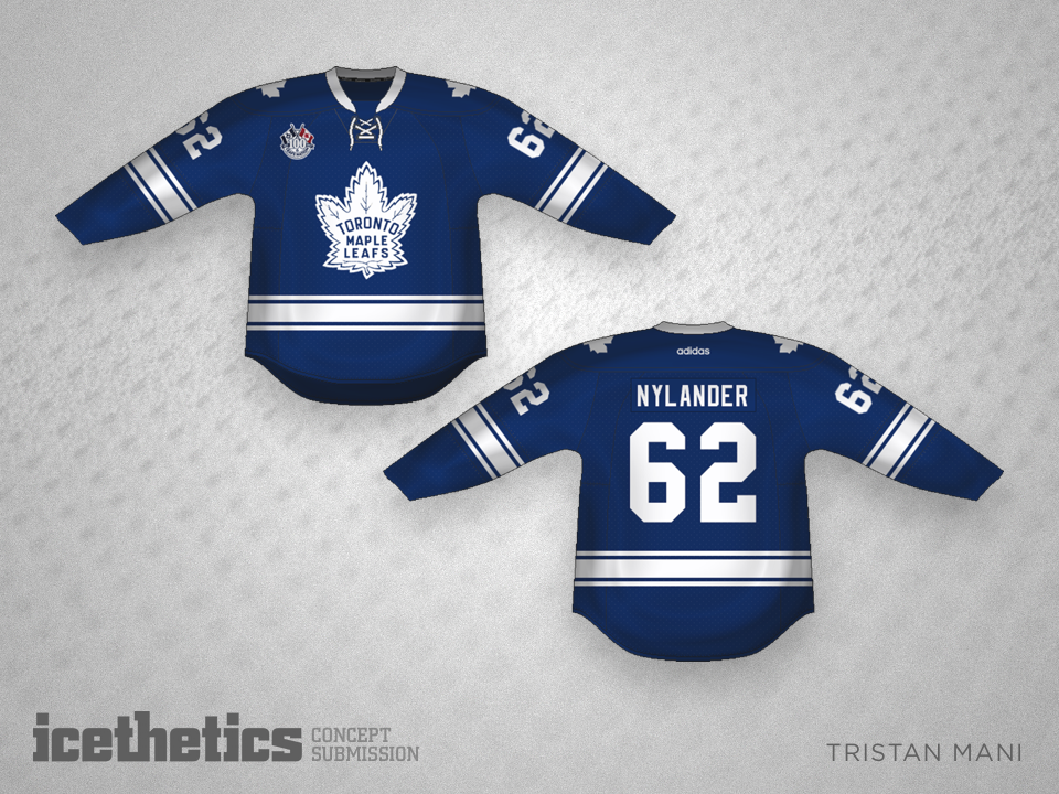
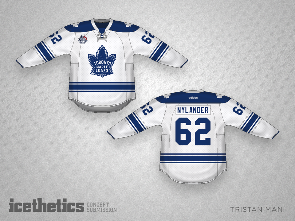
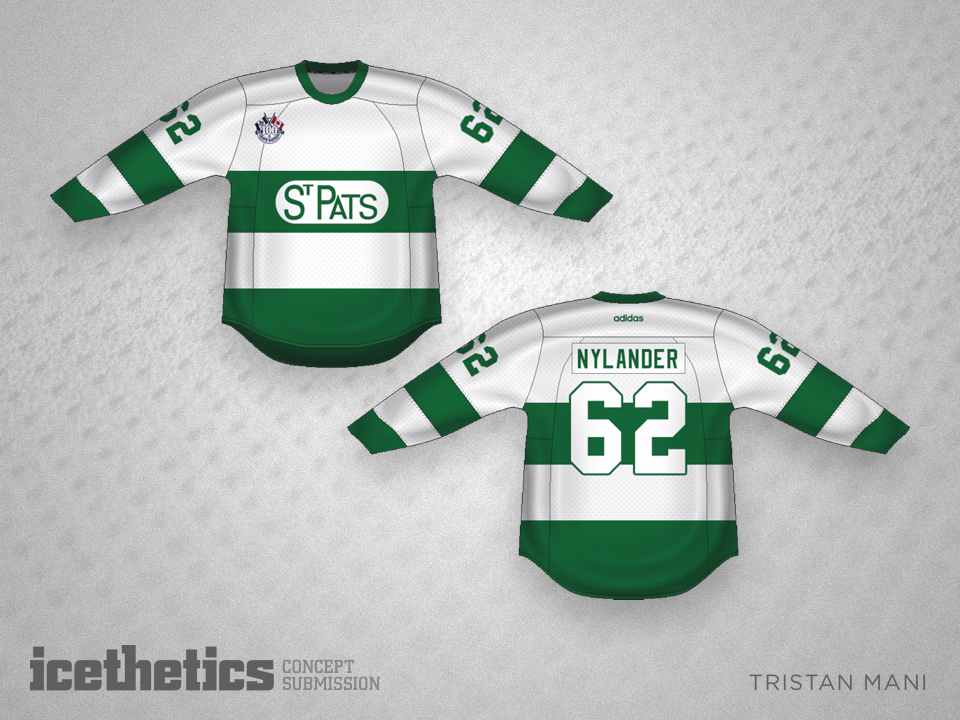
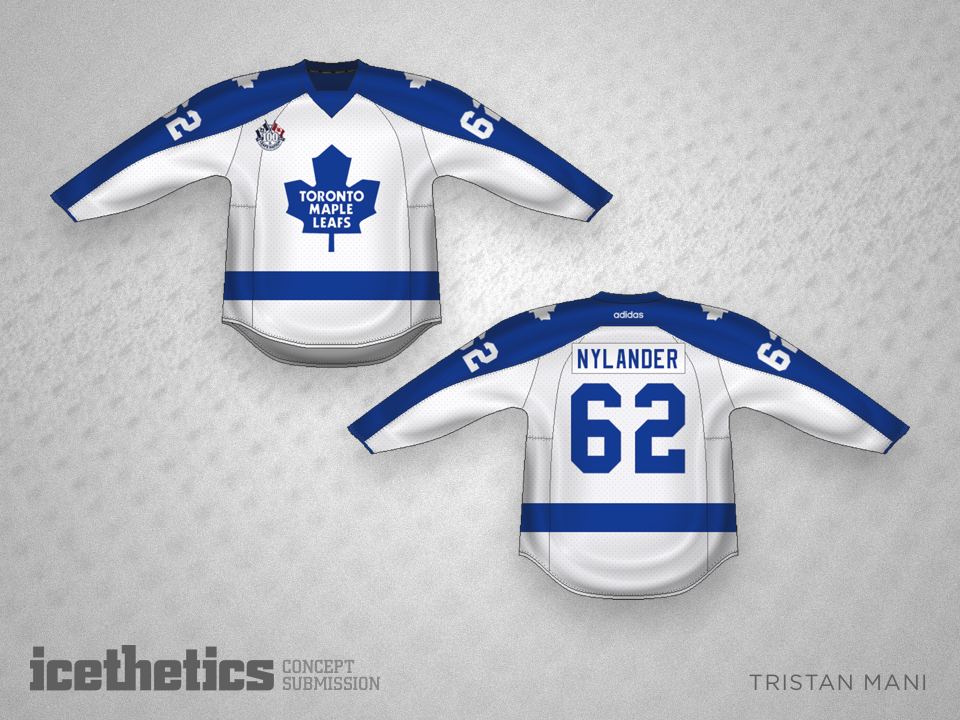
#13 · Tristan Mani: Toronto Centennial
For the second year in a row — and fourth time ever — Tristan Mani cracked the best list with his suggestion for the Toronto Maple Leafs' centennial season. It came before we knew the Leafs would get a new logo for their 100th birthday but despite that it stands up extremely well.
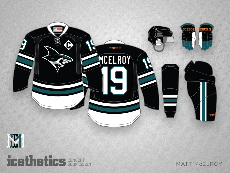
#12 · Matt McElroy: Angrier Sharks
Not a year has gone by without the illustrious Matt McElroy making our countdown — and don't be surprised if you see his name again later on in this list. But here at #12 is his use of the San Jose Sharks' Los Tiburones logo that really resonated with readers.
"Absolutely brilliant! I want this jersey. I want to buy it!" —Franck Baker
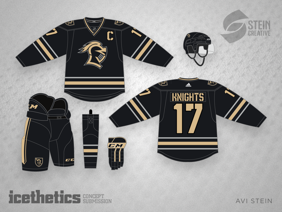
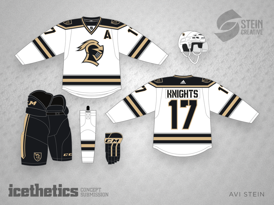
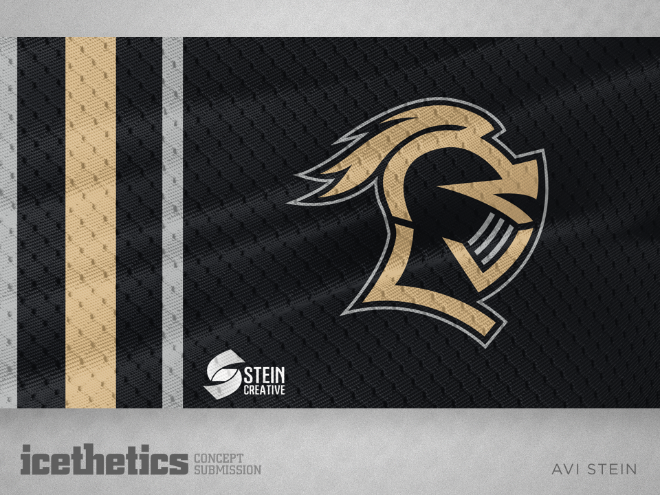
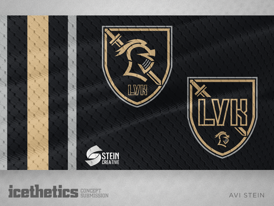
#11 · Avi Stein: Las Vegas Knights
In the months leading up to the Vegas Golden Knights' name and logo announcement, there was no shortage of concept submissions aiming to predict what the new NHL club would look like. Avi Stein's was the community's clear favorite as the highest-rated concept in the category.
"Classic with a modern twist. This is a great concept. Id love to see these jerseys in the NHL." —Jeffrey Thunders
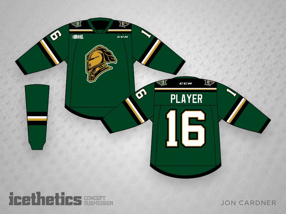
#10 · Jon Cardner: The Original Knights
We enter the top 10 with the original Knights — the OHL club from London. Jon Cardner's contribution reminded us why the new NHL franchise couldn't simply be named the Las Vegas Knights. And he did it with a rather beautiful redesign of the team's jerseys.
#9 · John Elbertson: Chocolate and Cream
The Hershey Bears have arguably one of the most untouchable looks in the minor leagues, but that doesn't mean there's no room for extra touches. This classic, two-tone look made for one of the best-looking concepts of 2016.
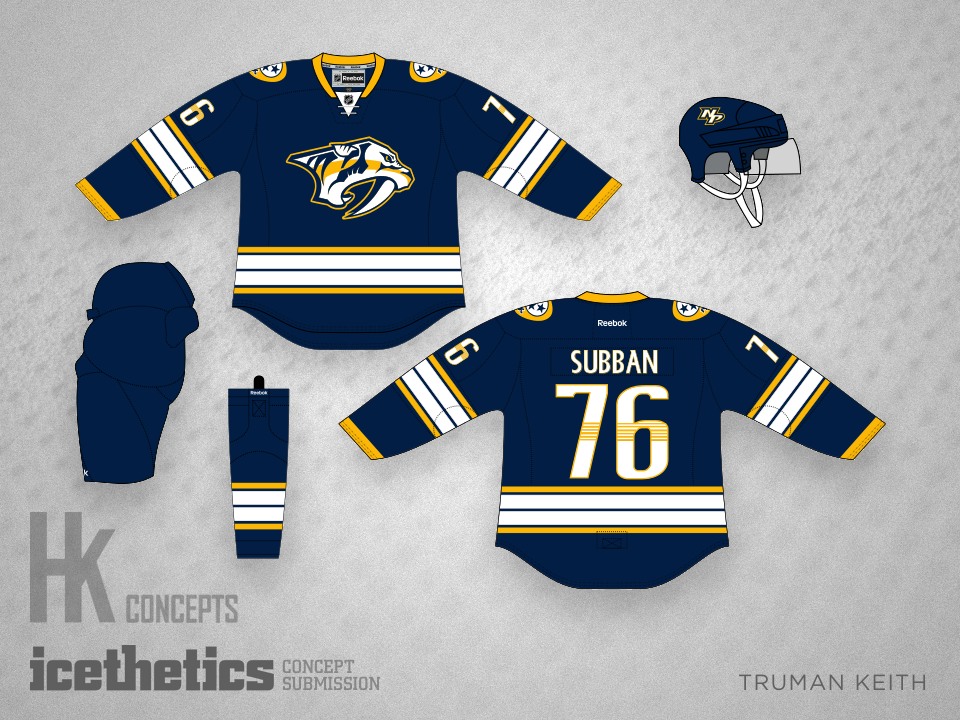
#8 · Truman Keith: Nashville's Blue Option
Truman Keith burst onto the scene this year with some beautifully simple redesigns. But none was more well-received than his blue third jersey concept for the Nashville Predators.
"Wonderful jersey! Nashville, this would be a top seller!" —Stephan Stavseth
#7 · Bryan Dyck: The Forgotten 50th, Part 2
In October we saw a couple of concepts imagine what it might look like if the Dallas Stars celebrated the 50th anniversary of the franchise in 2016-17. Bryan Dyck made an impact on readers by resurrecting details from the old Minnesota North Stars sweaters.
"(slow clap, rising to loud applause) Excellent work." —ScreamingViking
#6 · Andy Bourne: Tampa Perfection
If Steve Yzerman and the Tampa Bay Lightning ever needed proof that black is a necessary part of the team's color palette, they should look no further than this simply brilliant uniform set from Andy Bourne. His design revises the club's modern logo while incorporating elements from the past with a classic, traditional striping layout.
"As a HARDCORE Lightning fan, I gotta say these are much better than the sweaters we have now! Great job!" —Corbin Burdette
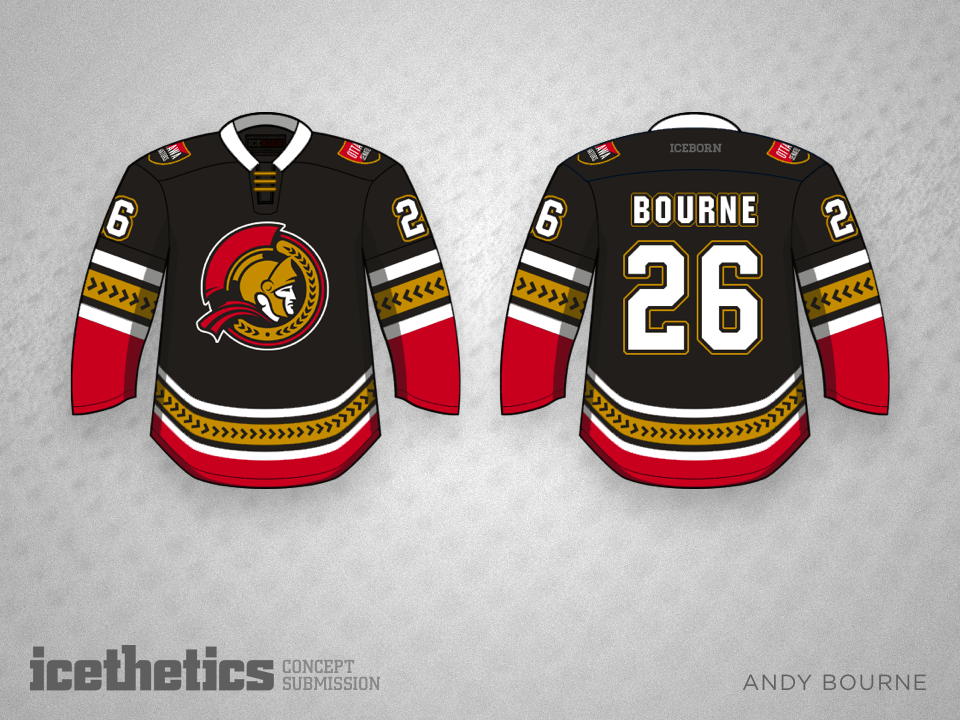
#5 · Andy Bourne: Ottawa Wow
Andy Bourne hit the jackpot with the coveted back-to-back slots in our concept countdown. Every year an Ottawa Senators jersey ends up on this list and this year is easily one of the all-time best. I'm starting to think the NHL should just hire Andy Bourne to redesign all their uniforms. They would be absolutely immaculate.
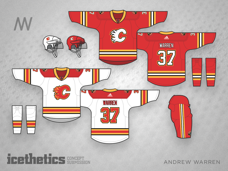
#4 · Andrew Warren: Classic Flames
Like the Sens, the Calgary Flames are in dire need of a uniform update — which they're likely to get from Adidas this summer — but really all they need is this beautiful set from Andrew Warren.
"Outstanding. Clean, classic, and professional. Infinitely better than the nonsense they currently wear." —Brian B.
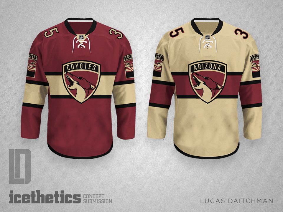
#3 · Lucas Daitchman: Identity Swap — Cats and Dogs
Lucas Daitchman has easily become the most prolific concept artist every to contribute to Icethetics. His submissions in 2016 easily numbered in the hundreds. With that kind of volume, it's hardly surprising he's made this list. But he did it in style — the first Freak Out Friday post ever to make it this high on our countdown! And all he had to do was draw some parallels between the new Panthers' branding and the Arizona Coyotes.
"These are amazing!!" —Ian Lee
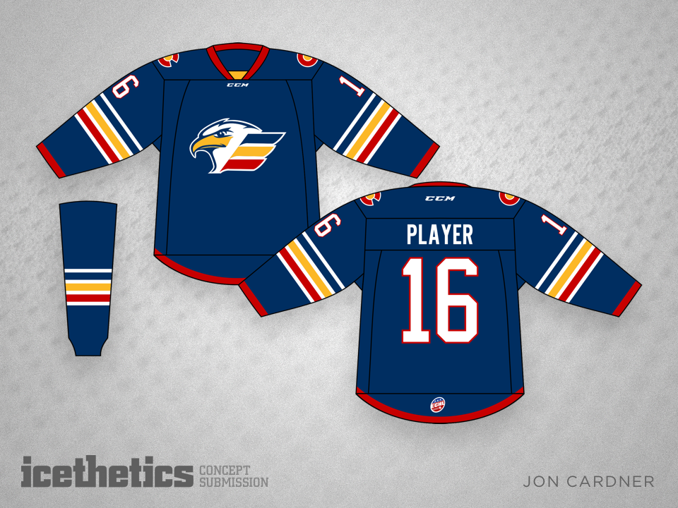
#2 · Jon Cardner: More Colorful Eagles
Minor league teams are often overlooked by Icethetics concept artists, so I made an effort in 2016 to highlight them as much as possibly with their own day of the week on Sundays. So for the fourth time in our countdown — and second time from Jon Cardner — it's a team from the minors! His colorful redesign of the ECHL's Colorado Eagles left readers in awe, earning a stunning full five-star average rating. Now if only we could get the Eagles to ditch their bland black and white uniforms we'd really be on to something!
"I love these, especially the blue. Great work!" —Max Well
#1 · Matt McElroy: Stars Over Los Angeles
Who else could it be?
For Matt McElroy, this will surely prove an unforgettable year. His brilliant work on Icethetics and the IceHL fantasy league finally got him noticed in the design circles that truly matter. Over the summer, he was hired to create the new logos and uniforms for the AHL's Springfield Falcons.
Perhaps the icing on his 2016 cake can be the recognition from his friends and peers here at Icethetics who absolutely loved art deco style concept for the 2017 NHL All-Star logo. It really was a beautiful design, but the NHL opted instead for a over-the-top glitzy look.
But as the best concept of 2016, Matt's idea will certainly not be forgotten!
And that's that. Fantastic fan concepts came through in 2016 and continue to roll in to my inbox every day. Now with excitement and anticipation at an all-time high as an expansion team prepares to hit the ice and Adidas takes over production of all NHL sweaters, 2017 is shaping up to be another incredible year on the Concepts page!
One more note to all the artists who have ever contributed. I know it's not easy to subject yourself to the opinions of strangers on the Internet, but I think we definitely have one of the best communities when it comes to constructive critiques. Thank you for taking part!
MORE BEST CONCEPTS: Best of 2015 | Best of 2014 | Best of 2013 | Best of 2012

