
Lightning reveal new away jersey, 25th anniversary logo
/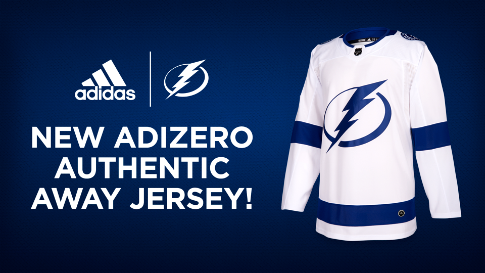
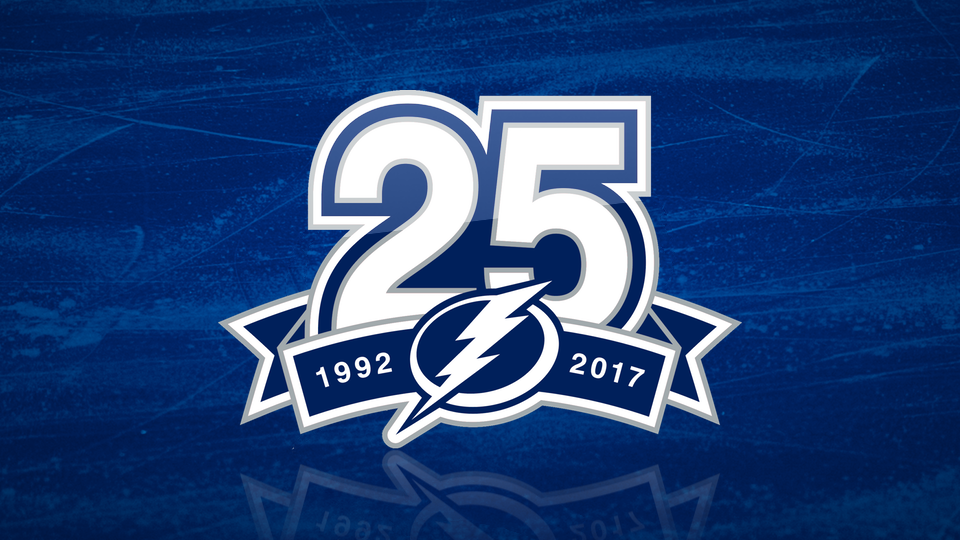
The Tampa Bay Lightning unveiled their new white road jersey tonight along with their 25th anniversary logo during a special draft party for season ticket members.
For the most part, the new sweater isn't a huge departure from the old one. But "TAMPA BAY" has been removed from the crest, creating a cleaner design that allows the bolt to stand on its own. It's a simple change but it looks good. (If only the Canucks had thought to do the same.)
As for the 25th anniversary logo, it lacks some of the bite we saw five years ago with the 20th — but the bolt worked so well as a "0" so it would be hard to get that wrong. Still, it's a classic design and will probably still look good when we find it in old pictures another 25 years from now.
Would I have liked more out of the logo? Speaking as a Lightning fan, of course, but it could always be worse. And who doesn't like Helvetica, anyway?
So with two events this season and logos already on both shoulders, how will the Bolts handle the 25th anniversary and 2018 NHL All-Star Game patches? It's a little odd, actually. The 25th patch will be worn on the front of the blue home jersey all season. On the white jersey, the ASG patch will be used until the All-Star Game, then the 25th patch will replace it for the rest of the season.
In wrapping up here, I'm excited to announce that the Lightning enlisted me to write up the history of the team's uniforms for their website! Check it out!