
Minor leagues teem with milestone marks
/I'm catching up on blog posts after a relaxing two-week vacation, ditching the northwest for a more tropical climate. Some things happened while I was away and I'd like to get them on the record here.
The other day I wrote about the teams celebrating their 20th anniversaries with commemorative logos in the 2017-18 season. Today I want to tackle some of the other minor league milestone marks we got.
ECHL
On July 4, the ECHL brought out their own stars and stripes in the form of a new 30th anniversary logo.
The press release credits the design to Royer Designs of Toledo, Ohio — a first-timer in this field as far as I can tell. But it's a great look and should represent the league well next season.


The ECHL's previous anniversary logo was its 25th during the 2012-13 season.
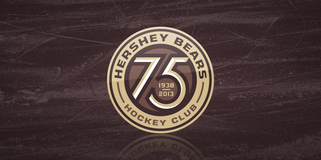
Hershey Bears
The oldest team in the AHL is becoming an octogenarian. The Bears are 80 years old this season!
The team revealed this 80th anniversary logo on June 28. It's another great bit of work from Joe Bosack, who was hired to redesign the club's logos in 2012-13 for their 75th anniversary.

These are undoubtedly some of the best logos in minor league hockey.
By the way, I said the Bears are the AHL's oldest team but I should clarify that they're the oldest still in the same city they started. The Hartford Wolf Pack and Utica Comets can trace their lineage to 1936, but lots of relocations have happened in between. Speaking of Utica...
Utica Comets
The Comets' 5th anniversary mark commemorates their time in upstate New York, since leaving Peoria. It may seem odd to celebrate being around just five years, but the Vancouver "V" reference is too good.
The logo was revealed on July 9 but the Comets haven't yet said whether it will be worn on the uniforms.


The Comets also wore an "inaugural season" patch when they debuted in 2013-14. Great logos all around for this team as well.
The logos in this post have really gotten it right! And there's one more.
Everett Silvertips
We'll wrap up in my neck of the woods — the Western Hockey League. The Everett Silvertips here in Washington are embarking on their 15th season. But instead of an anniversary logo, the team announced July 12 they will wear special "throwback" home and road uniforms.
The Old English-style "E" is the crest from the new jerseys, which are based on a design the team has used on special occasions in recent years. But it's not a true throwback. Keep in mind the team was founded in 2003.


The Silvertips previous celebrated their 10th year in 2012-13 with a pair of anniversary logos.
Tri-City Americans
Another Washington-based WHL club, the Tri-City Americans, are turning 30 this year. They have an anniversary logo that features their secondary mark at the center.
The Americans relocated to Kennewick, Wash. from New Westminster, B.C. in 1988.


In 2012-13, they used this 25th anniversary logo which was rather shamelessly lifted from the New Jersey Devils, who turned 25 in the 2006-07 season. Here's a look at the original in case it escapes your memory.


Speaking of which, the Devils have a 35th anniversary logo on the way, according to Michael Raisch of Fanbrandz. He says they're currently working on the design.
I think that covers it. Any others I missed?
UPDATE (7/24): Yep, there's another one in the minors! (Thanks, Sean.)
Iowa Wild
Like the Comets, the Wild are also reaching their fifth year in the AHL. And there's a logo.
It's a bit heavy on text — Iowa gets name checked not once but twice — and it doesn't work great on green or wheat backgrounds, but the design isn't bad. Symmetry is usually the name of the game in logos like this these days so they get creativity points for the off center Wild logo at the top.


And also like Utica, Iowa had an inaugural season logo during the 2013-14 season.
UPDATE (7/25): Since we're talking minor league anniversary logos in this post, I should probably include the one that was designed and voted on right here at Icethetics.
South Carolina Stingrays
Last fall, the Stingrays enlisted the talented concept artists that frequent the site to help them create a logo to commemorate their 25th anniversary in 2017-18.
We held a contest to design not only a logo but an alternate jersey that will be worn during the season. The winning logo came from Brooks Freeman. The winning jersey was designed by Benjamin Rajaobelina.


The Stingrays previously marked their 20th anniversary in the 2012-13 season.
UPDATE (7/30): Just came across another one I missed from a couple weeks ago.
Ontario Reign
The Reign are celebrating a decade in Ontario, California.


Of course this is a somewhat misleading anniversary. The original Ontario Reign franchise was founded in the ECHL when the Texas Wildcatters relocated in 2008. Then in 2015, when the AHL decided to add a Pacific Division, the Los Angeles Kings wanted to use their ECHL city, so the Reign and Manchester Monarchs essentially switched cities and identities.


Technically, the lineage of the current Ontario Reign franchise shows they were founded in 2001 as the Manchester Monarchs of the AHL, making this their 15th season. But anniversary events like this are little more than marketing tools to sell tickets and merchandise. And as far as Ontario hockey fans are concerned, this will be their 10th year cheering on the Reign.