
Loose Threads: Isles leak, Jets wordmark, and Avs confusion
/Haven't done a Loose Threads post in a while, but with everything that came up over the past week, it seemed like a good time to dust it off.
First, the Edmonton Oilers surprised us on Tuesday morning with the reveal of their throwback jersey and 40th anniversary patches to be worn throughout the season. The royal blue retro sweater will be used four times in 2018-19 against former Smythe Division opponents.
Then later that day, the 2019 NHL Winter Classic jerseys for the Boston Bruins and Chicago Blackhawks were leaked to Icethetics. Both teams are going with throwback mashups from the 1920s and 1930s — really digging into the archive there.
And there's a lot more that hasn't made it onto the blog yet. Let's dive in with the New York Islanders. Their new third jersey design was leaked last Saturday on Twitter. It's blue with white shoulders — and clearly inspired by the 2014 Stadium Series sweater the club wore and subsequently used as an alternate for a year.
Image from @TwoTurtleDuffs via Twitter
I wasn't sure about its legitimacy at first, but I've since gotten confirmation from multiple confidential yet well-placed sources. So it's probably fair to say we will see this on the ice in 2018-19. No word yet on when the Isles plan to make it official.
I have a few thoughts on the design. The new crest is a nice evolution of the NY logo that was plucked out of the club's longtime primary logo for that Stadium Series jersey. Unfortunately, the design wasn't well-balanced on its own and the chrome treatment was a major misfire. They made some adjustments for the black Brooklyn jersey a year later.


I think they finally nailed it this year by flattening the stick and moving the stripes down to the blade. At least now you can tell yourself it's just meant to represent tape rather than The Only Four Stanley Cups They'll Ever Win. I just think embedding into your primary logo symbolism that points to one specific time in your history is a bit short-sighted. But that's just my take.
As for the rest, I was hoping to see an orange jersey from the Isles again as the earlier reports indicated. Teams should take chances with their third jersey. The Islanders did in 2015 with that black jersey. It may not have been the most popular jersey ever made, but it was cool. This new design — if accurate — doesn't feel different enough from the primary jersey. Plus, the trend of killing the waist stripes seems to be alive and well, so that's annoying too.
There are two other interesting details you might've picked up on. It looks like a silhouette of Long Island appears on the inside of the collar as a hanger effect — possibly alluding to the the fact that the Islanders are, in part, returning to the Nassau Coliseum this season. The club will split its home games between there and Barclays Center. That shouldn't be too confusing. Better check your tickets before you head out the door on game night.
Lastly, there seems to be a new script logo on the helmet, though with this image quality, it's difficult to make out any of the details. At least that gives us something to look forward to at the actual unveiling — whenever that might be.
Speaking of new script logos on helmets, the Winnipeg Jets have something new as well.
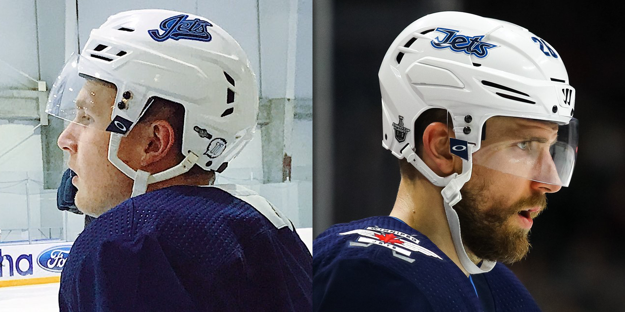
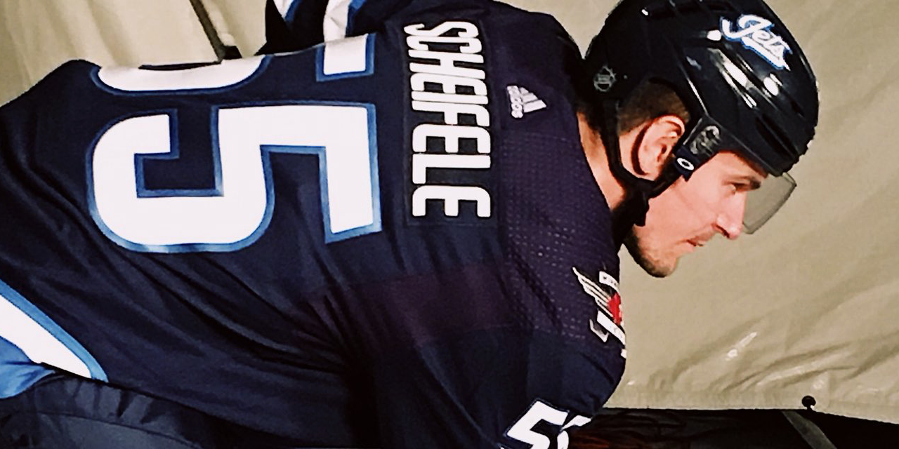
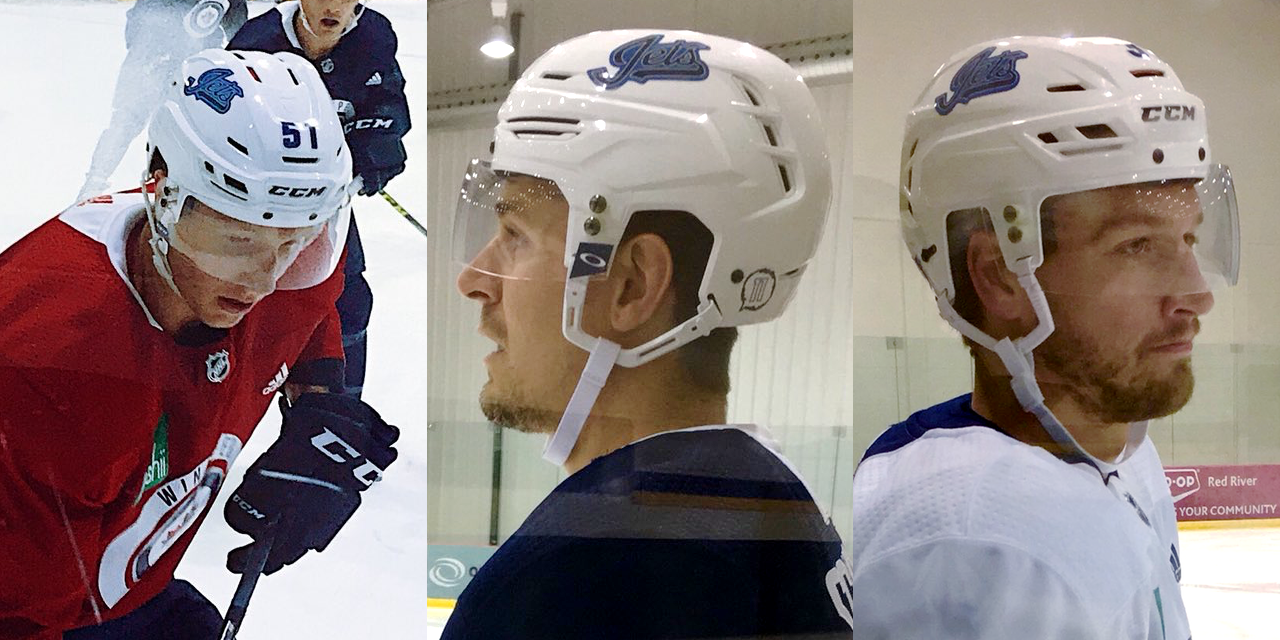
In several photos tweeted by the Jets from practice sessions, the YoungStars tournament, and a Mark Scheifele photo shoot, we can clearly see the new design, which matches what fans found when their season ticket packages began to arrive — confirming the upcoming third jersey unveiling.
Photos from @WickedFictitious and @mremis
All of this has added fuel to the speculation that the Jets' new third jersey will be aviator blue with this new script logo as the crest. At this point it wouldn't surprise me and it would probably be a nice choice.
Final item of the day is about the Colorado Avalanche. On Thursday, they published an article on their website about Fan Fest, which is scheduled for Sept. 29. The original text included a mention of "the new Avs third jersey" in a list of prizes being given away at the event.
If you click that link now, you won't find a mention of a third jersey anywhere. Within 24 hours, it had been deleted from the article. Weird, right? I grabbed a screen shot of the original page just to be sure I wasn't going crazy.
Screen shot from Colorado Avalanche official website
You can see the relevant portion highlighted. It's not clear why Avs suddenly removed this reference to their widely anticipated new sweater. Will it still make an appearance at Fan Fest? Or did the Avs suddenly decide not to have it there at all?
As far as the design, I'm really not expecting anything much different from the navy blue third jersey the Avs introduced in 2015 with the Colorado Rockies-inspired crest. Perhaps, like the Blue Jackets, the Avalanche want to avoid the appearance of duping fans by "unveiling" a jersey they've already worn for a couple years. Sure, it'll be in the new Adizero cut, but the design should remain largely the same. In fact, that particular jersey seemed to have been designed with Adizero in mind — using the squared corners on the shoulders, for example.
That's all I've got for now. I'll continue to keep the JerseyWatch updated as news comes in.