Jets Jerseys Coming 9/6

Just past noon in Winnipeg today came the tweet we've all been waiting for.

It's true. After much waiting, the Winnipeg Jets will finally unveil their new home and road uniforms to the world in just four days — on Tuesday, Sept. 6. The team's tweet gave no other details about the event, but other media outlets were able to fill in the blanks.

The Winnipeg Free Press reports the unveiling will take place at the 17 Wing Winnipeg base in St. James. The connection to the Canadian Air Force is lost on no one, of course. The article didn't specify the time, but I've read 11 AM Central, for those interested.
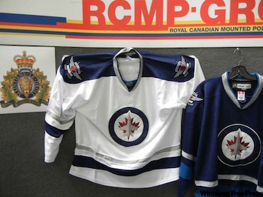
RCMP bust jersey counterfeitersBut believe it or not, as far as I'm concerned, that wasn't the most exciting Jets jersey news of the week. Apparently, the RCMP busted up a ring of counterfeiters! Good for them!

It probably goes without saying, but if you were one of the misguided souls who gave your money to criminals, you probably shouldn't count on getting what you paid for.

One weird thing about the bust. RCMP said there were 40 jerseys and said they were worth $12,000. That's $300 a piece if your math skills are failing you. My guess is they're basing that figure not on what the counterfeiters were charging but on what the real authentics will likely cost. Rounded up.

Anyway, as I've pointed out many times before, True North has already said the uniforms look nothing like this and I take them at their word. After all, when the logo leaked, rather than denying it, they quickly threw together a press conference to officially unveil it.

I get the feeling the actual jerseys aren't going to be what anyone was expecting. But we'll find out for sure on Tuesday morning, won't we?

One more jersey to vote on
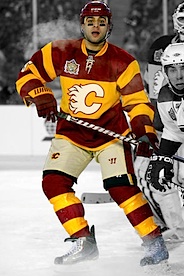
For the last few months, I've been conducting a series of polls to determine a ranking of NHL uniforms used during the 2010-11 season. In that time, you've voted on all the jerseys for all 30 teams. Except for one, as I discovered when trying to put together the final ranking.

I left out the Calgary Flames' Heritage Classic jersey because I actually set up the Canadian teams' polls just prior to the outdoor game in February. I feel I can't assemble a comprehensive list without a vote on this, so take a look and rate it 1, 5 or 10.

For what it's worth, there's no point to holding a poll for the Montreal Canadiens' Heritage Classic jersey as it was practically identical to their road jersey.

And sorry for the delay on this. The good news is it should be put to bed just in time for the Icethetics Season Preview in a few weeks! Can you believe it's already September?!

Royals unveil new home, road jerseys
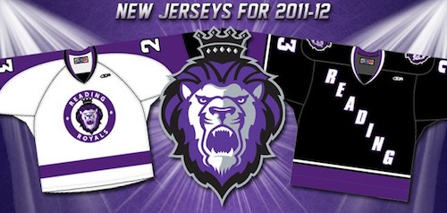
Reading Royals unveil new uniforms / FacebookThe ECHL's Reading Royals will sport a new look for the 2011-12 season.

The new sweaters were revealed on the team's website and Facebook page back on Aug. 22. (What? I've been busy.) 

The Royals are affiliated with the Bruins and Maple Leafs but their new uniforms look rather borrowed from a team with which they share a state (the Flyers) and a team which they share a color scheme and similar identity (the Kings). Weird, right?

Still, these are solid hockey uniforms. Let's be honest, you could pick worse teams to emulate. Like almost any fellow ECHL team, for example. So my kudos to the Royals!

Knights bring back the green
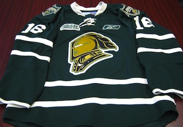
OHL Knights new third jerseyThe OHL's London Knights unveiled a new green third jersey on Tuesday. And it looks absolutely stunning. Dallas Stars, are you paying attention?

The new jersey was revealed at a press conference introducing the newly acquired Max Domi — yes, that would be Tie Domi's kid. And what more is there to say about it really? It's just awesome. And a shame no one in the NHL aside from the Wild will be wearing anything like it.

You can read more details about the acquisition of Domi and see video of him trying on the new threads right here.

In other news, I have some links that some readers have shared to further share with the rest of you:

  • Brock B. writes in to tell us about the WHL's Lethbridge Hurricanes officially changing their logo. They've been using it on an alternate jersey, but it's getting promoted this season. And it's a blatant rip-off of the Washington Capitals' look. For shame, Lethbridge. Hurricane Watch
  • John W. wants us to know that just because there's no Heritage Classic this season doesn't mean hockey fans north of the border won't be treated to some high quality outdoor hockey. The Hamilton Bulldogs will host the Toronto Marlies in the elements this winter. TSN
  • And finally, I don't have a link for this, but The Hockey News published its annual NHL logo ranking this week. Naturally, Chicago tops the list. Surprisingly, the Canadiens were No. 3 and the Jets were way too high at No. 8. (It got 4% of the overall vote but that's clearly a soft number.) The Lightning's new logo was dead last. Who do I see about that?

Minor League Report, Part II

As a continuation of yesterday's post, a couple of minor league hockey fans have written in with jersey news to share.

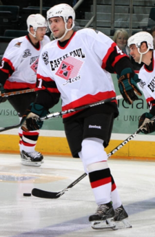
Guillaume Desbiens #41The Manitoba Moose celebrated Hockey Night in Manitoba last night, paying tribute to minor league and youth hockey across the province.

Part of the promotion includes the Moose wearing the sweater of the Community Jersey Program winner for the game. In this case it was the East St. Paul Aces (photo, right) — from the East St. Paul Community Centre.

The Moose have more photos from last night's game up on their website if you're interested. They lost 2-1 to the Toronto Marlies.

By the way, it's all happening again next year, so if you're involved with a Manitoba hockey organization, and you want to see the Moose wear your jersey, get the details here.

Thanks to Trevor for the heads up.


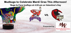
Daniel also writes in regarding his Bossier-Shreveport Mudbugs of the Central Hockey League. They've got a couple of specialty jerseys on tap, including one tonight.

Mudbugs Mardi Gras jerseyTo celebrate Mardi Gras, the Mudbugs are wearing specially-designed (and rather tacky, I have to say) sweaters this afternoon against the Corpus Christi Ice Rays.

Believe me, I will post game action photos as soon as I can find them.

The Mudbugs say they will be auctioning off the jerseys over the next week but it isn't clear where the money will go.

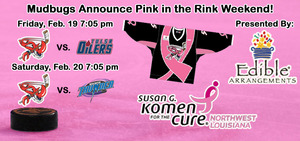
Mudbugs Pink in the Rink weekendBut wait, there's more from the Mudbugs. Their Pink in the Rink event takes place next weekend, on February 19 and 20. And they're not just auctioning jerseys, according to their website.

Other items to be auctioned off during the weekend include: team captain Brett Smith’s pink helmet (to be worn during pre-game warm-ups), various autographed pink Mudbugs hockey sticks, a pink referee’s jersey which will be worn by the official and even the pink tie that Head Coach Scott Muscutt will wear behind the bench during the weekend.

Yes, a guy's pink helmet and a pink ref's jersey are actually on the auction block. Don't everybody bid all at once now. Some of the proceeds from the auction will benefit Komen for the Cure of Northwest Louisiana. Not sure where the rest are going.


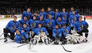
London Knights don blueAnd we finish with a follow-up to a recent post about the OHL's London Knights' plan to go blue for the Make-A-Wish Foundation.

Ryan sent in this photo (right) from the Knights' website taken last weekend. The Knights beat the Brampton Battalion 4-1 while wearing the blue.

Next weekend, I'll be keeping an eye out for photos from the Mudbugs' and ECHL Florida Everblades' Pink in the Rink events. I actually plan on going to the Blades game so I may have some photos of my own to share.

A Certain Kind of Crazy

Yesterday I posted a handful of notes relating to the recent rash of specialty sweaters both in the NHL and the minor leagues. I saved a couple for today because they're just a certain kind of crazy that deserve a post all their own.


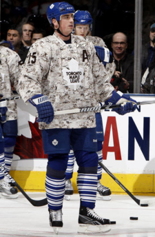
Tomas Kaberle #15This one, too, begins with the Toronto Maple Leafs. Earlier tonight, they joined couple of other NHL clubs who have paid tribute to the military with special camouflage warm-up jerseys in 2009-10.

Don't misunderstand, these teams always seem to have their hearts in the right place when they do these things, but I do think it's sometimes a bit nuts.

The Leafs offered a few more details regarding the reason for tonight's military-themed sweaters.

More than 360 Canadian Forces personnel attended the game at the invitation of Maple Leaf Sports & Entertainment. Gen. Walter Natynczyk officiated the ceremonial puck drop before the game, and was visited at centre ice by former Leafs goaltender Johnny Bower, who was in full military garb.

If you're interested in more pictures from the warm-ups and pre-game ceremonies, the team's web site is happy to oblige.

For the record, it appears, to me at least, that the Leafs were wearing the same Reebok-made camo jersey that the Blackhawks and Ducks wore earlier this season.


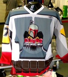
Icehawks' Star Wars jerseyAlso tonight, the IHL's Port Huron Icehawks hit the ice wearing what I can only describe as a visual atrocity.

At least most teams are bringing awareness to an important cause or donating auction proceeds to a worthwhile charity. The Icehawks are just dressing up in Star Wars-themed jerseys for an evening!

All right, to be fair, these jerseys are being auctioned for charity — the Cherry Beach Council on Aging. And before you scoff, think of your grandmother.

Still, Star Wars Night? Really? TheForce.net — not kidding — posted a press release about the event, which included the following:

Star Wars jersey in actionThe Port Huron Icehawks are hosting their 3rd annual Star Wars Night on Saturday, January 30, 2010 at McMorran Arena. The players will be wearing specialty Star Wars jerseys to be auctioned off for charity. Proceeds benefit the Cherry Beach Council on Aging.

Bounty hunters from all over the galaxy will want this one-of-a-kind piece of Icehawks/Star Wars memorabilia! The action goes into hyperspeed as the Icehawks take on the Flint Generals at 7:30 p.m.

These extremely cool jerseys were designed by Great Lakes Garrison member Scott "Crow" Withers TK-1491.

Two things: 1) Playing fast and loose with the term "extremely cool," aren't we? 2) This is the third time they've done this?! It's true. A photo gallery, for those among you who would dare to boldly go where no... wait, that's not right.


Finally, we end the night with the OHL's London Knights. These guys normally wear green and gold, but when it comes to raising cash for the Make-A-Wish Foundation, they're all about the blue and gold.

For those who can't read the text on the image, here's all of the information we have relating to the special jerseys.

On Saturday, February 6th, be part of the House of Blue in support of the Make A Wish Foundation of South Western Ontario, presented by The Brick.

Knights players will wear blue jerseys which will be up for auction following the game with all proceeds going to Make A Wish. Join the London Knights and wear Blue!!!

I'll keep an eye out for pictures of these special jerseys next weekend.

Thanks to Ryan for the Knights tip, Victor for sending along the Icehawks link and Shaun for drawing my attention to the Leafs' military night jerseys.

Hershey Gets New Jerseys

As I mentioned last night on Twitter, there is an awful lot going on in the minors these days. Time to get everyone caught up. We'll begin with the AHL and work our way down.

The Calder Cup champion Hershey Bears have unveiled brand new sweaters for the 2009-10 season. They did so yesterday on their official web site — while I was busy with the Wild third jersey leak.

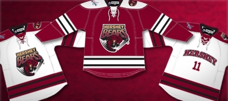
The Bears made the switch to the Reebok Edge style uniforms two seasons ago and were one of the few teams that kept changes to a minimum — HERSHEY placed diagonally down the front of the chocolate jerseys and BEARS down the front of the white ones. Those designs are no more.

Hershey Bears' new jerseys for 2009-10

The home and road sweaters will now place the team's primary logo front and center, while reserving a new text-based design for the alternate jersey. The new third takes its inspiration from the Dallas Stars' with the city name arched above the player's number.

The Bears have also announced the launch of the new sweaters will take place during their season opener in October.

The make of the jersey has remained the same, but the appearance has changed. Anyone looking to purchase one of the new jerseys can do so on opening night, October 3. As always, fans can customize their jerseys to have specific names on the back.

Thanks to James for the tip.

Moving right along now to the ECHL. The Ontario Reign will play host to the league's 2010 All-Star Game. It was announced yesterday that the logo for the event will be unveiled this Friday at 1 PM EST.

The Citizens Business Bank Arena will play host to the 18th ECHL All-Star Game which takes place on January 20, 2010. The event is sponsored by Reebok. No word on whether the All-Star jerseys will be debuted on Friday as well.

We'll finish up our look at the minors with the QMJHL. As you know the league is switching over to the Reebok Edge uniforms this season. Scotty from Hockeybums tells me the plan is for the league and Reebok to unveil all of the remaining uniforms on September 9. Not a hard date to remember — 09/09/09.

One more item now regarding the London Knights.

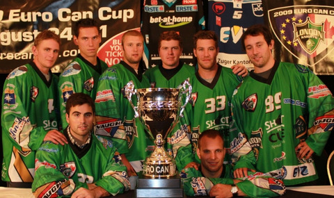
London Knights in their Euro jerseys

The Knights will be hosting the Euro Can Cup in which they and other participating teams will don European-style jerseys — as seen above. It's a rather awful sight. Organizers are hoping for it to be a success. I'm hoping it's not if for no other reason than those terrible uniforms.

You can read more about the event at the London Free Press. If you'd like to punish yourself by looking at more pictures of these jerseys, click here.

Retro Revamp for Logo Champ

Why repair what's not broken? Tradition is a common response in this sport. The only thing that bothers me about it.

The London Knights of the Ontario Hockey League officially announced last month their intentions to sport a new — or old, rather — look for the next season. Interestingly, they didn't even bother to post their own news release on their web site, but rather borrow from Ryan Pyette of the London Free Press.

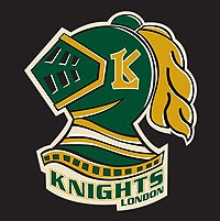
The Knights recently updated their web site to reflect the new symbol, seen here to the left. I'm all for a throwback except for when it goes out of its way to be aesthetically unpleasing. Which I feel like this does.

What I will give them is the new shades of green and gold. Huge improvements over the previous design. That's what you should be seeing on a hockey jersey.

GM Mark Hunter said, "When we took over the team, we didn't know what that Spider-Man Knight thing was. We wanted to go back to the old look, the green-and-white."

I half-agree with him. That logo was always a little off. While I don't know where he got "Spider-Man" from, it never seemed like it was balanced quite right. Despite its lack of clean, sharp design elements, this new logo is actually balanced.

However, I think hundreds of Icethetics readers and fans might disagree. After all, it was just over a year ago that the previous incarnation of the London logo beat out 19 others and was declared the best in the OHL by voters here. And not two months later, deemed to have the overall best logo of the 60 Canadian Hockey League clubs.

I think there could be no better reason to call a rematch. As we move into the summer, I plan to relaunch a feature that allows Icethetics readers to do what they do best: Express your opinion and vote! Logo tournaments will be back with a new format and everything. But I'm getting ahead of myself.

After the Knights unveiled their new logo, shouldn't a jersey have followed? Reebok has infiltrated even the OHL now and has deemed it inappropriate for any team to unveil their new look prior to the giant, soul-crushing corporation's say-so. Or more accurately, "The OHL has a new sweater agreement with Reebok so teams have to wait for the cue in early September." Right.

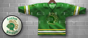
So we'll wait until then to see it, but in the meantime, the article says to expect something from the early days circa 1968-70. For a better idea of what that means, we visit KnightsHistory.com, an offshoot of the Knight's official web site. See the following image.

I really hope Knights fans are happy with this. I mean it's for you guys anyway. It just seems like taking a giant leap backwards. On one hand, yes, it truly looks like a hockey sweater. But on the other, "Those sharp-looking green third jerseys are done," writes Pyette.

Being a Lightning fan, I don't think I deserve a vote. So let's hear from some Ontarians. (Is that what you're called?) Is the retro look an improvement or did the Knights already have the best logo in all of Canadian junior hockey?