Desert Green

i
673 VOTES

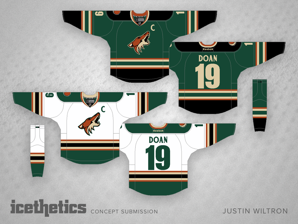
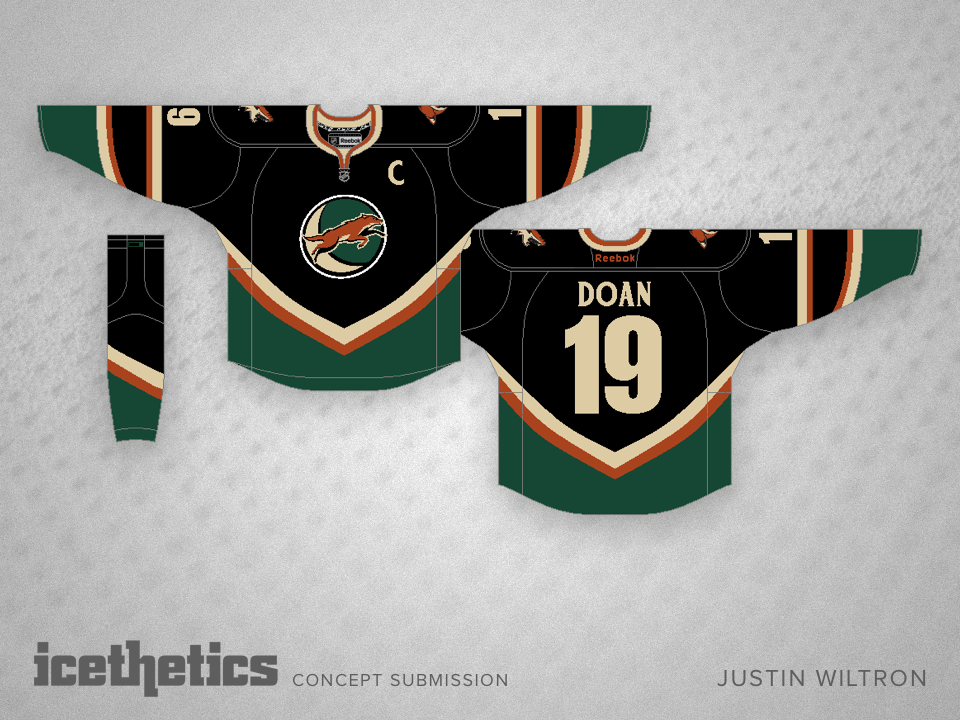
As the Arizona Coyotes embark on a new era, perhaps a uniform upgrade is in order. And maybe it could involve more than two colors. Justin Wiltron spices things up with a little green.

0 Comments
Share
i
RATE THIS CONCEPT

Coyote Beauty

i
603 VOTES

Kevin Dion sent in this concept prior to the Coyotes announcing their name change. As an alternate jersey, it would fit much better with the team's existing home and road aesthetic. Plus, change "Phoenix" to "Arizona" and they could wear it this fall.

0 Comments
Share

Turn Ahead the Freak Out II

i
700 VOTES

In 1998, the MLB thought throwback uniforms were getting stale so they decided to spice things up with their Turn Ahead the Clock promotion. They introduced what they thought were futuristic style uniforms. Needless to say, it didn't work out. But it still inspired David Parkinson to put together this Phoenix Coyotes concept. Happy Freak Out Friday!

0 Comments
Share

0642: Coyotes De-Edged

i
541 VOTES

Like many, Steven Grant has never been a big fan of the Reebok Edge jersey designs. So he's been slowly "de-Edging" the NHL. In today's entry, he tackles the Phoenix Coyotes with a sharp mix of old and new.

0 Comments
Share

0605: Desert Do Over

i
686 VOTES

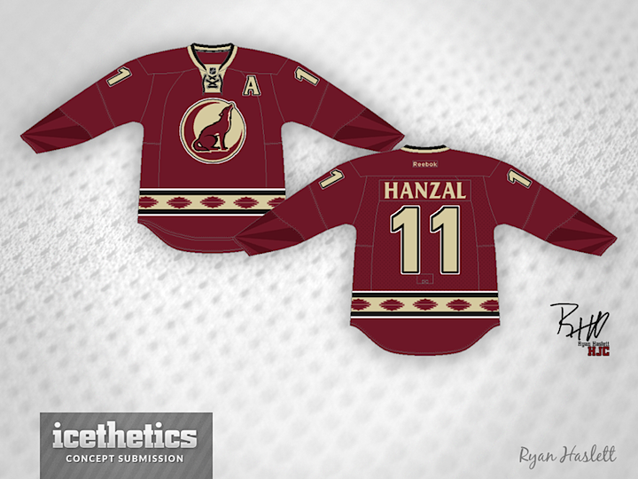
The Phoenix Coyotes become the Arizona Coyotes next year and with that brings an opportunity for an identity refresh. At the very least they could adopt a new third jersey. This one from Ryan Haslett borrows an unused logo from the club's 2008 third jersey prototype process.

0 Comments
Share