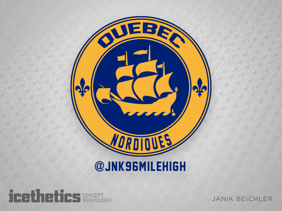
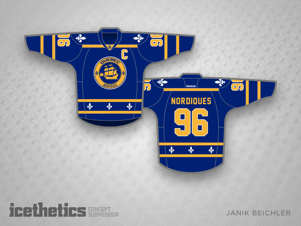
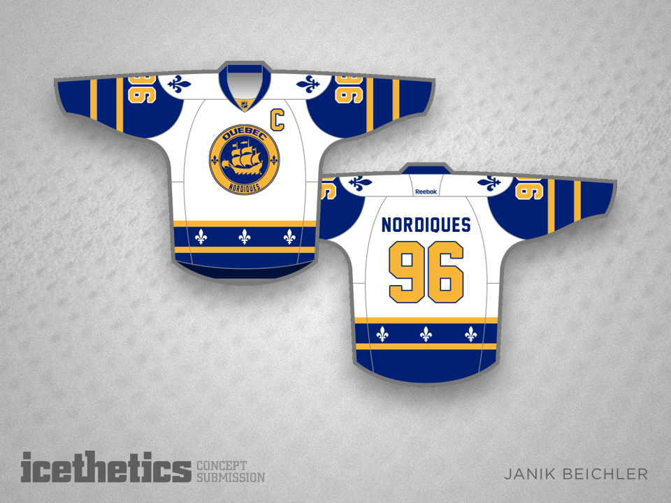
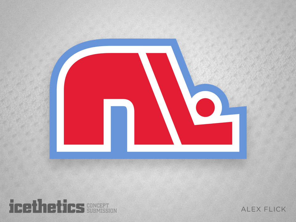
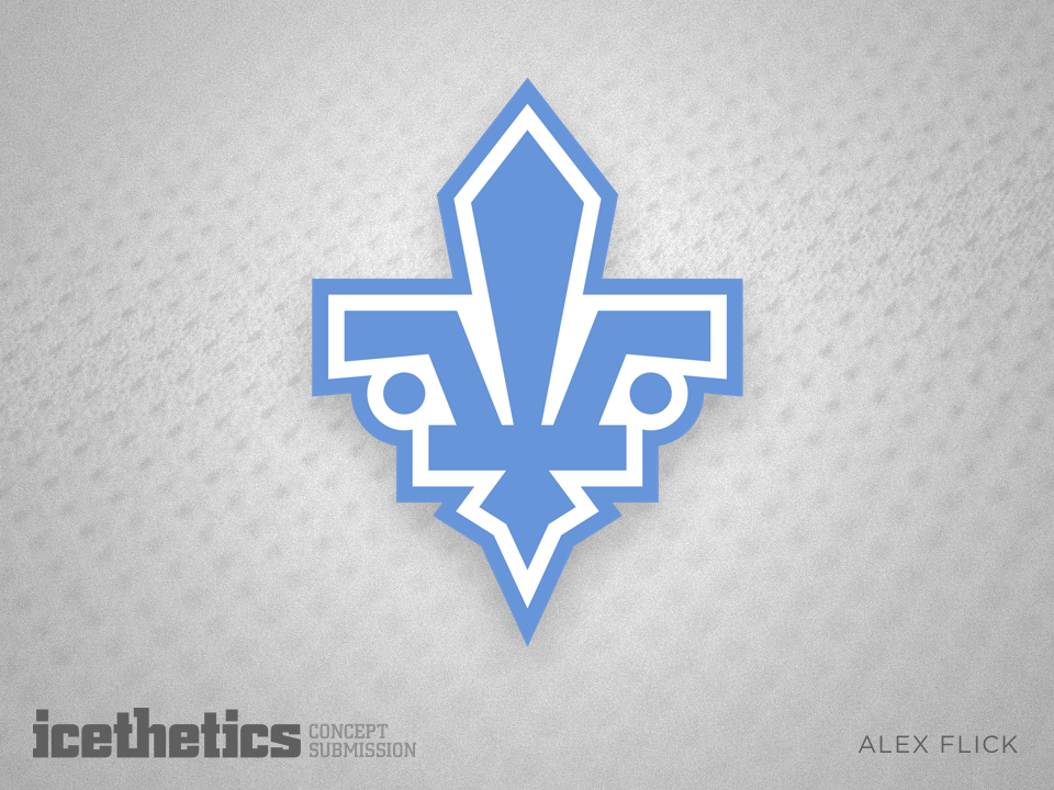
New Nords

i
289 VOTES

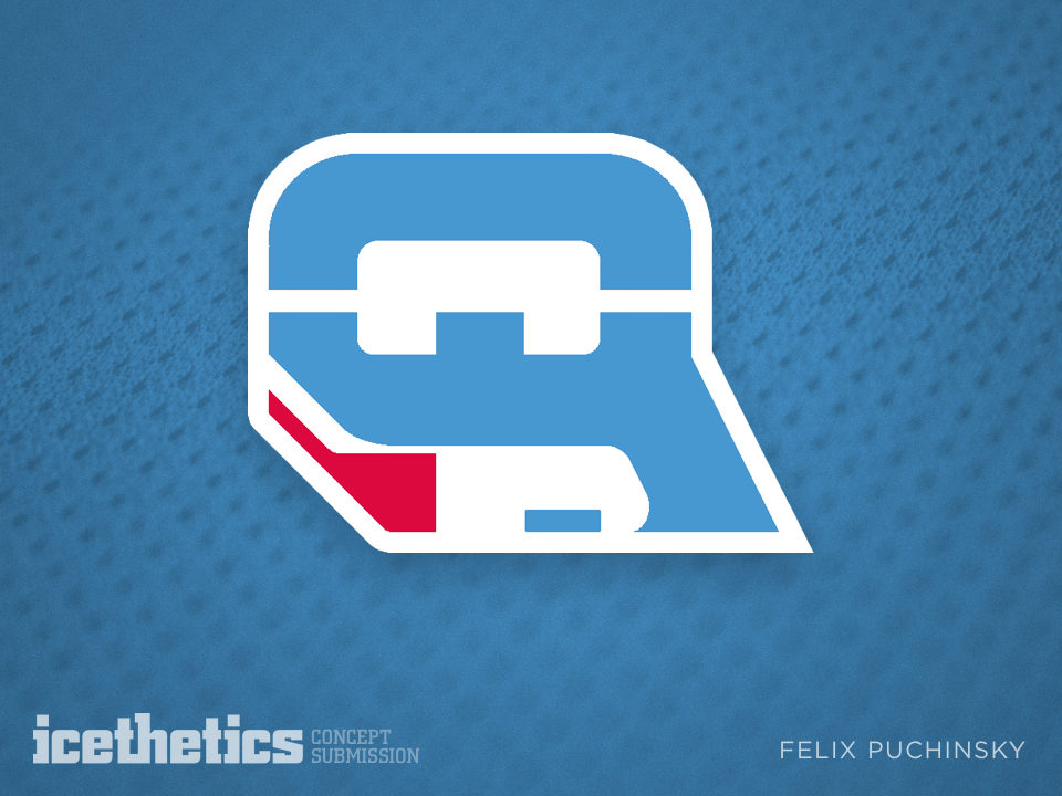
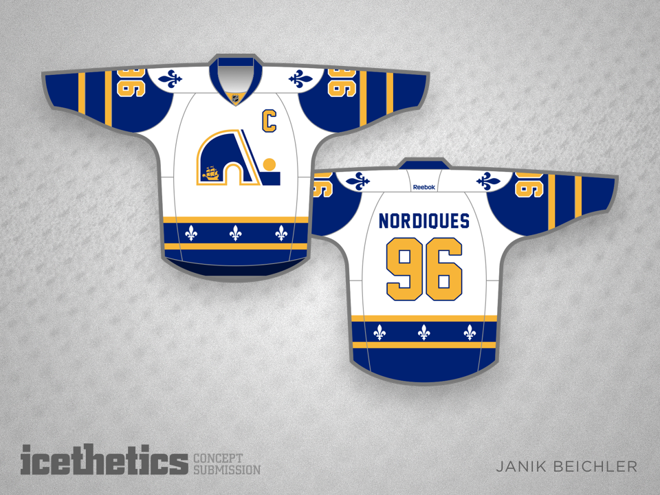
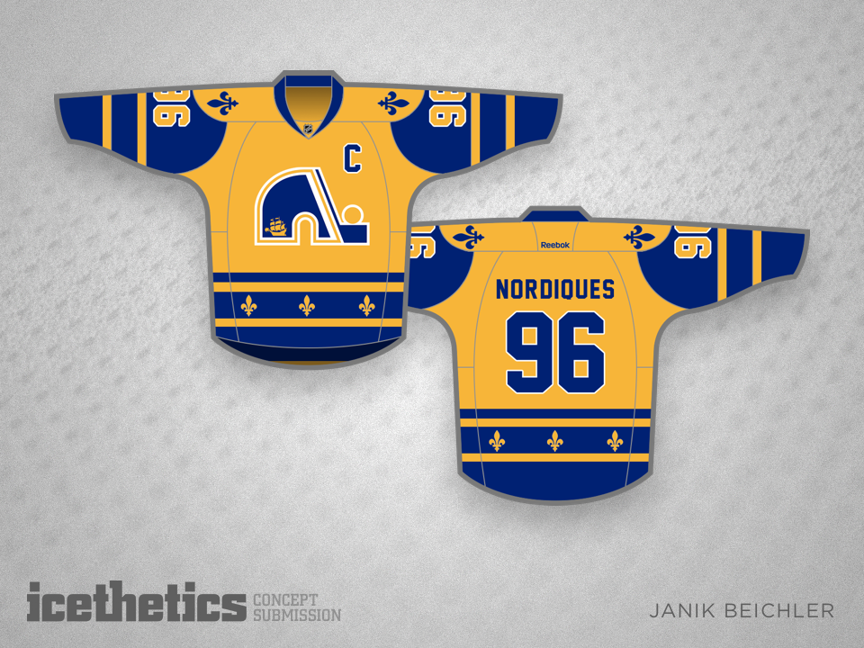
As an entire province waits hopefully for the return of its NHL team, Felix Puchinsky has a couple of ideas for new logos. Think either of these could work for the new Nordiques?


i
29 VOTES

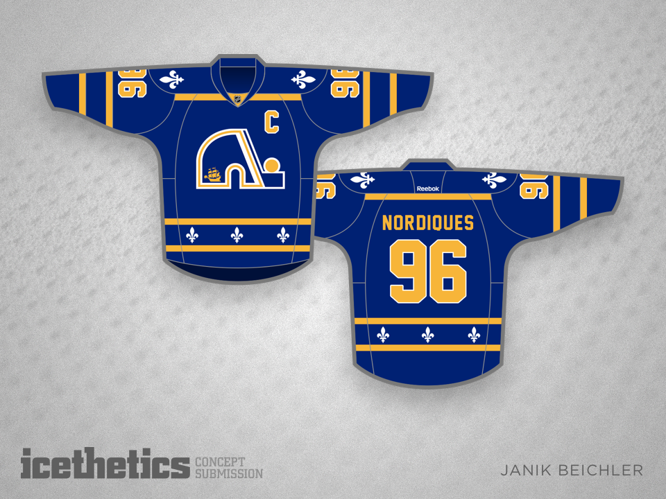
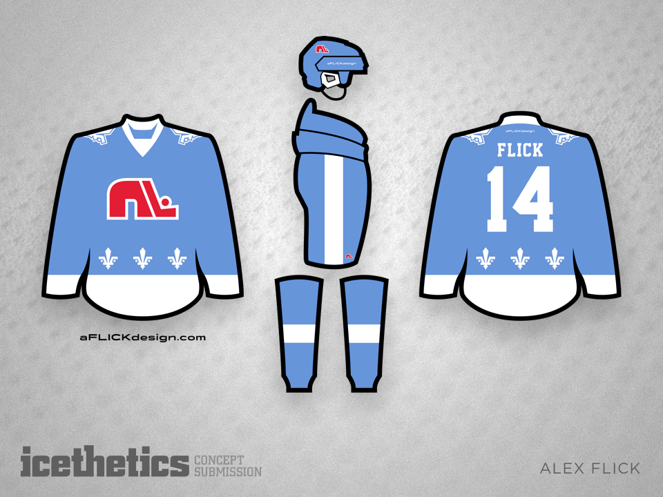
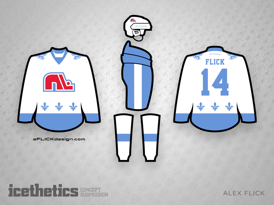
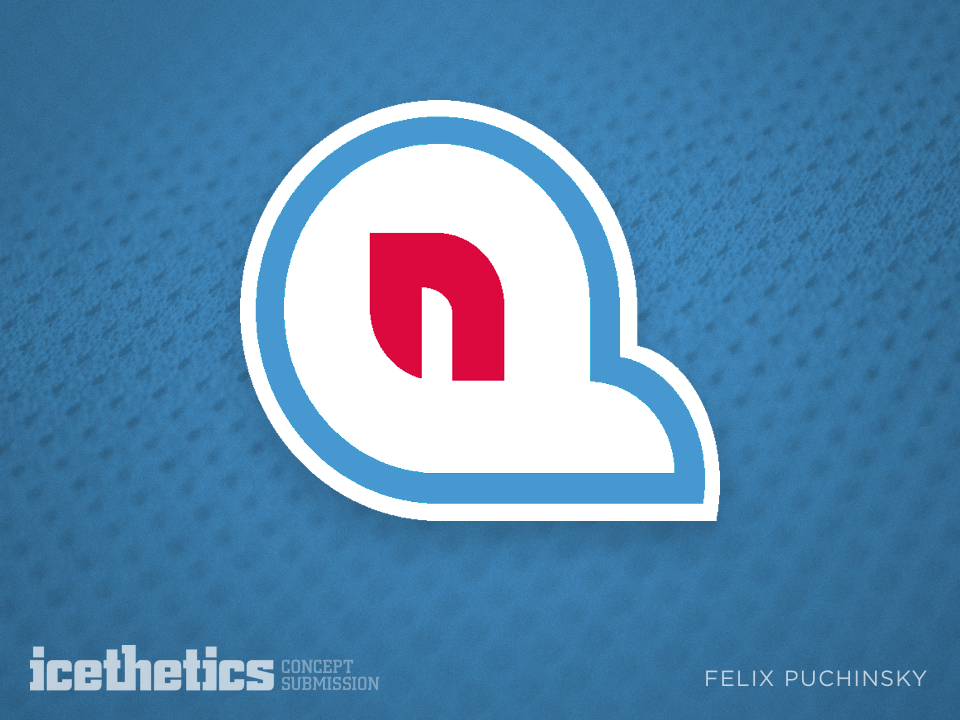
UPDATE · Sep 26 · Felix has created another variation of his "QN" letter mark.

i
RATE THIS CONCEPT

Unique Nordiques

i
297 VOTES

Janik Beichler makes his debut on the Concepts page today with a Nordiques set. He writes:

Since the Nordiques would not be the only team from Quebec, the new color scheme is that of Quebec City, instead of the light blue of the province Quebec.
The ship in the logo is also that from the Quebec City flag. However, the fleur de lis is still included, which creates a combination between the historical team and the expansion franchise — similar to the Winnipeg Jets, who went with a new style and color scheme, while maintaining the name.
i
245 VOTES

Janik also submitted this set which relies more heavily on the previous Nordiques logo. Do you have a preference?

Nordiques in a New Era

i
281 VOTES

A few years ago, Alex Flick won a logo design contest for what would prove to be a short-lived Central Hockey League team named the St. Charles Chill. Today, he's updating the Quebec Nordiques for a new era. Quite a talent here.

Legault's Expansion IV

i
240 VOTES

Christian Legault has taken over our Saturday concept posts for a few weeks. After tackling Las Vegas, Seattle and Kansas City, he's trying his hand at Quebec today. What do you think of his new take on the Nordiques? If the design looks familiar, its actually Christian's third version since August and December last year.

Cockeram Double

i
338 VOTES

Two by two, we continue with a couple from Brandon Cockeram. There are a lot of hockey fans hoping for the return of the Nordiques. Should they look like this?

i
321 VOTES

And what about the Sabres? Is the time coming for a uniform revision?