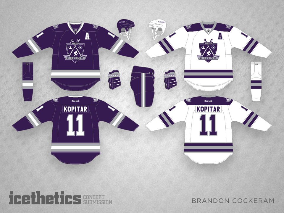
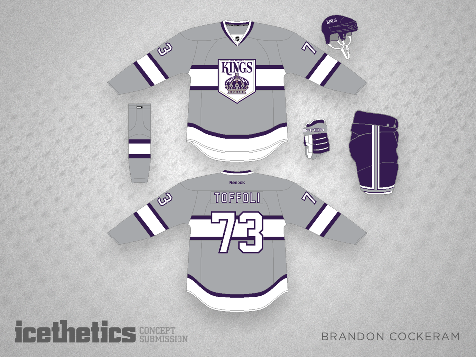
Classic Nashville

i
187 VOTES

When the Predators redesigned their logo and uniforms, their aim, at least in part, seemed to be simplifying their look to a more traditional style. The problem is the jerseys are still very much of the Reebok Edge era. So Brandon Cockeram has a fix for that today.

i
RATE THIS CONCEPT

Green and Grey

i
223 VOTES

Given that the Dallas Stars recently adopted green and grey as their colors, this probably wouldn't fly in the real world for the Minnesota Wild. But as a concept, I think Brandon Cockeram is onto something. It's a pretty solid look that no one can say looks like Christmas.

Cockeram Double

i
338 VOTES

Two by two, we continue with a couple from Brandon Cockeram. There are a lot of hockey fans hoping for the return of the Nordiques. Should they look like this?

i
321 VOTES

And what about the Sabres? Is the time coming for a uniform revision?

Purple Kings

i
288 VOTES

Unique logos. Unique colors. How could the Kings go wrong with a set of jerseys like these from Brandon Cockeram? Almost anything is better than black and white.

Seals of Gold

i
235 VOTES

Everyone remember the California Golden Seals? After a brief existence in the late '60s and '70s, they moved to Cleveland before merging with the North Stars in 1978. Imagine if they were still around today. What might they look like? Brandon Cockeram has an idea.