Concept Collection 42
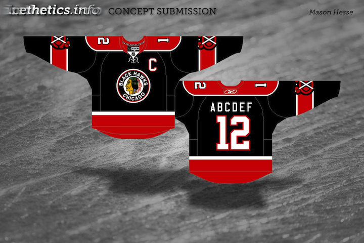
/Got a handful of concept art to share. No theme on this one, just a mish-mash of some interesting ideas.
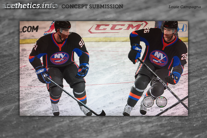
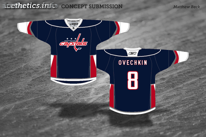
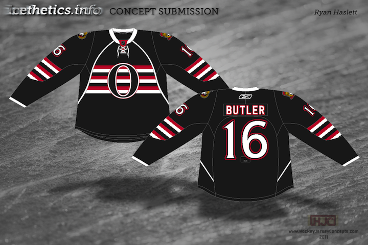
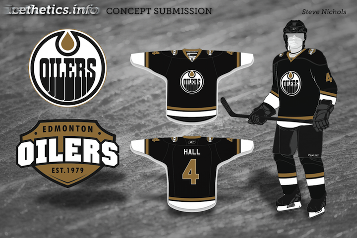
Been getting a lot of Panthers concepts, by the way. Thinking the next post may be Florida-themed.
Got a handful of concept art to share. No theme on this one, just a mish-mash of some interesting ideas.


Been getting a lot of Panthers concepts, by the way. Thinking the next post may be Florida-themed.
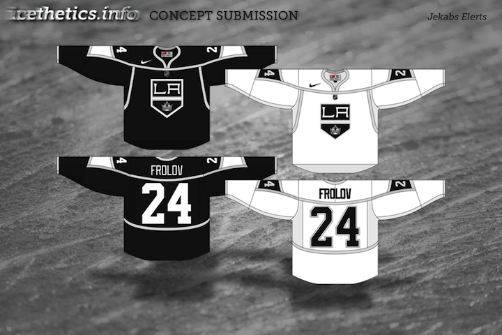
Continuing with the new concept art format. Seems to be getting good reviews. Today brings a handful of great designs by some Icethetics regulars.
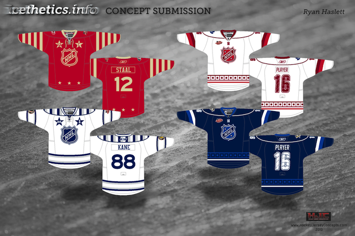


If you recognize the logo in Ryan's Capitals concept, you're not alone. It's not an original design. In fact, it's a logo commissioned by the Capitals years ago but never used. It was included in a post a couple years ago about lost logos registered with the patent office but later abandoned.
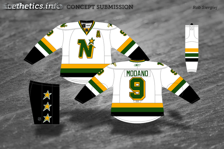
They say fashion is cyclical. Trends come and go and come around again. In the NHL, we seem to be re-entering a retro phase. Throwback jerseys have always been popular with fans, but it seems only in the last few years have teams started to take advantage of that. Classic designs that bring history back to life have started making their way back into the mainstream, in the form of alternate jerseys and special events such as the Winter Classic.
So "retro" is the theme of today's post. Let's see what our artists have come up with.
By the way, I have lots of new concept art ready and waiting. Someone needs to stay on me about keeping this page updated. I'm very forgetful.
Has it really been seven weeks since the last concept post? Unacceptable. Yes, there have been a lot of blog and tournament updates. And yes, I've been busy lately. But seven weeks is a long time. So I'm going to try some new things to keep the concepts flowing.
Since getting this page updated is lower on my list of website priorities due to the time/effort required, I'm going to start adding new concept art to our brand new Facebook page on a regular basis to keep everyone satisfied. However, I will continue to save some items to be showcased here on the site.
So I'm taking some time out this holiday weekend to post a handful of new work. Most of the concepts sent in tend to be a slight re-imagining of a team's uniform. Usually some stripes are rearranged or colors changed. But every so often, an especially creative concept appears. That's today's topic.
I'm shooting for concept updates on a weekly basis, but that may be too much to ask for. Just know that I'm doing the best I can. I'm assuming things will quiet down on the news front as the summer goes on, which will allow more time for concept posts.
As the winter winds down, there's been a lot of talk about next year's Winter Classic. Rumor has it the Washington Capitals will get to host. And by far, the most popular opponent among Icethetics readers seems to be the Ottawa Senators. That's our theme for today's post.
By the way, I do have a few more Olympic concepts to share. I'll try to get those posted before the weekend.
Time to ring in February with some new concepts! Icethetics artists have been hard at work on a couple Southeast Division teams these days. Let's take a look at what they're working up for the Capitals and Thrashers.
 Glen Cuthbert Glen Cuthbert |
Just last Thursday I posted the news that the Washington Capitals are planning a special 35th anniversary celebration this coming Friday. The release tells us they'll wear a red jersey with a unique commemorative patch. While the rest of us are getting our hopes up for some type of throwback sweater, Glen is being a little more realistic in his interpretation. Not as exciting, but likely what to expect in D.C. on Friday. |
 Ryan Haslett Ryan Haslett |
But speaking of throwback, Ryan has taken some liberties by merging two different eras of Caps logos on this white jersey. Sad to say, I am not a fan. But I must admit I always liked the Caps' blue and bronze days of the mid-90s and early 00s. It gave them a unique identity until they ditched the blue jersey for a black one. |
 Brian Brideau Brian Brideau |
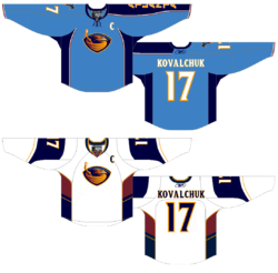
I can always tell when a team's uniform design is unpopular with Icethetics readers — because concept art just comes pouring in. And evidently, the Thrashers are one of those teams. Brian's jerseys may not look much different from Atlanta's actual sweaters — and honestly, the blue one isn't — but look closely at the white one. It's been simplified and freed of piping. Actually, it's really just a white version of the maroon third jersey. Amazing what a few slight alterations can do. |
 Ryan Haslett Ryan Haslett |
And to go with that design, imagine Ryan's dark blue sweater as an alternate. It harkens back to the Thrashers' original dark uniforms and a time when it was rare to see an NHL club with two different crests for their home and road jerseys. I'd love to see that make a comeback. |
 Glen Cuthbert Glen Cuthbert |
Now we finish with the artist, Glen, who began today's concept post. He offers up another maroon option for a Thrashers third jersey. Only the logos have been changed from the current alts. But even that is a major improvement. |
Thanks to everybody who's been sending in concept art — keeping the reserves full. All of your amazing work will be posted soon!
I'm sure I'm enjoying Sin City right about now. And I'm sure you guys are enjoying these daily concept posts. This is the second of five auto-posts and today's theme is rebranding.
Rebranding has become a very popular topic among Icethetics concept artists — giving a complete uniform and logo overhaul to a given team. Sometimes the overhaul is drastic and sometimes it's subtle. But it usually results in something better than which actually exists.


 Robert Giannone Robert Giannone |
We start with Robert Giannone's rebranding of the Philadelphia Flyers. Robert isn't looking to replace the classic P logo so much as give it a nice complement that could be used as a shoulder page, third jersey crest or merchandising mark. He's created an F lettermark based on the P used on the team's old orange alternate sweater. And he's put an awful lot of work and thought into it. He's had patches embroidered and attached to an actual Flyers jersey as well as a cap. They don't look out of place at all. So I'm completely with him — that is until we get to his wordmark. That's where you lose me. That does not say Flyers at all. To me, it says graffiti. But aside from that, I like this logo, and although we've seen versions of it before — and by that I mean this Zephyr X-line hat — it's always nice to see someone putting some effort in. You can see more of Robert's work on his web site. |
 Ryan Broda Ryan Broda |
Next, Ryan Broda offers the Atlanta Thrashers a newer look. He's kept the same color scheme and wordmark but has made some adjustments to the other logos — ridding them of the primary mark often ridiculed as looking like a bird stirring itself into a bowl of soup. Ryan's kept the strongest element of that design — the bird head — and has added some additional details to the logos to make it look a little meaner. It's a very sharp concept. |
 Julian Kazmierczak Julian Kazmierczak |
Julian offers us something a little different for the Ottawa Senators. He's decided to drop the gold completely and stick with the black and red which were most prominent when the Sens first existed in the early 20th century and were later revived in 1992. The logo is back-to-basics but the striping may be a bit much. Overall, however, I think he may be on to something. It's simple and isn't that what we've been wanting ever since the beginning of the Age of Reebok? |
 Matt Marczel Matt Marczel |
I've got one more item to share today. This comes from the always prolific Matt Marczel. However, Matt hasn't so much rebranded the Capitals here as offered up a third jersey to die for. Every time the topic comes up, we look for ways of getting the Caps into a blue third jersey with the Weagle heavily featured. This does that in the best way. But better yet, I'd vote that this be the primary home jersey. And even if we can't have that, what about putting the Weagle on the front of the red jersey? The Capitals have a brilliant logo here and it seems to just be going to waste. |
Excellent work by all of these artists. They should be proud. And you should come back tomorrow for more concept art.
We're kicking off a new concept series today here at Icethetics. Designer Elliott Strauss has been on a mission to rebrand the NHL for the better. Some teams need sweeping changes, others not so much. For the 10-part series, Elliott set out with the following goals:
I think Elliott is on the right track, for the most part here (though I may disagree with the need to make home and roads always match). Distinct identities, attention to detail and tradition are all important aspects to NHL uniforms. Let's see how they stack up!
All bold text in this post is in Elliott's own words. Artwork MAY NOT be reproduced without permission.
 The colors stay the same, but the logo is new as I took the U.S. Capitol dome and combined it with a red star and circle — my version of the pre-Ovechkin primary.
Uniforms are a little top heavy but pants stripes help balance it out. The alternate is somewhat similar to the Capitals' current home, thought I thought the Weagle logo made a better crest.
A great start to this series. The only change I would make is to swap the home and third jerseys. To me, the Caps will always be red despite their late-90s identity crisis.
That Weagle as a crest is an incredible look that Washington needs to take advantage of one of these days.
 The sand color is darker here throughout the Coyotes identity.
With the jerseys, I wanted to move away from the extreme traditional look a little. Notice that the stripe on the bottom of the hem forms the same design between the jersey base and the pants as is on the arms. For that reason, the pants color had to change.
The road uniform is sand — just something different. The crest of the alternate is based on an old patch they had when they still wore purple and green.
Another inspired concept here. I think the only missed opportunity was the sweater numbers. The rest of the design really works — even the non-white road sweater.
 I took the Panthers' logos and updated them to be smoother and more intense.
The uniforms play heavily on the claw motif — even slight claw marks on the numbers.
The alternate relies on the contrast between navy and red.
The Panthers have had great uniforms since their inception in 1993 — at least until the Age of Reebok. What Elliott's done brings them back into the 21st century.
The jerseys are sharp and so are the logos. Very nice work as we wrap up this series debut.
Elliott Strauss is a talented artist whose work has been seen previously as finalists for both the USF Ice Bulls and KractIce logo projects here at Icethetics.
We'll certainly see more from him over the next several weeks.
In next week's edition of the Strauss NHL Rebrand, prepare for teh Oilers, Red Wings and Thrashers.
You've been patient (most of you). My inbox has seen a lot of concept art over the past few weeks and I'm thrilled to finally be posting it! (Seriously, if someone can help me figure out a way to make Icethetics my only job, we'll all be a lot happier. A lot.)
All right, I've got 14 items to get to tonight, so let's not waste time. We'll begin with the Colorado Avalanche, whose brand new third jersey has recently been leaked (see the blog for more info on that).
A lot of readers have bemoaned a lack of creativity, I believe having to do with the fact that it's simply a revision of the Avs' previous third. This first concept certainly avoids drawing on past designs while simultaneously reminding us the Nordique spirit will never die.
The other team soon releasing a brand new third will be the Florida Panthers. Rumor would have us believe it may look a little something like this.
It's a return to red, which I'm sure longtime Cats fans will appreciate, and it borrows very heavily from the Wild's home uni — easily one of the best in the NHL.
Seeing all these new third jerseys the last couple of years makes me wonder who got it right and who didn't. Some teams don't have one and could really use it. Obviously, the Penguins, Wild, Sabres and Blues got it right.
I've been hoping the Rangers would one day return to the Lady Liberty jersey which at one point was my favorite in the league. Here's a re-envisioning of that.
The Capitals would do well to add a blue jersey. Many have suggested the Weagle take center stage, but why not a red version of the primary logo? How would it all look on a Lethbridge Hurricanes sweater?
The Canucks dropped the ball with their third last year. It was what we all expected, but that should be their home sweater, and not an alternate. Here's one idea for an alternate with yet another brand new logo.
Now that Whalers merchandise is making its way back onto store shelves, maybe the Hurricanes could pay tribute on one St. Patrick's Day sometime.
Maybe even the Red Wings could get in on the third jersey action — even though they've never been one to follow that crowd.
The Dallas Stars dropped the ball worse than anyone two years in a row — bad home and road sweaters followed by a shockingly worse third. Since we're talking nostalgia and vintage these days, why not a trip down memory lane the heart of Texas?
Lastly, the Ducks. It seems like every concept post at some point feels the need to help out those poor Anaheim Ducks. Nobody was sad to see the "Mighty" go away, but nor were they glad to see the artistic carnage that would ensue on the sweaters to follow.
I'm not saying gold is the way to go necessarily, but maybe stepping outside the box isn't a bad thing. Anyway, the colors are great, but the logo could use a lift.
 Jake Niehl
Hey, an actual duck. Go figure.
I enjoy ending a concept post with a little something to freak you out, if at all possible. Tonight is no exception. The Sabres and Canucks have their 40th anniversaries coming up next season. Let's get started by putting an actual saber on the Sabres' jersey.
And hell, why not just run the gamut of past logos and colors for the Canucks? You know they never did have a red jersey.
A little something to frighten Panthers fans. As we near Halloween, perhaps this could be a costume.
And lastly, one of the most ridiculous Atlanta Thrashers concepts ever to grace these pages.
Show your mcskilz! To the first person who can legitimately make the rest of the numerals out of that simple Thrash logo — bragging rights for life!
Hope the wait was worth it. I'm really trying to keep this updated. And since I know it's what you guys want, I'll make a special effort to have something new hear at least once a week — though it likely won't be in the quantity you see tonight.
Keep those concepts coming! Email them to icethetics@gmail.com.