Grand Rapids Griffins unveil new look, colors
/


On Tuesday, the AHL's Grand Rapids Griffins unveiled a whole new look, including new colors, jerseys and logos.
The Griffins switch to a black and red color palette after years of blue and red. They've also adapted the logo used on one of their alternate jerseys as their new primary mark.
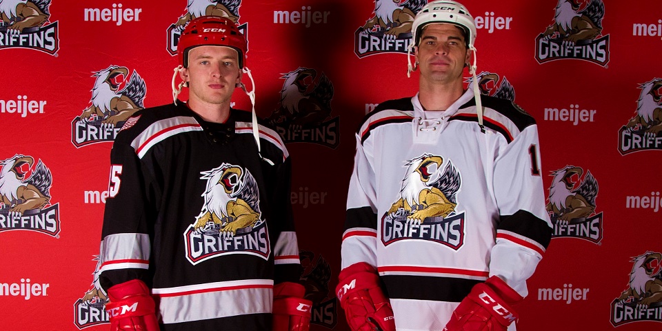
Lastly, the rebrand also involves new sweaters, seen above. For more great photos from the reveal, be sure to find the Griffins on Flickr.
This fall, the Griffins embark on their 20th anniversary season. The celebration prompted the club's redesign.
Marking the first primary logo change in the history of the franchise, the Reebok-designed logo features Griff fiercely protecting the skyline of Grand Rapids, reinforcing the pride that the Griffins have in their city while portraying an aggressiveness that was absent from the original logo.
Prior to its adoption as the primary logo, the artwork had been featured on the Griffins’ home Wednesday jerseys since 2012.
"Each season we review every aspect of our business and look for ways that we can improve. This year, as we underwent this process heading into our 20th season, we looked at ways to modernize our logo,” said Griffins president Tim Gortsema.
“While the traditional and original Griff has been and always will be a storied part of our team’s history, we desired a fiercer incarnation that also incorporates our amazing city’s skyline.
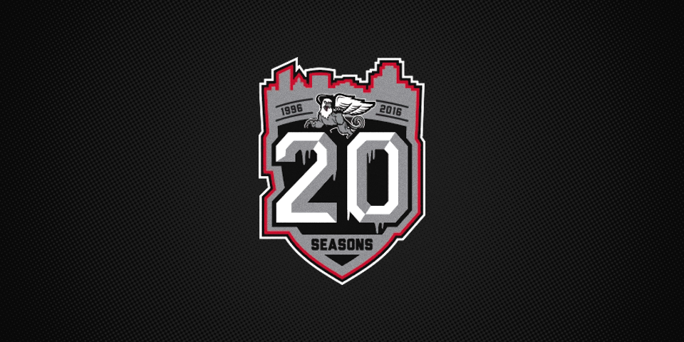
The jerseys feature special shoulder patches. On the right is the logo of their NHL affiliate, the Detroit Red Wings. On the left is a design commemorating the 20th anniversary.
So there it is. What do you think of the new Griffins?
Image via Grand Rapids Griffins
