
Inside the AHL, ECHL All-Star branding for 2019
/A few weeks ago we were treated to new logos and jerseys for the All-Star events taking place in the AHL and ECHL during the 2018-19 season. I took some time to get the inside story on the designs — which happen to come from artists that Icethetics readers know well.
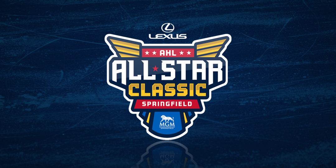
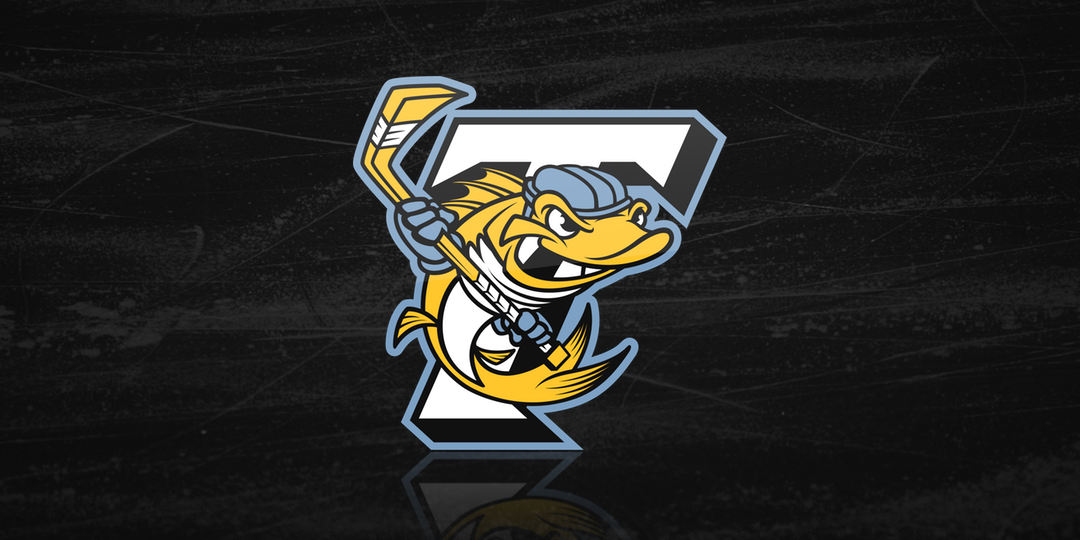
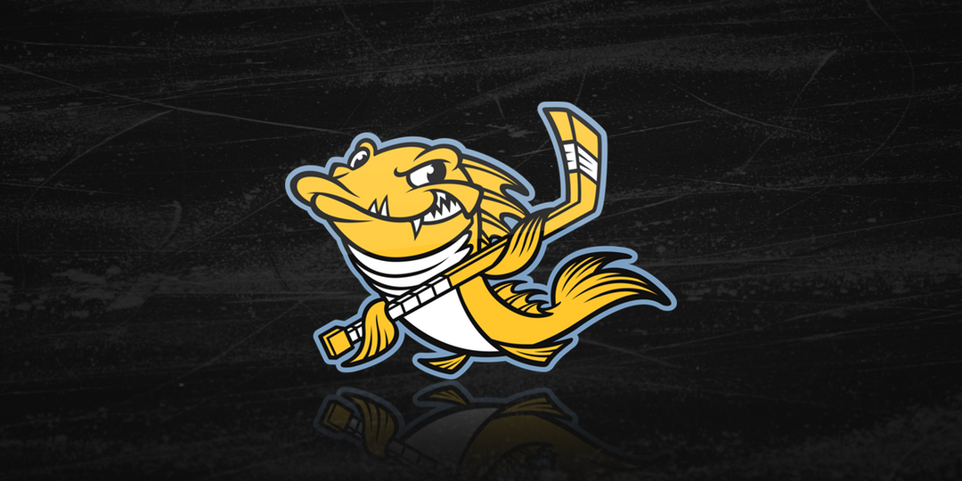
On June 28, the 2019 AHL All-Star Classic officially got its logo. The Springfield Thunderbirds will host the event on Jan. 27-28 with a logo well-aligned with their branding. It actually originated with the designer of the T-Birds' own logo — longtime Icethetics contributor Matt McElroy! He's certainly making his mark on the AHL. In fact, he currently works as a graphic designer for the Ontario Reign.
I chatted with Matt a few weeks ago after he tweeted that he "wasn't involved in the final process, only the beginning stages." He also shared a few of the designs that were turned down by the league. And when you look at them, you really have to wonder why.
I'm personally a fan of "Option 3.5" with those feather elements — a nice nod to the Falcons and Indians from Springfield's AHL past. Interestingly, the final mark they chose doesn't include the year or the AHL logo. And the Lexus logo is floating at the top rather than being integrated the way it was on the other designs Matt tweeted. Strange.
Included in the AHL press release: "The logo reflects elements of the Springfield Thunderbirds, including the gold wings and the T-Birds inspired font. The logo not only recognizes the support of the All-Star Classic’s partners, but also recognizes the city of Springfield as the home of the All-Star Classic, the AHL and the Thunderbirds organization."
As for Matt's part in the design process, he tells me he spent a few months working with the Thunderbirds to come up with some options to send to the AHL. Apparently, he and the league didn't quite see eye to eye on some of the creative decisions and eventually the AHL moved forward on their own without his input. It's a shame but it's also hard to know all of the factors involved in a process like this.
Meantime, Matt says the Reign are definitely keeping him busy!
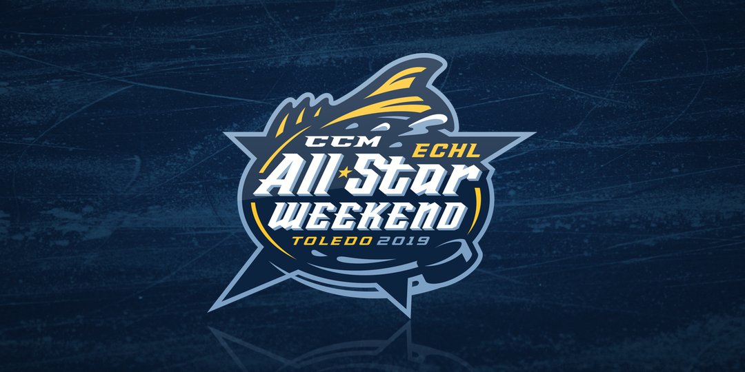
2019 ECHL All-Star Weekend logo
Elsewhere, the jerseys for the 2019 ECHL All-Star Weekend were unveiled by host Toledo Walleye on July 2. In a twist on the NHL and AHL All-Star formats, the ECHL event will be a 4-team 3-on-3 tournament — but two of those teams will be comprised of players from the host team. More on that in a minute.
But first, let's talk about the branding for the ECHL All-Star Weekend. It's superb — as is, in my opinion, just about everything that comes from the Toledo Walleye. The reason is the club's creative director, Dan Royer, along with Dan Simon of Studio Simon, who's done some incredible sports branding work — mostly in baseball.
I talked with Royer recently to get the rundown on their latest collaboration. The challenge with minor league event logos like this can be the sponsorships. There are often a lot of elements that have to be incorporated cohesively into one overall design.
"We've worked with Dan Simon on logos in the past and he's great at making complicated event logos seem clean and contained," Royer said. "It’s not easy creating a brand mark that contains 2-3 sponsor logos, a location, and a year… oh, and the name of the event. Making all those elements work together is a true challenge, and Dan is a master in that regard."

2019 ECHL All-Star Weekend Logo with sponsor
In this case, the Dans were required to include sponsor logos for CCM and ProMedica, the city of Toledo, the year 2019, and "ECHL All-Star Weekend" all within one unified style that still feels at least a little like the Walleye. I think they nailed it.
With the primary logo settled, Royer and Simon still had a lot more to do. I mentioned earlier that two of the four All-Star teams would be comprised of Walleye players. But you can't exactly call them Walleye A and Walleye B. So the creative team got, well, creative.
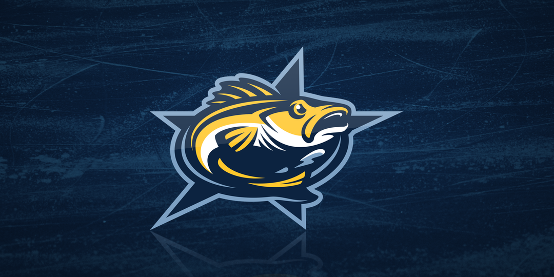
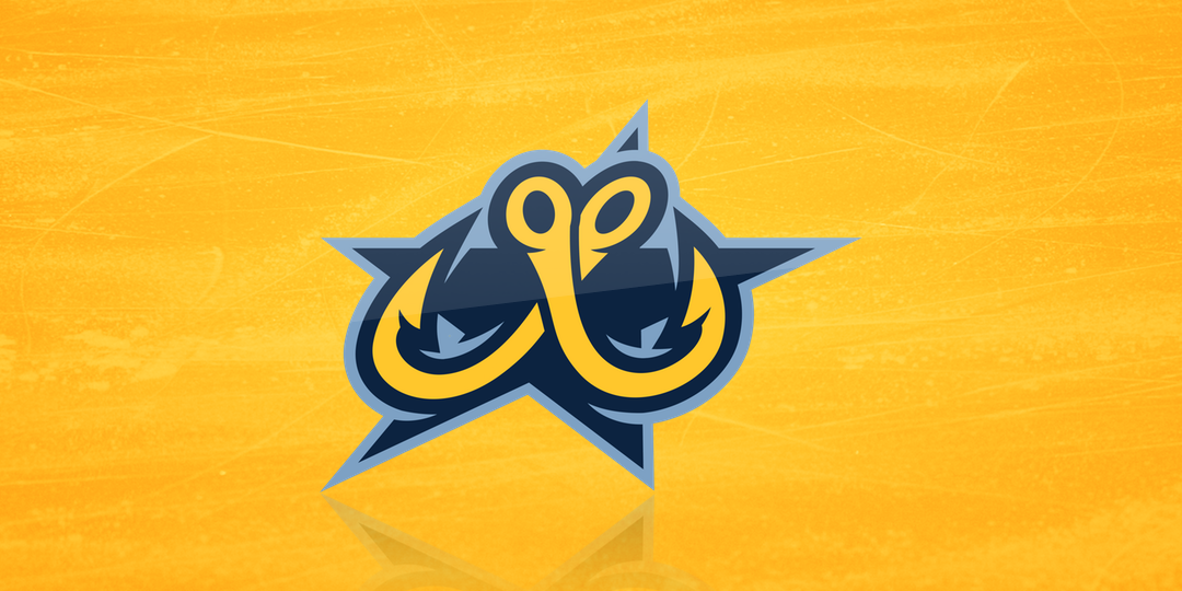
Meet the Fins and Hooks — and the shoulder patch that unites both teams. Royer said they came up with a number of ideas for team names but "the fins and hooks are elements that we use often as secondary marks, and our fans have responded well to them over the years."
"I wanted to keep the slanted star as the main shape for all of the logos," Royer said. "That’s one piece that is consistent throughout all the marks. The Fins team logo has a fin cutting across the star and the fin actually completes the top of the star. The Hooks team logo includes a slanted “W” made out of two fish hooks, which is a variation of a popular Walleye secondary logo."
Of course the Fins and Hooks will need opponents from around the ECHL.
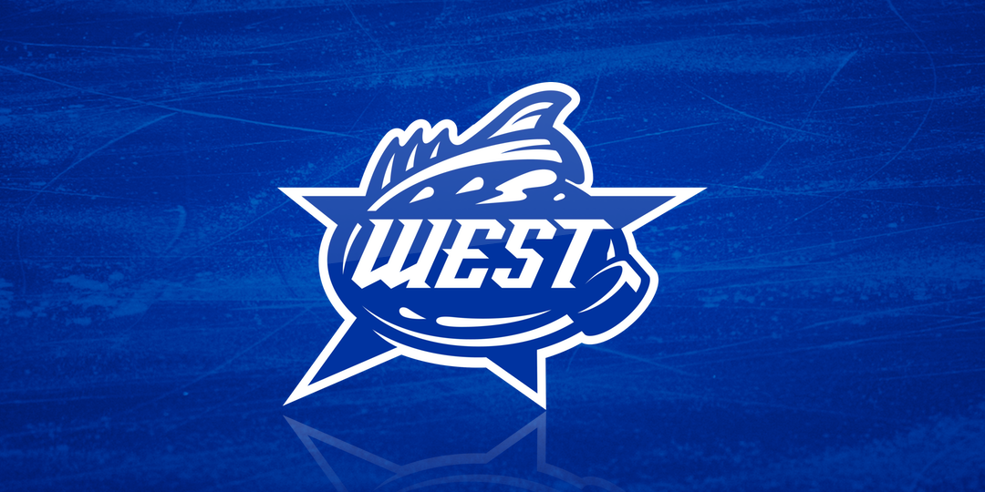
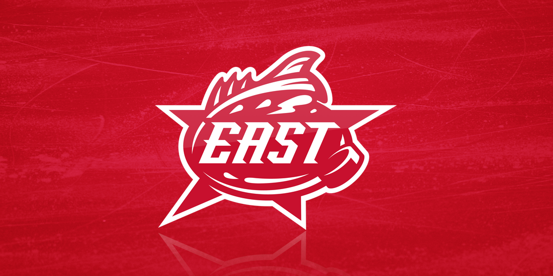
"The East and West team logos feature a more traditional look," said Royer "with the brand lettering within the slanted star shape. Each logo introduces their team colors, which leads us to the jerseys."
Perfect segue. These are the jerseys of the 2019 ECHL All-Star Weekend.
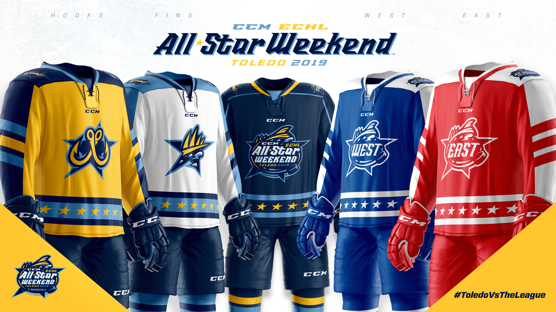
2019 ECHL All-Star Weekend jerseys
You might be wondering why there are five jerseys. Royer's got us covered.
"The Weekend jersey is navy and has the All-Star event logo on the chest," he said. "That jersey will be worn by the Walleye during their regular season game against Fort Wayne on Jan. 20."
Royer said he "designed the jerseys to have a consistent brand feel, while featuring the team logos and color schemes. The colors will really help separate the guys during the event."
There's no doubt in my mind these jerseys will stand out well in any combination of match-ups. That's both the challenge and fun of designing for an event where all four teams can play each other but only have one jersey option.
"The Fins jersey is white with Walleye light blue [sleeves], featuring the Fins logo on the chest," Royer said. "The Hooks jersey is yellow with Walleye navy sleeves and features the Hooks logo on the chest. The East team jersey is a classic red and white, and the West is royal blue and white. All of the jerseys have similar sleeve stripes and a band of stars along the lower body of the jersey."
For my money, this whole package is a master class in sports event design. The consideration that went into every decision is apparent in every pixel. Bravo to the Dans!
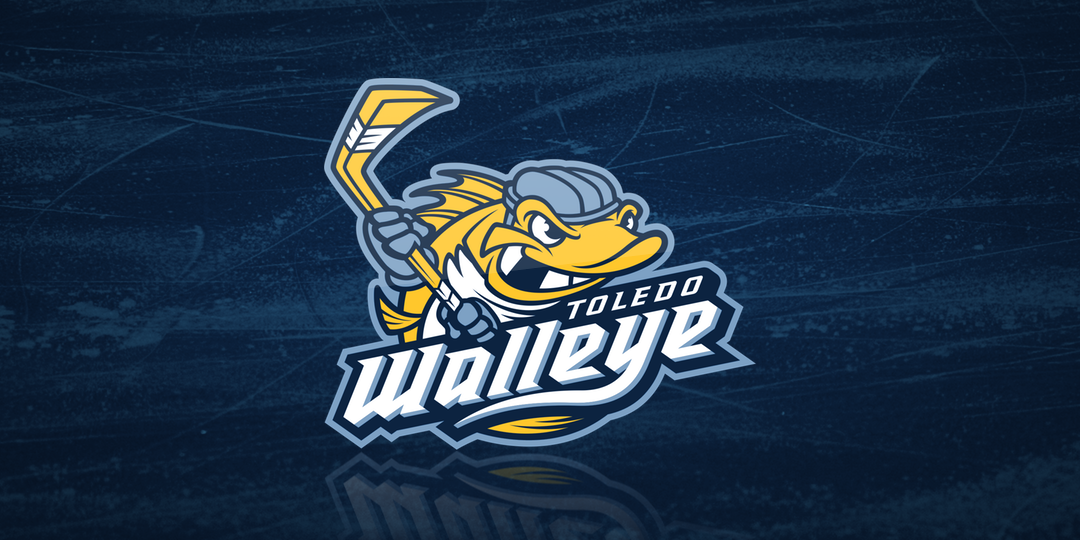
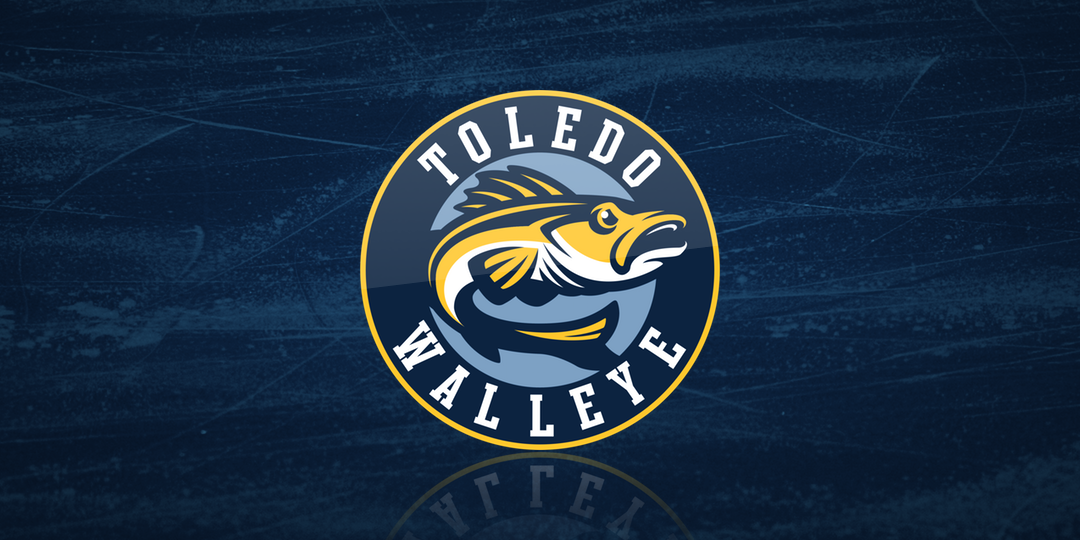
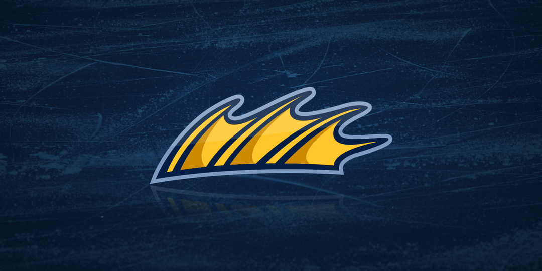
For what it's worth, my praise really goes beyond the All-Star branding. Since their inception in 2009, the Toledo Walleye identity has been a joy to cover. By the way, that means a 10th anniversary logo could be right around the corner!
Whether it's a traditional hockey look, a wild zombie theme, or a brilliant Harry Potter tribute, their alternate uniforms are consistently some of the best out there. And I'm not just talking about the minor leagues. Here's a sampling of some of their primary and secondary logos.

"We have worked hard to come up with some interesting looks over the last few years," Royer said. "Jersey design is something I’ve always been drawn to. We don’t design all our specialty jerseys in house. But when we can, it almost always results in a better reaction from our fans.
"Our fans love our team and our brand. The more true to that we are, the more they enjoy the slight variations. All of our on-ice specialty jerseys are either raffled or auctioned off for various charities. Our fans love showing their support for those charities by purchasing their favorite jersey. It’s a great opportunity for the Walleye organization and our Walleye fans to give to some great causes."
And lest we forget, the Walleye replaced the Toledo Storm — who used this logo for 16 years.
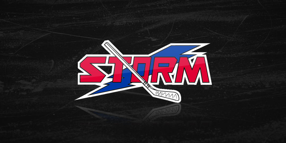
Toledo Storm logo, 1991—2007
So let's all agree that the Dans are probably the best thing to ever happen to Toledo hockey fans blessed with the gift of sight. Long live the Walleye!