
Newfoundland Growlers unveil uniforms for inaugural season
/

Two months after introducing their logo, the Newfoundland Growlers officially revealed their uniforms today. The new ECHL affiliate of the Toronto Maple Leafs is preparing to embark on its inaugural season this fall.
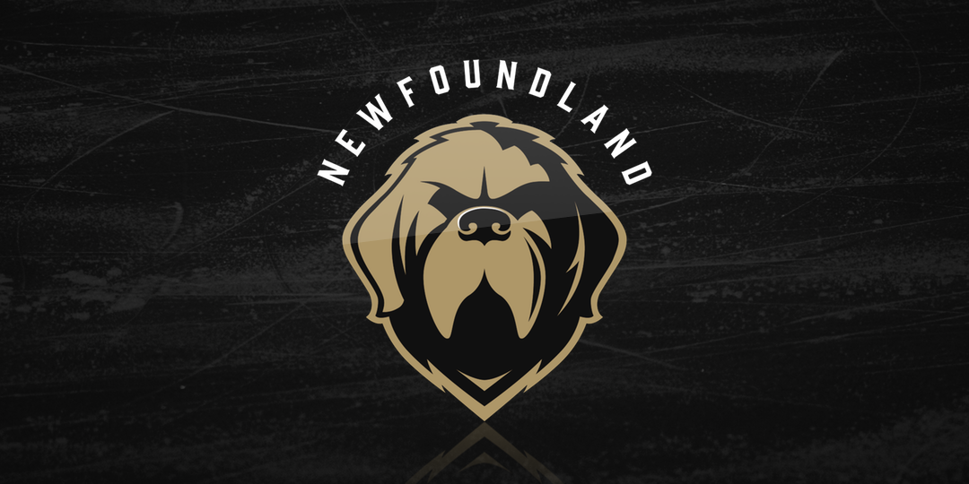
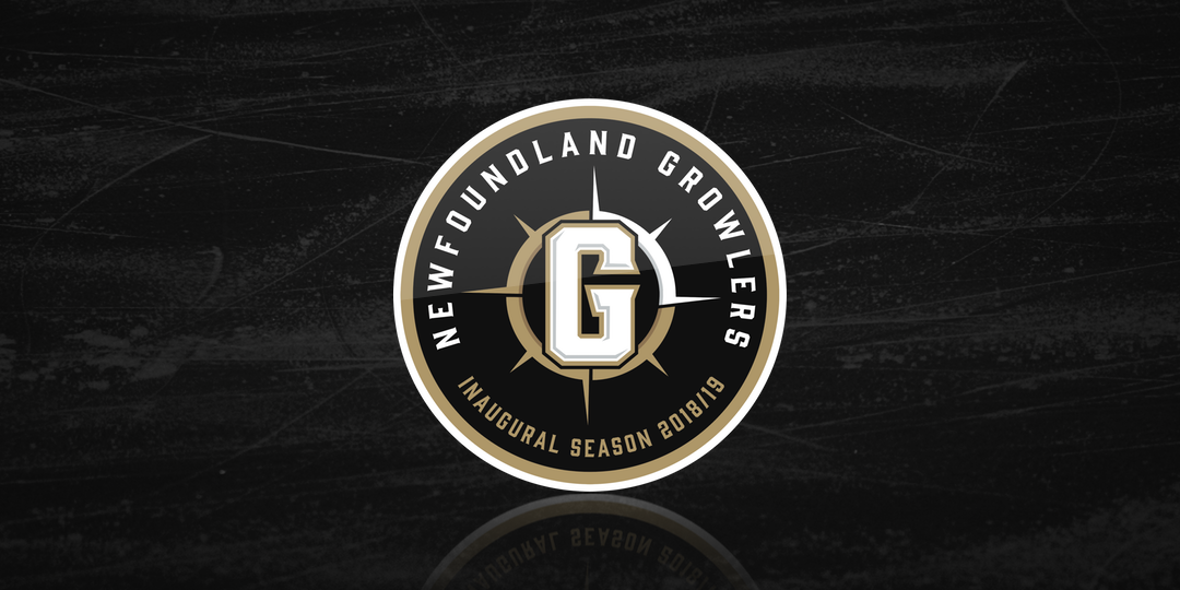
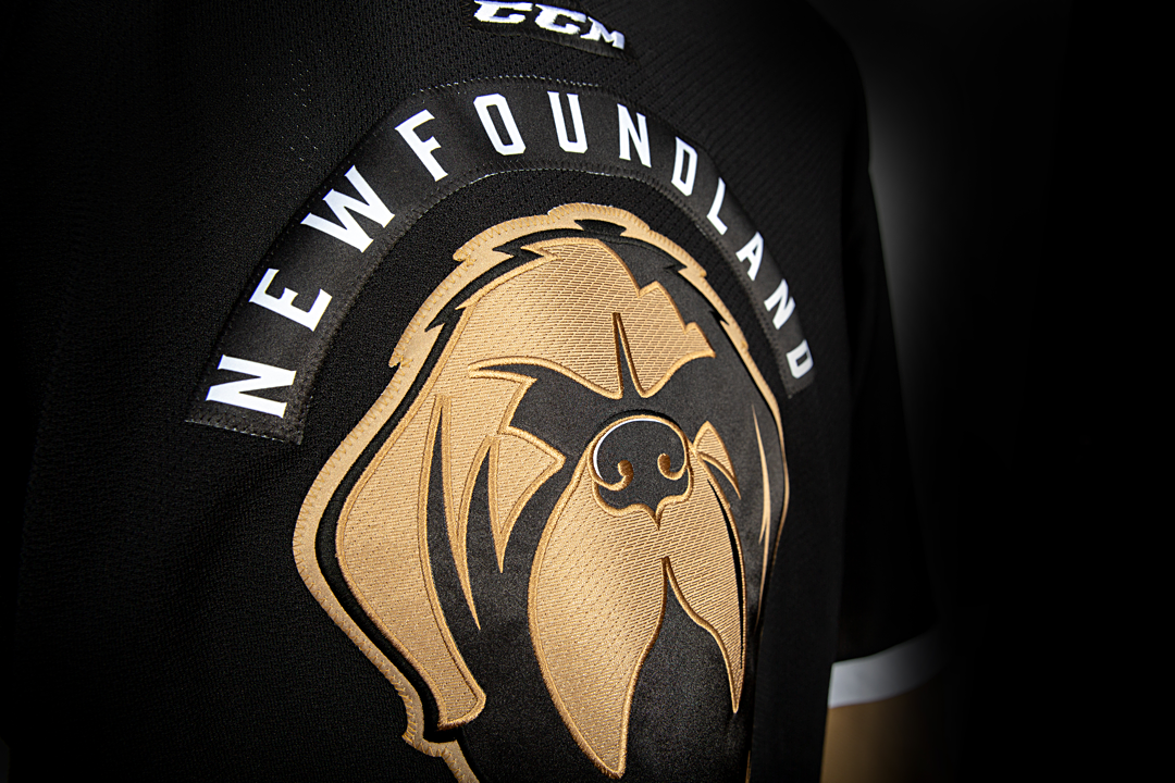
Like the logo, the jerseys are simple but striking — black and white with gold trim. The black road sweater features the name of the island arched above the dog's head. The shoulders are each adorned with a patch commemorating the club's inaugural season.
Newfoundland Growlers jerseys, 2018—
When the logo was unveiled in May, it received a lot of immediate praise from fans and Icethetics readers in particular. It's hard not to think the jerseys won't get the same. This look is about as traditional as they come especially in the minor leagues. In fact, it's almost a complete 180 from the Leafs' former ECHL affiliate, the Orlando Solar Bears.
Overall, it's a solid look. Though the color palette is minimal, it's been used well here. What's more is it's a truly unique brand that Newfoundlanders can rally around. If you look back over the years at minor league teams in St. John's, they've all been based on their NHL affiliate.
Just within the last decade, they had the AHL's IceCaps, which was a unique name, but they wore Winnipeg Jets jerseys in 2011 and Montreal Canadiens jerseys in 2015. If you go back even further, the St. John's Maple Leafs played in the AHL from 1991 to 2005 — and everything about their branding was taken directly from the Toronto Maple Leafs.
In other words, I get the sense this will be an important identity in the hockey history of St. John's, Newfoundland. I hope it's around for years to come.
Here's a closer look at some of the details of the uniforms.


What do you think of the overall look of the Growlers?